Religiosidad Popular

Source: www.behance.net Laura Cárdenas. License: All Rights Reserved.


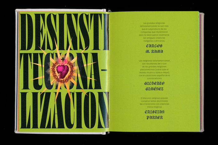
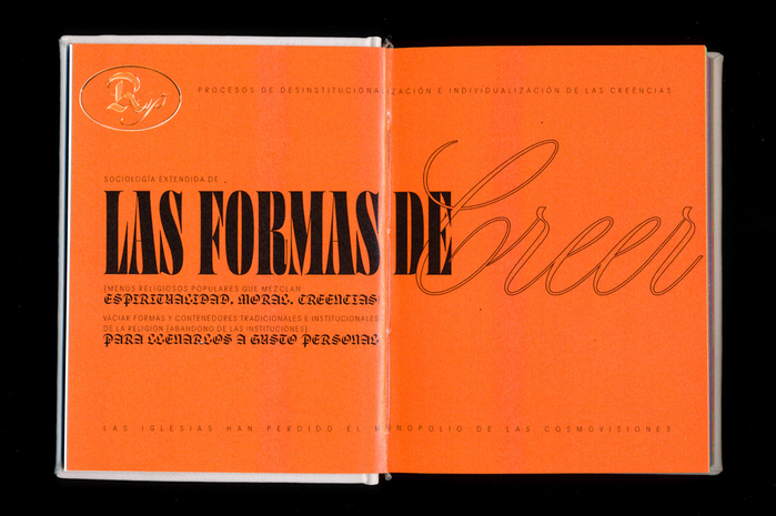
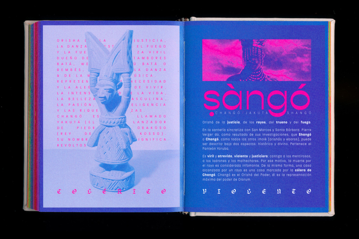
This editorial project is a result from personal questions, explorations, research and readings around popular religiosity. This book explores religiosity and spirituality with a local and popular graphic look.
The texts presented in the publication are results of personal notes and individual interpretations.
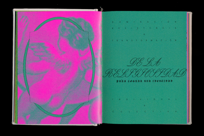
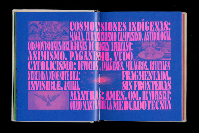
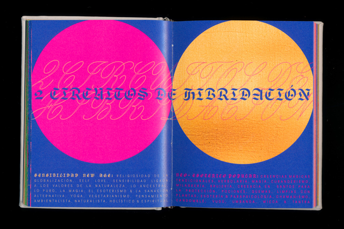
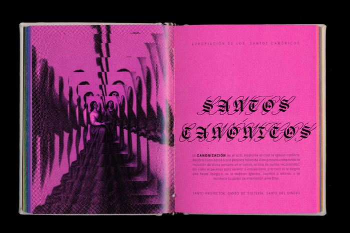
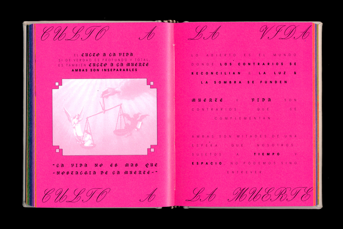
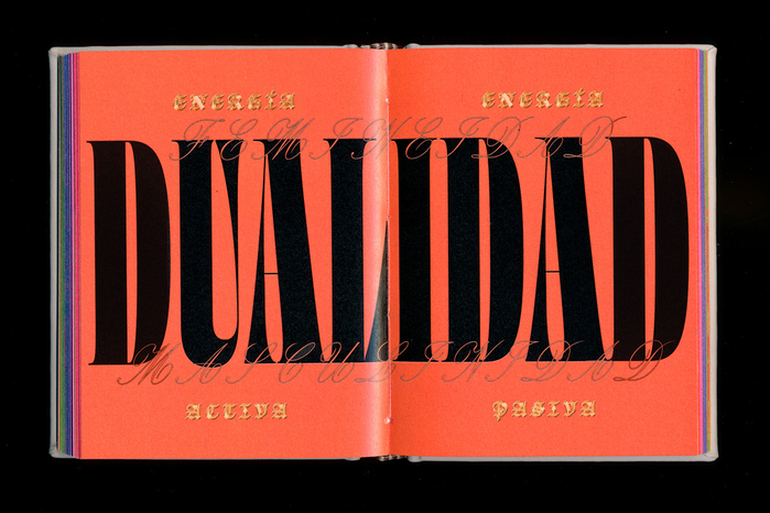
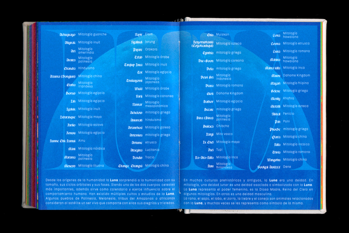
The book seeks to show the process of deinstitutionalization and individualization of beliefs, and the contrast between different religious and ideological systems, so the fonts used need to have an evident contrast between them, so a blackletter typeface (Respira Black) was used in contrast with a script font (Carta Nueva) and other contrasting fonts for the headlines, including Ohno Fatface and Gopher. On the other hand, Kiffo BT was used as the body text font since it is an easy-to-read and fluid font.
Source: www.behance.net Laura Cárdenas. License: All Rights Reserved.
Source: www.behance.net Laura Cárdenas. License: All Rights Reserved.

Source: www.behance.net Laura Cárdenas. License: All Rights Reserved.
Source: www.behance.net Laura Cárdenas. License: All Rights Reserved.
Source: www.behance.net Laura Cárdenas. License: All Rights Reserved.
Source: www.behance.net Laura Cárdenas. License: All Rights Reserved.

Source: www.behance.net Laura Cárdenas. License: All Rights Reserved.
Source: www.behance.net Laura Cárdenas. License: All Rights Reserved.
Source: www.behance.net Laura Cárdenas. License: All Rights Reserved.
Source: www.behance.net Laura Cárdenas. License: All Rights Reserved.

Source: www.behance.net Laura Cárdenas. License: All Rights Reserved.
Source: www.behance.net Laura Cárdenas. License: All Rights Reserved.
Source: www.behance.net Laura Cárdenas. License: All Rights Reserved.

Source: www.behance.net Photo: Laura Cardenas. Laura Cárdenas. License: All Rights Reserved.
This post was originally published at Fonts In Use