I Remember Germany album series

Source: www.flickr.com Uploaded to Flickr by Bart Solenthaler and tagged with “filmotypeviking”. License: All Rights Reserved.
Vol. 1 features Filmotype Viking with custom script lettering and a lady dreaming of Gutenfels Castle above the Rhine. The small type at the bottom is in red caps from Franklin Gothic Wide. [More info on Discogs]
Filmotype Viking (Sample unavailable)


Filmotype Warden (Sample unavailable)

Filmotype Latin (Sample unavailable)


I Remember Germany is a series of folk music compilations released by Fiesta Records in the early 1960s. The record label was established by Jose Morand in New York in 1952 and specialized in international music, in particular from Continental Europe and Latin America. Their I Remember… series also covered music from other countries. There were at least eleven volumes in the Germany subseries alone. Shown here is a selection of eight album covers.

Source: www.flickr.com Uploaded to Flickr by Bart Solenthaler and tagged with “twentiethcentury”. License: All Rights Reserved.
Vol. 2 has a view into Segringerstraße in the historic town of Dinkelsbühl. The title is shown in red caps from Twentieth Century Ultrabold Extended. “Volume 2” probably is in the regular-wide Bold style from the same family (or Futura, on which it is based on). The yellow lines at the bottom left are set in two weights of Venus Extended. [More info on Discogs]
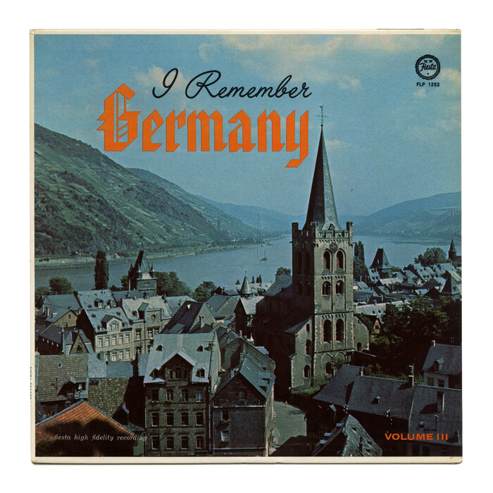
Source: www.flickr.com Uploaded to Flickr by Bart Solenthaler and tagged with “americantext” and “filmotypelariat”. License: All Rights Reserved.
Vol. 3 depicts St. Peter in Bacharach on the Rhine. The rigid blackletter isn’t of German origin: it’s American Text by Morris Fuller Benton, designed for American Type Founders in 1934. It’s contrasted with Filmotype Lariat. Small text at the bottom uses Century Expanded Italic and more Venus Extended. [More info on Discogs]

Source: archive.org Internet Archive. License: All Rights Reserved.
Vol. 4 is openly dedicated to beer and beer drinking songs. In terms of typography, it features more American Text and Venus Extended, this time together with Filmotype Warden. [More info on Discogs]
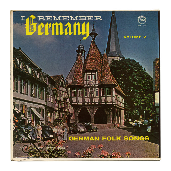
Source: www.flickr.com Uploaded to Flickr by Bart Solenthaler and tagged with “americantext”. License: All Rights Reserved.
American Text and Venus Extended also serve for vol. 5. The wide slab is Filmotype Wand. The photograph shows the town hall of Michelstadt with its timber-frame construction. [More info on Discogs]

Source: archive.org Internet Archive. License: All Rights Reserved.
Vol. 7 is an exception in that it focuses on a single artist, Willy Schneider (1905–1989), who “recorded more than 800 records in the ‘Rhine and wine’ genre.” The script is Filmotype Latin.

Source: archive.org Internet Archive. License: All Rights Reserved.
On the cover of vol. 9, we get to see young folks in traditional costume, drinking wine somewhere above the Rhine. The script is Filmotype York. [More info on Discogs]

Source: archive.org Internet Archive. License: All Rights Reserved.
Vol. 10 returns to blackletter. Again, it’s not a German design, but another creation by Morris Fuller Benton, Engravers Old English. The bold sans-serif caps are from Twentieth Century or Futura. “Golden Tone Stereo” uses Copperplate Gothic. The fairytale castle is Neuschwanstein. [More info on Discogs]
This post was originally published at Fonts In Use