Fondation Bakea
Published April 29, 2025
By FontsInUse
Contributed by Oudin Romain
Pierre Jeanneau. License: All Rights Reserved.

Pierre Jeanneau. License: All Rights Reserved.

Pierre Jeanneau. License: All Rights Reserved.
Pierre Jeanneau. License: All Rights Reserved.

Pierre Jeanneau. License: All Rights Reserved.
Pierre Jeanneau. License: All Rights Reserved.

Pierre Jeanneau. License: All Rights Reserved.
Pierre Jeanneau. License: All Rights Reserved.
This post was originally published at Fonts In Use
Pierre Jeanneau. License: All Rights Reserved.
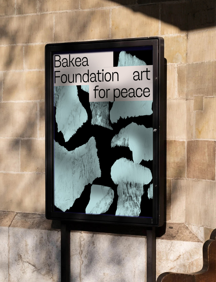
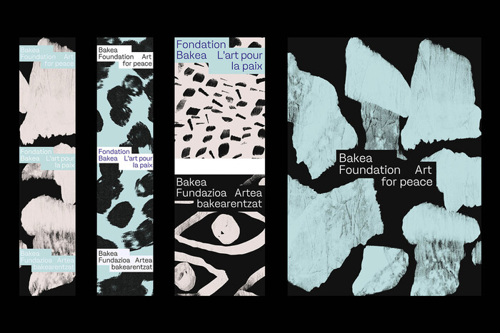
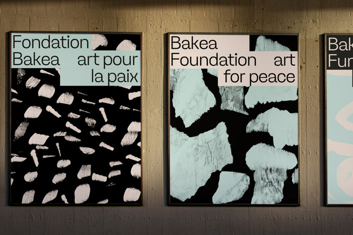
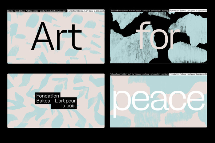
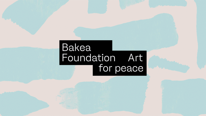
The Fondation Bakea, dedicated to artistic and cultural initiatives, required a visual identity that embodies both elegance and modernity. Designed by Pierre Jeanneau, the branding conveys a refined and contemporary aesthetic, using typography as a key design element.
The chosen typeface, Ginka (from Lift Type) plays a central role in shaping the foundation’s identity. Its distinctive letterforms, a balance of organic curves and structured geometry, provide a unique and memorable presence across various applications. The type’s subtle yet expressive nature aligns perfectly with the foundation’s mission of fostering creativity and cultural dialogue.
Pierre Jeanneau. License: All Rights Reserved.
Pierre Jeanneau. License: All Rights Reserved.
Pierre Jeanneau. License: All Rights Reserved.
Pierre Jeanneau. License: All Rights Reserved.
Pierre Jeanneau. License: All Rights Reserved.
Pierre Jeanneau. License: All Rights Reserved.
Pierre Jeanneau. License: All Rights Reserved.
This post was originally published at Fonts In Use
Read full story.
WRITTEN BY
FontsInUse
An independent archive of typography.
More from FontsInUse