FFF – French Football Federation
Source: solstices.studio Solstices Studio. License: All Rights Reserved.


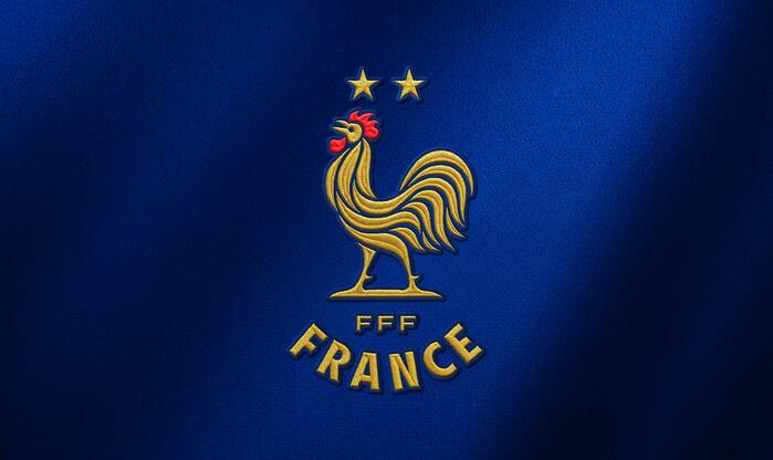
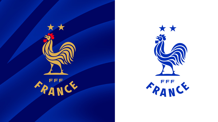
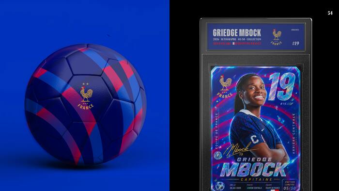
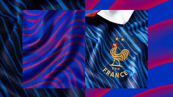
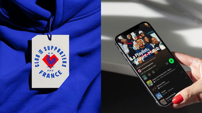
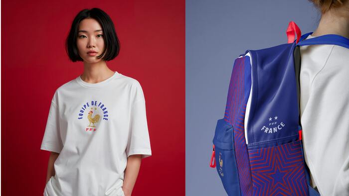
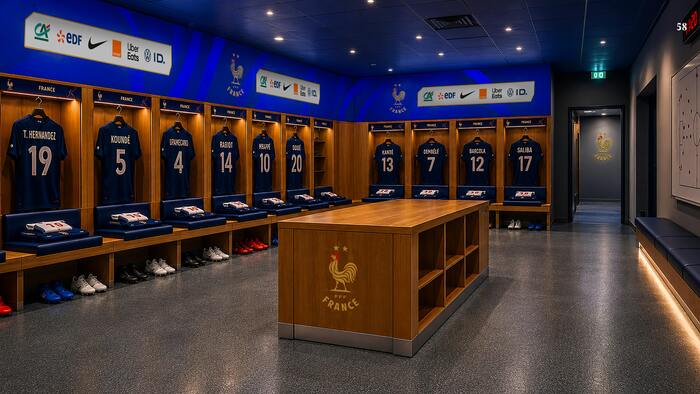
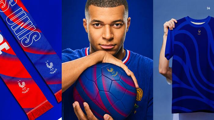
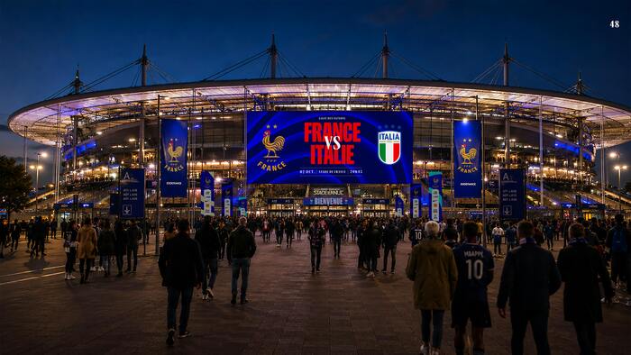
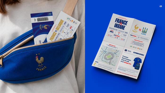
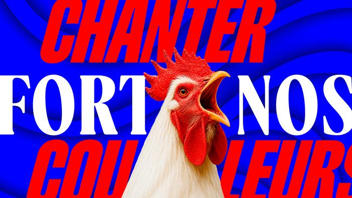
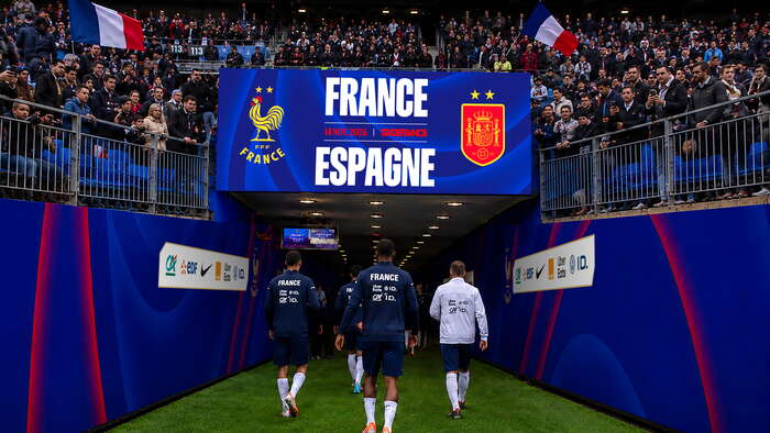
Redesigning the visual identity of a century-old institution requires finding the precise balance between heritage and contemporary uses. Designed by the team at Solstice Studio for the French Football Federation (FFF), in collaboration with Blaze Type, this new identity unifies all national teams (Senior, Women’s, Youth, Futsal) around a streamlined emblem for the first time. While the 1920s-inspired rooster returns with a left-facing beak and bold, assertive lines, the true cornerstone of this visual system relies on two bespoke Sans and Serif type families, crafted to connect shirt tradition with brand modernization.
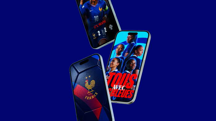
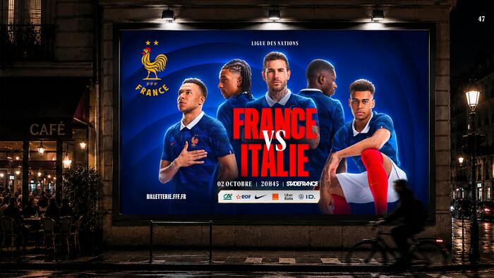
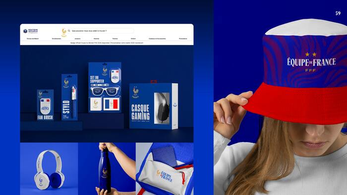
Designed by Matthieu Salvaggio and Léon Hugues, this custom typographic duo hinges on a structured dialogue between a serif approach and a sans-serif approach. FFF Héritage relies on elegant serif details to establish a noble, grounded, and authoritative presence for official FFF communications. Meanwhile, FFF France embraces a clean sans-serif design, shaping the word “FRANCE” beneath the new emblem to bring raw impact, rhythm, and a modern edge tailored for event, digital, and lifestyle content. Behind letterforms of deceptive simplicity lies extensive optical tuning and legibility engineering, ensuring optimal rendering across everything from large-format displays to broadcast graphics.
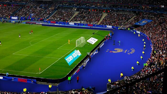
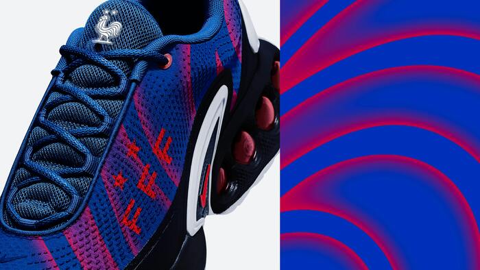
Far from being a mere decorative addition, this serif and sans-serif typographic pairing acts as the binding agent for the new brand architecture. Paired with an expanded color palette (from historical blue to gold, complemented by new accent shades), Blaze Type's custom work delivers a clear and flexible visual hierarchy across the entire federation. It equips the Équipes de France with a unique, instantly recognizable voice, built to carry the identity of French football into a new athletic and cultural era.
Source: solstices.studio Solstices Studio. License: All Rights Reserved.
Source: solstices.studio Solstices Studio. License: All Rights Reserved.
Source: solstices.studio Solstices Studio. License: All Rights Reserved.
Source: solstices.studio Solstices Studio. License: All Rights Reserved.
Source: solstices.studio Solstices Studio. License: All Rights Reserved.
Source: solstices.studio Solstices Studio. License: All Rights Reserved.
Source: solstices.studio Solstices Studio. License: All Rights Reserved.
Source: solstices.studio Solstices Studio. License: All Rights Reserved.
Source: solstices.studio Solstices Studio. License: All Rights Reserved.

Source: solstices.studio Solstices Studio. License: All Rights Reserved.
Source: solstices.studio Solstices Studio. License: All Rights Reserved.
Source: solstices.studio Solstices Studio. License: All Rights Reserved.
Source: solstices.studio Solstices Studio. License: All Rights Reserved.
Source: solstices.studio Solstices Studio. License: All Rights Reserved.
Source: solstices.studio Solstices Studio. License: All Rights Reserved.
Source: solstices.studio Solstices Studio. License: All Rights Reserved.
Source: solstices.studio Solstices Studio. License: All Rights Reserved.
Source: solstices.studio Solstices Studio. License: All Rights Reserved.

Source: solstices.studio Solstices Studio. License: All Rights Reserved.
This post was originally published at Fonts In Use