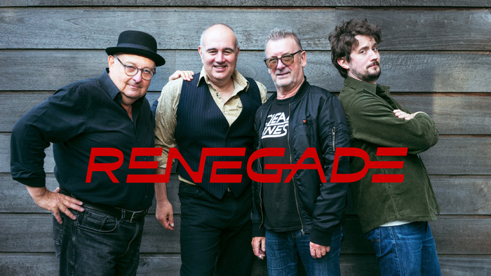
Renegade band logo
License: All Rights Reserved.
Renegade logo superimposed on a band shot by Yaël Reicher

Belgian rock band Renegade wanted a logo inspired by the Clean Lines logo. This sparked the idea for creating a typographic design with custom capital ligatures. Antipol’s wide italic styles matched the band’s drive and rock’n’roll attitude, and the character shapes offered plenty of customization options. Another inspiration source was the ingenious lowercase e variants in Raskal Oner, Emmanuel Rey’s outrageously original typeface design published by Swiss Typefaces.
In band leader Manu Tzwern’s own words: “I wanted to feature the fact that we’re ‘old and grizzled’, but the music is still a young man’s music in the true sense. Nailed it!”
Sadly, the logo was abandoned when the band decided to change their name to H.I.P.S. (Hiding In Plain Sight).
This post was originally published at Fonts In Use