Ember Spirits
Published November 2, 2026
By FontsInUse
Contributed by Hrvoje Živčić
Source: emberspirits.com Ember Spirits. License: All Rights Reserved.


Source: emberspirits.com Ember Spirits. License: All Rights Reserved.
Source: emberspirits.com Ember Spirits. License: All Rights Reserved.
Source: emberspirits.com Ember Spirits. License: All Rights Reserved.
Source: emberspirits.com Ember Spirits. License: All Rights Reserved.
Source: emberspirits.com Ember Spirits. License: All Rights Reserved.
This post was originally published at Fonts In Use
Source: emberspirits.com Ember Spirits. License: All Rights Reserved.
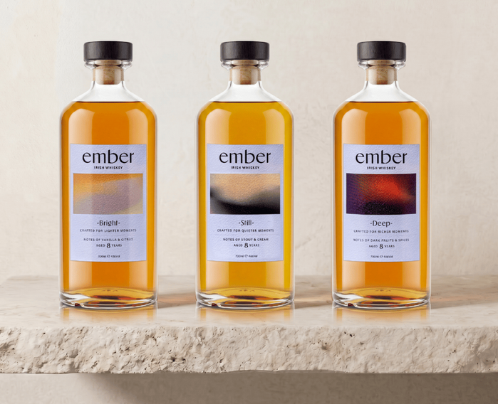
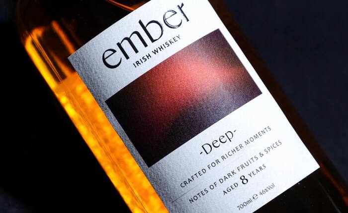
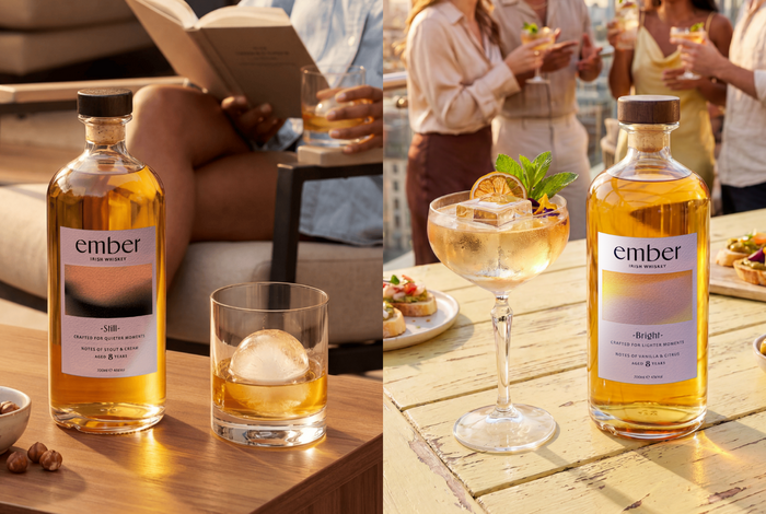
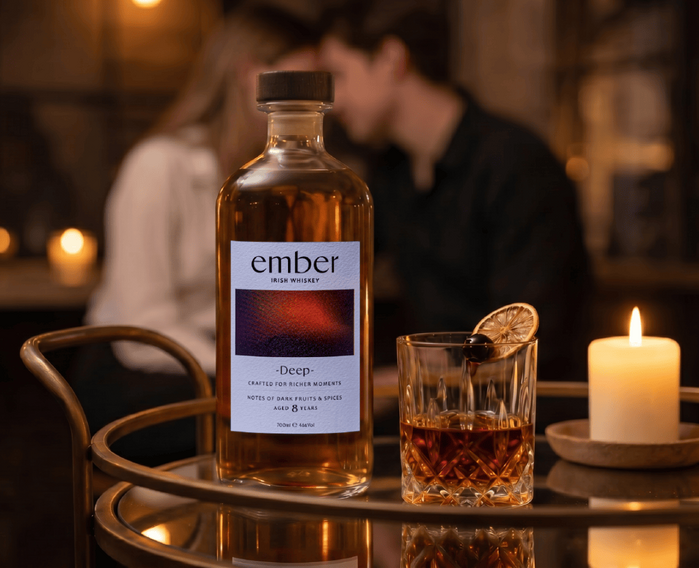
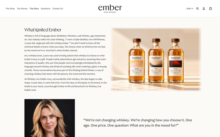
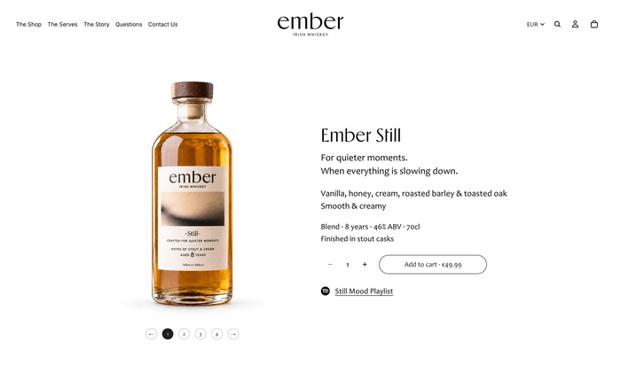
Ember is a new generation of Irish whiskey brand that moves away from the traditional visual language of heritage, distilling and age statements, instead building its identity around mood, flavour and occasion. The branding translates this idea into a clear and contemporary packaging system, with three expressions—Bright, Still and Deep. The typographic palette is based around Ergon and it's distinctive shapes, while colour differentiation and tactile label details create a premium feel. It is paired with Candara. Rather than relying on familiar Irish whiskey clichés, Ember uses graphic design as a way to make this category feel more contemporary.
Source: emberspirits.com Ember Spirits. License: All Rights Reserved.
Source: emberspirits.com Ember Spirits. License: All Rights Reserved.
Source: emberspirits.com Ember Spirits. License: All Rights Reserved.
Source: emberspirits.com Ember Spirits. License: All Rights Reserved.
Source: emberspirits.com Ember Spirits. License: All Rights Reserved.
This post was originally published at Fonts In Use
Read full story.
WRITTEN BY
FontsInUse
An independent archive of typography.
More from FontsInUse