The Dragon magazine covers, 1979–2000

Source: archive.org License: All Rights Reserved.
The masthead in Honda debuted in Issue 27 (vol. IV, no. 1). The secondary typeface is ITC Souvenir.


Debuting in 1976 as The Dragon, the magazine was variously also known as Dragon Magazine and Dragon. It was (or became) TSR’s monthly magazine in support of the immensely successful table top role-playing game Dungeons & Dragons in its various editions and successors, as well as other RPGs (published by TSR and others).
Dragon launched with hand-drawn lettering for its masthead (and a very zine feel), but from issue 27 (July 1979) onwards the masthead for The Dragon was set in ITC Honda. Honda, or lettering based on it, was used for the masthead until issue 274 (published in 2000). A redesign that starts with Issue 181 recreates the masthead with a stretched lettering, still base on Honda. Another redesign based on Honda again beings with issue 225 (see below).
Issue 204 has the surtitle “American gothic humor in gaming”, a dropped D in Dragon, and an airbrushed cover that is a pastiche of Grant Wood’s American Gothic. The man is wielding the traditional pitchfork (a trident), but now both figures are wearing merchandise tee-shirts: TSR (the owners of Dungeons & Dragons) for the man and Dragon for the woman (in, of course, Honda). The woman offers the traditional stern look and a set of polyhedral dice.
Issue 225 (January 1996) marks another redesign of the masthead, but still based on the Honda font: modelling the lettering in 3D and on a curve. This issue also introduces what I might be tempted to call “1990s DTP style”; that is, many fonts and colours and angles brought together with exuberance. I have peeked into the covers of the next few issues and can report that this style continues. The font choices, or at least the ones I can identify, for issue 225 also have a very 1990s vibe: stretched and rotated Helvetica Black Oblique for “Building a Better PC”, stretched Lithos with a shadow for “I’m OK, You’re One Dimensional”, Tekton with an offset shadow effect for “Back In The Saddle (Again)”, Omnia (with a scaled “the”) for “the greyhawk grimoires”, and stretched Charme for “Campaign Classics”. Issue 273 from July 2000 was the last to feature a logo based on Honda.
Source: archive.org License: All Rights Reserved.
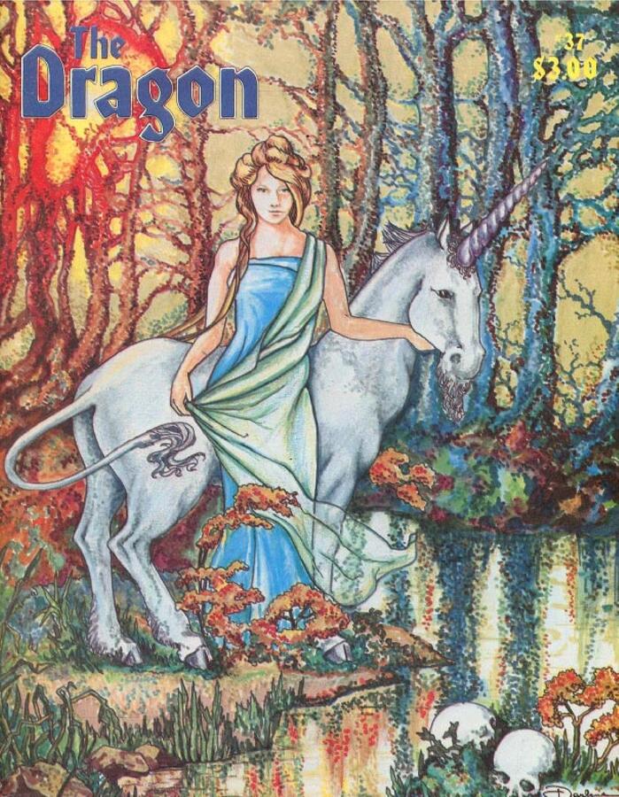
Issue 37 ft. a logo with flat fill and thin contour
Source: archive.org License: All Rights Reserved.
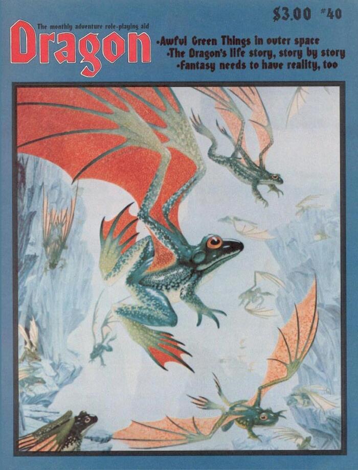
Honda also used for the secondary text here, with the flying frogs aka Awful Green Things, in their own box, so the text is over a flat background.
Source: archive.org License: All Rights Reserved.
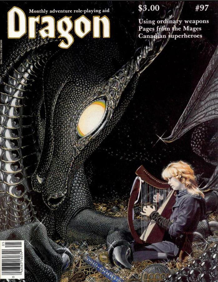
The colour of the masthead changes from issue to issue, often to suit the artwork. Here picking out the Dragon’s eye and the harpist’s highlights. Secondary type is in Baskerville AI.
Source: archive.org License: All Rights Reserved.
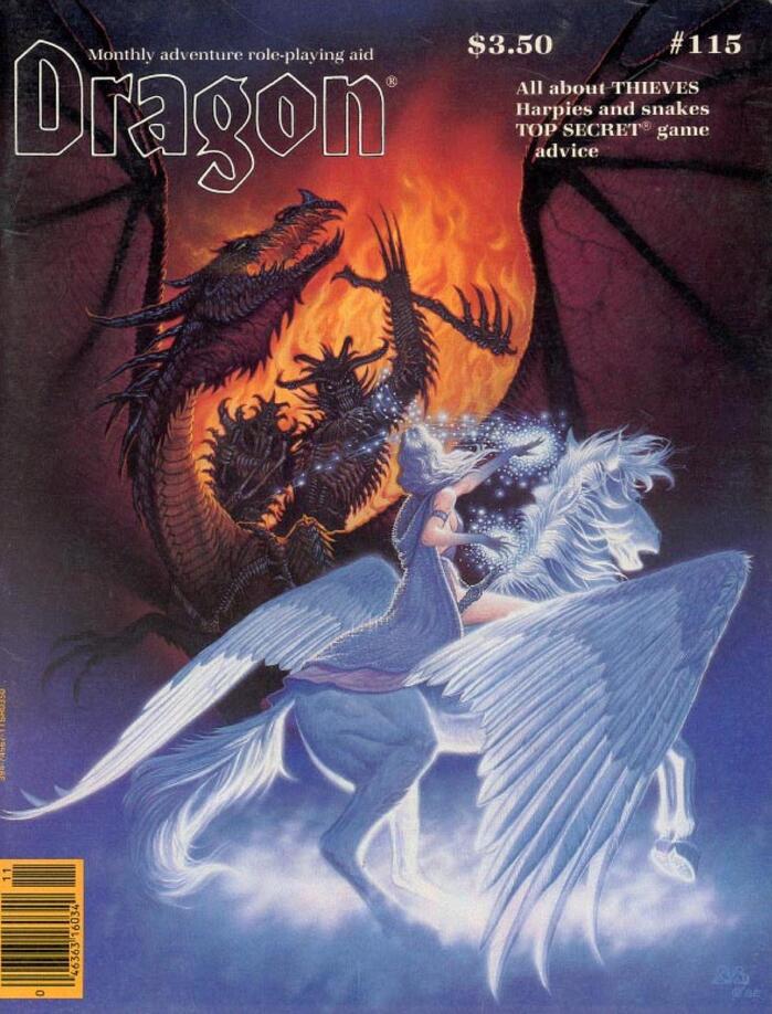
“Dragon” in outline only, over the artwork, for a sort of transparency effect. Secondary type is in ITC Zapf Book.
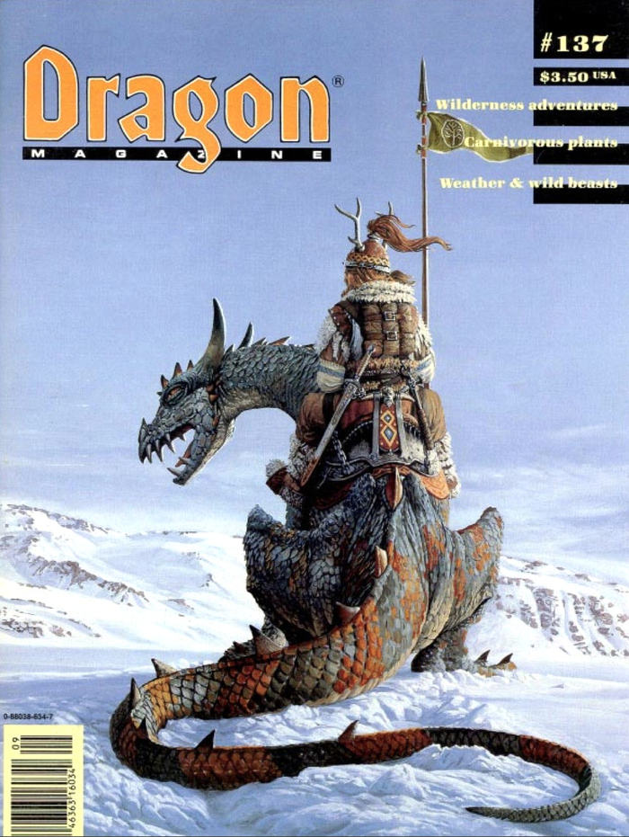
Source: archive.org License: All Rights Reserved.
Starting with Issue 128, the word “Magazine” was added to the logo, shown in tracked-out caps from Eurostile Bold Extended.
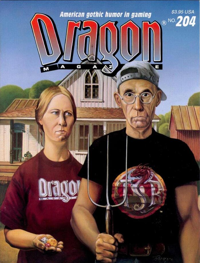
Source: archive.org License: All Rights Reserved.
Since Issue 181 the Dragon masthead is stretched into custom lettering, but still based on Honda. A gradient fill and a shadow also become part of the masthead. Illustrated here in Issue 204, about which I’ve said more in the text. Secondary type is in Antique Olive.
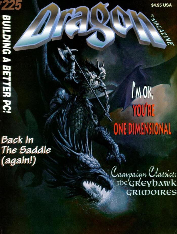
Source: archive.org License: All Rights Reserved.
Flashy redesign debuts in Issue 225. The stretched “Dragon” masthead is back to more conventional Honda, but modelled in 3D.
This post was originally published at Fonts In Use