Display in Use
Source: victionary.com Victionary Publishing. License: All Rights Reserved.


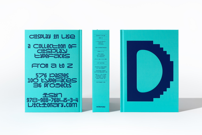
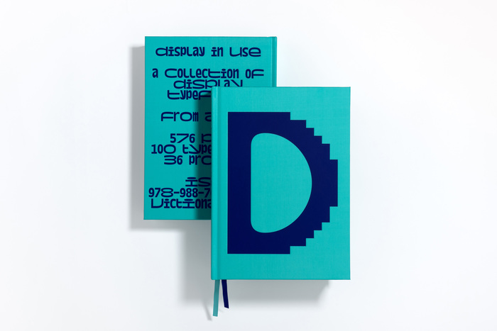
The latest volume in the Type in Use series by Victionary (2024–2025), this book highlights the use of display typefaces, renowned for their boldness and attention-grabbing qualities. They are adaptable across diverse design contexts, seamlessly integrating into print, digital, and beyond. Display in Use brings together the best fonts for big canvases, and provides a reference point for inspiration seeking designers and typographers.
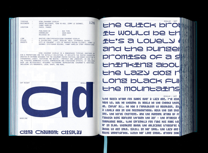
The book was designed by Ben Lee at Victionary. While the D on the front cover is from AC Visual, the back features Dina Chaumont Display. This lowercase-only monospaced typeface is built around the DIN A ratio. This format is used in portrait and landscape; thus two different widths coexist. The letters are designed to fill the surface as much as possible in both cases. This feature gives a distinct appearance and plays on formal and dynamic variations. Instantly recognizable, expressive and playful, Dina Chaumont Display perfectly embodies its role.
The monospaced font used on the spine and also for the info on the typeface pages (not shown) is unidentified.

Source: victionary.com Victionary Publishing. License: All Rights Reserved.
Source: victionary.com Victionary Publishing. License: All Rights Reserved.
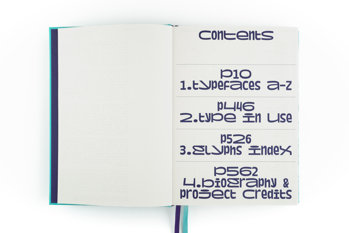
Dina Chaumont Display is also used for the contents page.
Source: victionary.com Victionary Publishing. License: All Rights Reserved.
Source: victionary.com Victionary Publishing. License: All Rights Reserved.

Source: victionary.com Victionary Publishing. License: All Rights Reserved.
Source: victionary.com Victionary Publishing. License: All Rights Reserved.
This post was originally published at Fonts In Use