DIO Media portfolio website
Source: diomedia.co.za License: All Rights Reserved.

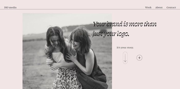
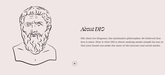
At design agency DIO media, we made a bold choice by utilizing OH no Type Co.’s Swear for all typography. The portfolio website, which embraces negative space, predominantly employs a soothing combination of eggshell white and faded black for its text and icons, creating an understated yet visually striking aesthetic.
The striking Swear Display Cilati style is paired with the toned down Text subfamily. Together, they add a touch of unconventional elegance to the website's typography. The juxtaposition of the simple design and the expressive nature of the type family creates a captivating visual experience, capturing the attention of visitors while maintaining a clean and sophisticated vibe, while aiming to highlight our commitment to delivering a unique and memorable brand for each client.
Source: diomedia.co.za License: All Rights Reserved.
Source: diomedia.co.za License: All Rights Reserved.
Source: diomedia.co.za License: All Rights Reserved.
Source: diomedia.co.za License: All Rights Reserved.
This post was originally published at Fonts In Use