Diego Marcon – Have You Checked the Children, Kunsthalle Basel
Source: kunsthallebasel.ch Kunsthalle Basel. License: All Rights Reserved.


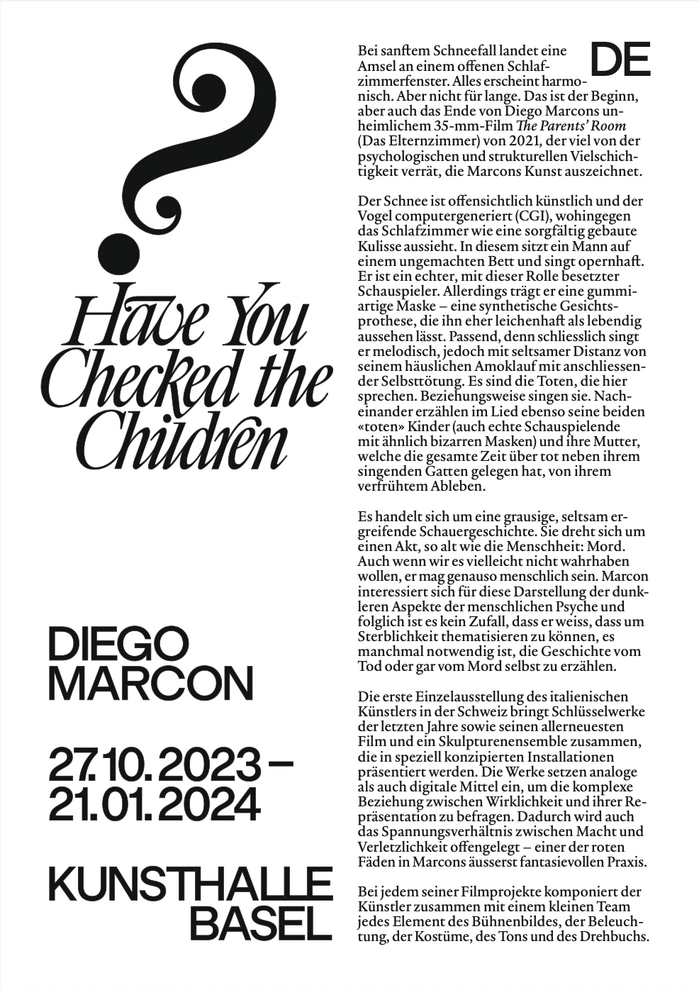
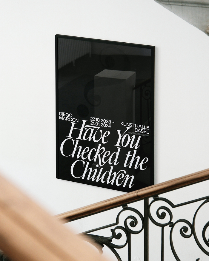
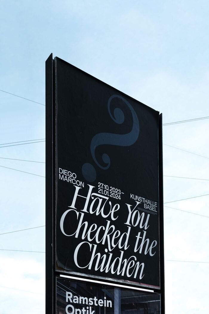
The exhibition Have You Checked the Children by Diego Marcon was presented at the Kunsthalle Basel from the 27th of October 2023 to the 21st of January, 2024.
The Kunsthalle Basel was founded in 1872 and is Switzerland’s oldest art museum. It is one of Europe’s leading institutions for contemporary art and is committed to bringing emerging artists to the attention of the public.
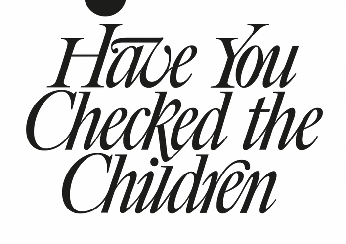
The exhibition text presented here is based on the exhibition poster by Sina Gerschwiler, a graphic designer based in Basel. While the exhibition texts were put together by the museum’s own communications team, they were designed using the same fonts as the exhibition poster. The fonts used for both the poster and the exhibition text are AC Modern Gothic and Big Caslon Italic. However, it is important to note that significant modifications were made to the title lettering, altering the typeface’s overall appearance. The text typeface is Practice.
Designed by Matthew Carter, Big Caslon is a high-contrast serif typeface for display applications, published by Carter & Cone. It is a digital reinterpretation of the “eccentric” display typefaces made by the original 18th-century Caslon foundry for large-scale applications, offering new uses for the typeface. These display typefaces have a distinctive design with striking stroke contrast, complementing but contrasting with the original Caslon text typefaces.
AC Modern Gothic is a sans serif belonging to the American Gothic style. It is considered a digital revival of the historical typeface Modern Gothic, a design made by the Chicago foundry Barnhart Brothers & Spindler around 1895. The digital version was created by the foundry AllCaps. The design was modernised, with optical corrections to avoid the classically heavy caps look, while maintaining the wide-set frame inherited from the Gothic style to preserve its character.
Practice is a serif typeface “anchored in the research of typographic paradigms” and “introduces a new perspective with an unprecedented sharpness”. It was designed by François Rappo and released with Optimo in 2016.
Source: www.sinagerschwiler.info Sina Gerschwiler. License: All Rights Reserved.
License: All Rights Reserved.
Source: kunsthallebasel.ch License: All Rights Reserved.
Source: www.sinagerschwiler.info Sina Gerschwiler. License: All Rights Reserved.
This post was originally published at Fonts In Use