Clutch by Emily Nemens
Published March 12, 2026
By FontsInUse
Contributed by Stephen Coles
Source: www.bethsteidle.com Beth Steidle. License: All Rights Reserved.


This post was originally published at Fonts In Use
Source: www.bethsteidle.com Beth Steidle. License: All Rights Reserved.
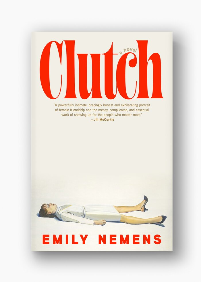
One might guess that designer Beth Steidle chose the type here very quickly, by simply starting at the top of the font menu, because both names start with “Aa”. Even if that is true, the pick for the title is very effective. Aabak is a high-contrast, ball-terminaled eyecatcher reminiscent of mid-century book covers. Steidle’s use of the narrow, upright typeface counters the flat and wide illustration (by Wayne Thiebaud) of a woman lying at the bottom of the canvas.
Thanks to Mark Simonson and The Casual Optimist for calling out this design.
This post was originally published at Fonts In Use
Read full story.
WRITTEN BY
FontsInUse
An independent archive of typography.