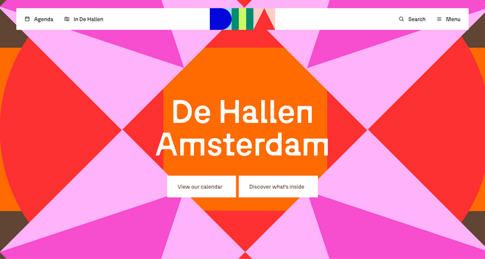
De Hallen Amsterdam
Source: the-brandidentity.com License: All Rights Reserved.


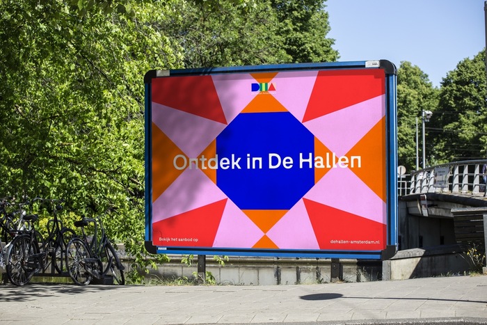
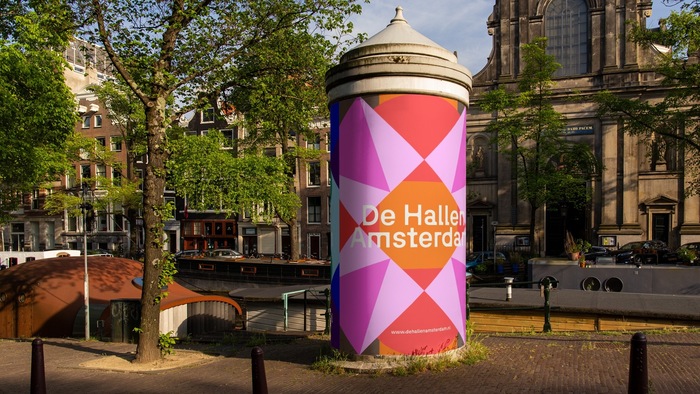
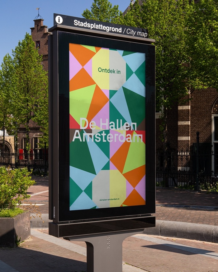
Amsterdam-based agency ON A DAILY BASIS developed the visual identity for De Hallen, a cultural landmark and former tram depot.
From film and food to design and craft – this is the place where creative makers, local entrepreneurs and cultural initiatives come together.
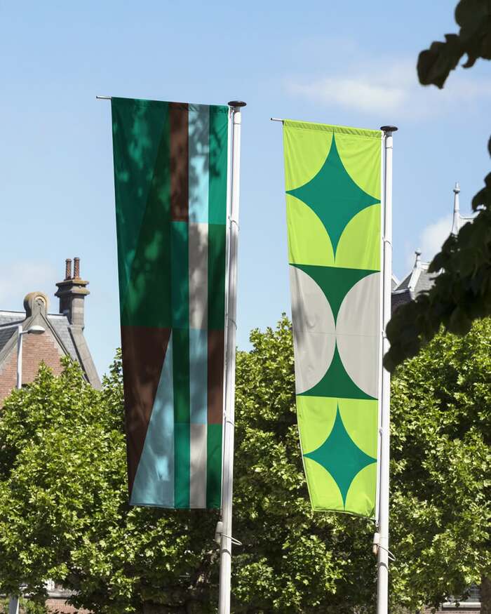
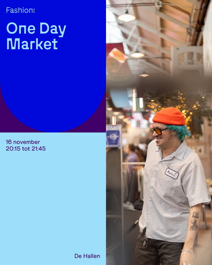
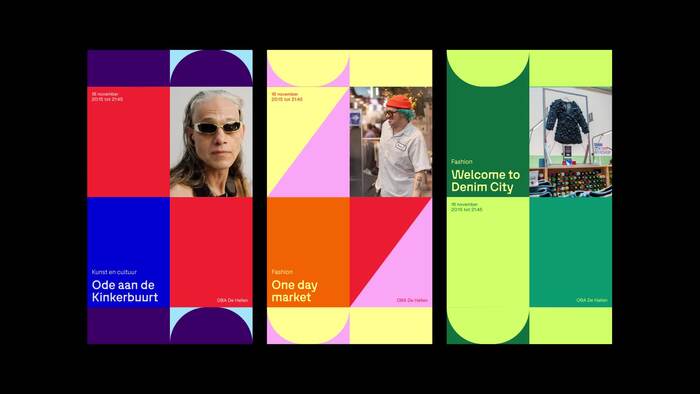
The system is built around the concept of “connection,” inspired by the unique symbols and colors of Amsterdam’s tram network. This modular language uses three geometric forms – a square, an arch, and a triangle – derived directly from the venue’s architecture to represent the diverse initiatives and communities that gather within the space.
The identity is set in Bugrino by Muhittin Güneş, with support from Overused Grotesk by RandomMaerks. Graphic design by Sjondebaron, Keren Avrich, Kirsten Bolwerk, and Maikel Timothy Botterman at ON A DAILY BASIS (ODB). The website was realized by Boring.
Source: www.instagram.com License: All Rights Reserved.
Source: the-brandidentity.com License: All Rights Reserved.
Source: the-brandidentity.com License: All Rights Reserved.

License: All Rights Reserved.
License: All Rights Reserved.
License: All Rights Reserved.
Source: www.dehallen-amsterdam.nl License: All Rights Reserved.

Source: www.dehallen-amsterdam.nl License: All Rights Reserved.
This post was originally published at Fonts In Use