David protein bars
Published December 3, 2024
By FontsInUse
Contributed by Jordan Egstad

Source: davidprotein.com License: All Rights Reserved.


Source: davidprotein.com License: All Rights Reserved.

Source: davidprotein.com License: All Rights Reserved.

Source: davidprotein.com License: All Rights Reserved.

Source: davidprotein.com License: All Rights Reserved.
Source: davidprotein.com License: All Rights Reserved.

Source: davidprotein.com License: All Rights Reserved.

Source: davidprotein.com License: All Rights Reserved.
This post was originally published at Fonts In Use
Source: davidprotein.com License: All Rights Reserved.
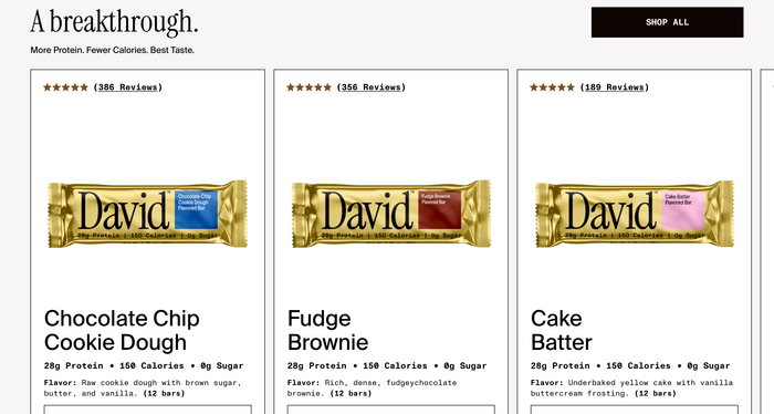
David is a newly launched enterprise that designs “tools to increase muscle and decrease fat”. Their first product is a luxury protein bar. The main brand typeface used for the logo and headlines is Instrument Serif. On the wrappers as well as on the website, it’s paired with Suisse Int’l and ABC Monument Grotesk Mono.
Source: davidprotein.com License: All Rights Reserved.
Source: davidprotein.com License: All Rights Reserved.
Source: davidprotein.com License: All Rights Reserved.
Source: davidprotein.com License: All Rights Reserved.
Source: davidprotein.com License: All Rights Reserved.
Source: davidprotein.com License: All Rights Reserved.
Source: davidprotein.com License: All Rights Reserved.
This post was originally published at Fonts In Use
Read full story.
WRITTEN BY
FontsInUse
An independent archive of typography.