Published December 1, 2024
Contributed by
Florian Hardwig Source: repozitorij.muo.hr Image: MUO – Muzej za umjetnost i obrt. License: All Rights Reserved.
 Undated poster (c.1970) with the weekly program of Teatar &TD. The logo is introduced with a fine manicule. Stencil is also used for the days of the week. Dates are in Schmale Herold, names of plays in Blippo and Helvetica, and time in Annlie Italic.


 Roaring Twenties (Sample unavailable)


Mihajlo Arsovski was a graphic designer working in Croatia. From Adrian Curry’s 2023 column for MUBI’s Notebook column:
Mihajlo Arsovski was born in Skopje, Macedonia, on July 9, 1937, to a family of pre-war leftist revolutionaries and photographers who moved to Zagreb after World War II. He studied architecture and art history before becoming one of the pioneers of modern Croatian graphic design. […] Over the course of his 60-year career, the famously publicity-shy Arsovski designed books, newspapers, album covers, signage, furniture, theater sets, and costumes, but it is as a poster designer that he is best known. He designed some 200 posters for the renowned experimental Zagreb theater company &TD Theatre, and his logo design for the company is still in use today.
Arsovski’s logo for Teatar &TD was introduced around 1970. It combines Stencil with a swashy ampersand probably taken from Letraset’s Bookman Bold, their version of Bookman Swash. (This glyph is not unique the swash-laden sixties release, but was included already in ATF’s original Bookman.). Arsovski provided posters to the theater already before. In the late 1960s, he mostly used a version of Egyptienne Bold Condensed in big and partly overlapping letters, supported by Akzidenz-Grotesk, see examples from 1966, 1967, 1968, and 1969. He employed the same combination for a series of movie posters made in 1966 for Kinematografi Zagreb.
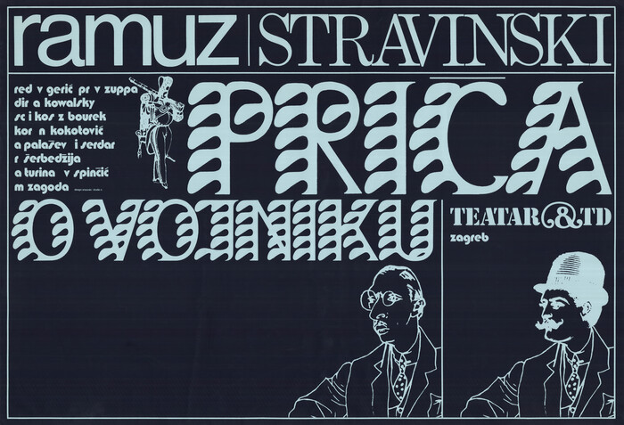
The first few theater posters to feature the new logo are printed in multiple colors. The poster for Priča o vojniku from 1971 drops the colors and goes white on black. Arsovski still included illustration – portraits of Ramuz, Stravinski, and the titular soldier. For subsequent posters, though, the designer relied on the power of typography, and exclusively worked with type. The chosen typefaces are diverse in style and origin, and include three originals designed for the Lettera series of alphabet source books: Sea weed, Roaring Twenties, and Sezession. In addition to the landscape format and the logo, the text typeface is another constant: it’s Blippo Black.
Arsovski died in 2020 at the age of 83. The website of Zagreb’s Muzej za umjetnost i obrt (MUO, Museum of Arts and Crafts) has a profile from that year (in Croatian). You can see more of his work in the museum’s excellent online archive.
 Source: repozitorij.muo.hr Image: MUO – Muzej za umjetnost i obrt. License: All Rights Reserved.
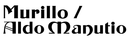
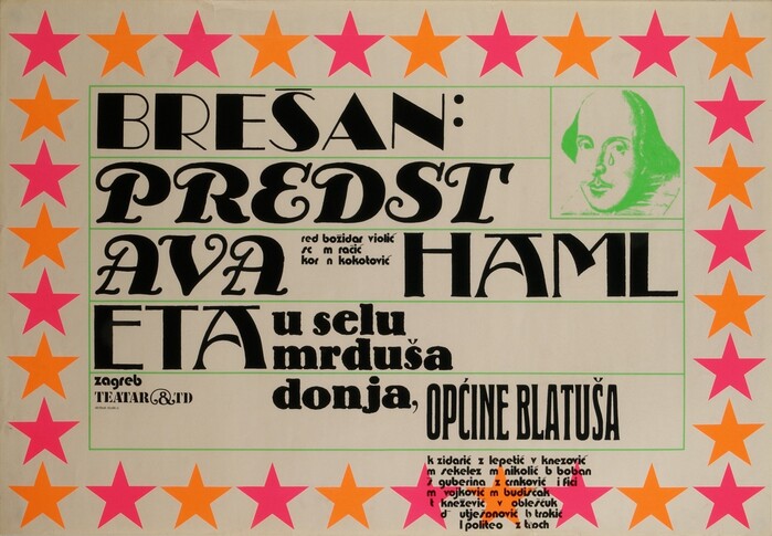
 Ivo Brešan – Predstava Hamleta u selu mrduša donja, općine Blatuša, 1971. Brešan’s name is in avariant of Broadway, distinguished by closed counters in B, a straight leg in R, a centered middle bar in E, and more small adjustments. I assume this is Roaring Twenties, with modifications. The title combines Handels-Cursief, Murillo, a hand-rendered (?) version of Bernhard-Antiqua extrafett (or Lo-Schrift?), and Schmale Herold.
 Source: repozitorij.muo.hr Image: MUO – Muzej za umjetnost i obrt. License: All Rights Reserved.
 Charles-Ferdinand Ramuz & Igor Stravinski’s Priča o vojniku (L’Histoire du soldat), 1971. The title is in Sea weed, with a custom-added flat diacritic. The names above use all-lowercase Helvetica and all-caps Century Expanded.
 Source: repozitorij.muo.hr Image: MUO – Muzej za umjetnost i obrt. License: All Rights Reserved.
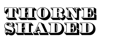
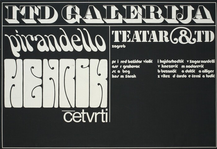
 Luigi Pirandello’s Henrik četvrti (Enrico IV, 1922), 1972. “ITD Galerija” is in Thorne Shaded, “Pirandello” in Smoke, “Henrik” in Sezession, and “četvrti” in Helvetica, again with a horizontal bar as caron.
 Source: repozitorij.muo.hr Image: MUO – Muzej za umjetnost i obrt. License: All Rights Reserved.
 Georg Büchner – Woyzeck (1836/1913), 1972, with overlayered Thorne Shaded and Torino Italic for “büchner”
 Source: repozitorij.muo.hr Image: MUO – Muzej za umjetnost i obrt. License: All Rights Reserved.
 Heiner Müller – Filoktet (Philoktet, 1965), 1972. The title uses Roaring Twenties, here without modifications, but with giant EndcapS. The playwright’s name is in lowercase Torino Italic.
 Source: repozitorij.muo.hr Image: MUO – Muzej za umjetnost i obrt. License: All Rights Reserved.
 Peter Nichols – Jedan dan u smrti male Joe (A Day in the Death of Joe Egg, 1967), 1972. Helvetica and Bookman Swash Italic are used for the title and Century Expanded for “Nichols”.
 Source: repozitorij.muo.hr Image: MUO – Muzej za umjetnost i obrt. License: All Rights Reserved.
 Harold Pinter – Stara vremena (Old Times, 1971), 1973. The geometric hairline caps are from Walter; “Pinter” appears to be in Prismania Thirteen.
 Source: repozitorij.muo.hr Image: MUO – Muzej za umjetnost i obrt. License: All Rights Reserved.
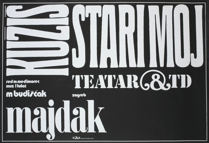
 Zvonimir Majdak – Kužiš, stari moj starring Mladen Budišćak, 1973. Caps from Schmale Herold are paired with another Berthold release: “majdak” is set in Normande Condensed.
 Source: repozitorij.muo.hr Image: MUO – Muzej za umjetnost i obrt. License: All Rights Reserved.
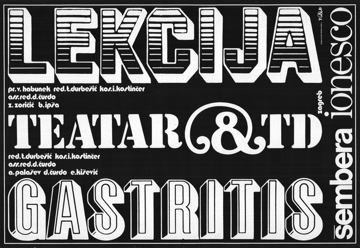
 Eugène Ionesco – Lekcija (La Leçon, 1951) / Slobodan Šembera – Vrijeme za gastritis (1971), 1973, with titles in Jim Crow and Baby Arbuckle
This post was originally published at
Fonts In Use
WRITTEN BY
FontsInUse
An independent archive of typography.