David Goodis book series, Vintage Crime/Black Lizard

Source: www.flickr.com Uploaded to Flickr by Bart Solenthaler and tagged with “filmotypeford” and “helvetica”. License: All Rights Reserved.
Nightfall, 1947 (1991). Photo by Ken Shung.


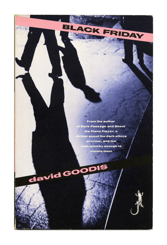
In the early 1990s, Vintage Crime/Black Lizard reissued a series of books by David Goodis (1917–1967). The crime novels in the noir fiction genre were originally published in the 1940s and 1950s.
For the paperback covers, Keith Sheridan Associates applied the same design recipe as for their reissues of books by Jim Thompson: monochrome photographed crossed by colored stripes that resemble police tape. These bands present title and author name in an expanded typeface. This time it’s not Latin Wide, but Filmotype Ford. This grot came out in 1953, around the time when Goodis wrote the novels. As with the Jim Thompson series, the first name is in all lowercase letters and the rest in all caps. The blurbs are again added in Helvetica breit fett.

Source: www.flickr.com Uploaded to Flickr by Bart Solenthaler and tagged with “filmotypeford” and “helvetica”. License: All Rights Reserved.
Street of No Return, 1954 (1991). Photo by Barnaby Hall.
Source: www.flickr.com Uploaded to Flickr by Bart Solenthaler and tagged with “filmotypeford” and “helvetica”. License: All Rights Reserved.
Black Friday, 1954 (1990)

Source: www.flickr.com Uploaded to Flickr by Bart Solenthaler and tagged with “filmotypeford” and “helvetica”. License: All Rights Reserved.
Shoot the Piano Player a.k.a. Down There, 1956 (1990). Photo by Ken Shung.

Source: www.amazon.com Uploaded to Flickr by Bart Solenthaler and tagged with “filmotypeford” and “helvetica”. License: All Rights Reserved.
Nightfall, 1953 (1991)
This post was originally published at Fonts In Use