Nintendo Super System flyer
Source: www.flyerfever.com Flyer Fever. License: All Rights Reserved.
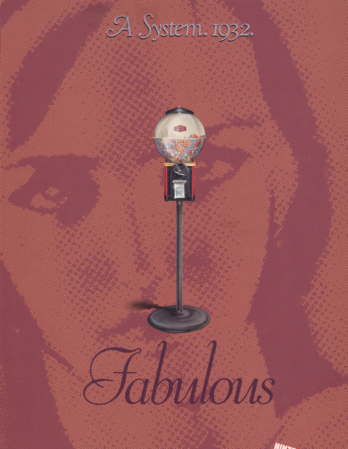
The 1932 “System” shows a gumball machine with Goudy Cursive (top) and Viant (bottom)


A four-page flyer advertising the Nintendo Super System arcade machine. Modula Sans is used to suggest that the system is modern and cutting-edge, contrasting with the more old-fashioned fonts associated with earlier “systems”.
Futura Extra Bold is used alongside Modula Sans for headings. Smaller text uses Matrix. Both Matrix and Modula Sans had been recently designed by Zuzana Licko.
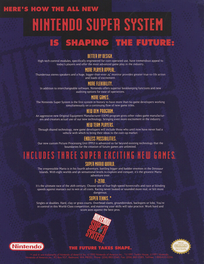
The Nintendo Super System logo itself uses Aurora Condensed.
Source: www.flyerfever.com Flyer Fever. License: All Rights Reserved.
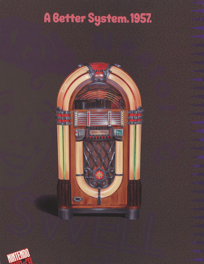
The “Better System” from 1957 shows a jukebox. The bold informal sans is unidentified. The word swell in the background appears to be in Futura licht.
Source: www.flyerfever.com Flyer Fever. License: All Rights Reserved.
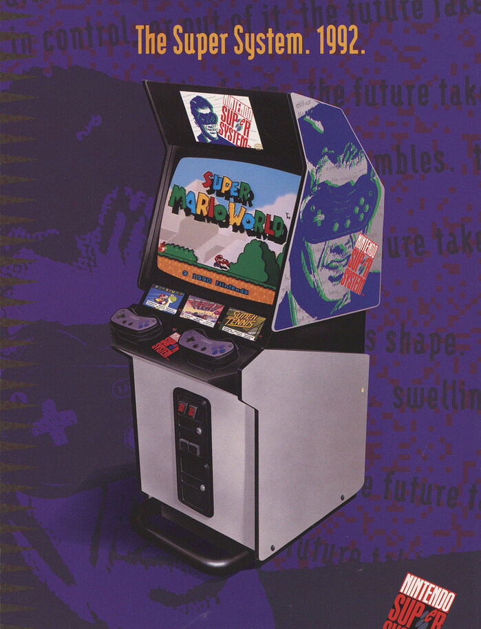
Modula Sans is used for the Super System from 1992.
Source: www.flyerfever.com Flyer Fever. License: All Rights Reserved.
The last page combines Modula Sans with Matrix and Futura Extra Bold. The small print is in regular Futura.
This post was originally published at Fonts In Use