Covalto 2026 rebranding

Source: www.covalto.com ©2026 Covalto. License: All Rights Reserved.

Covalto is a Mexican digital banking platform founded in 2015 by David Poritz and Allan Apoj Pascal. It provides financial services and digital banking solutions designed towards businesses. At the end of 2025 it pivoted from a pure fintech company to a full-fledged digital bank.
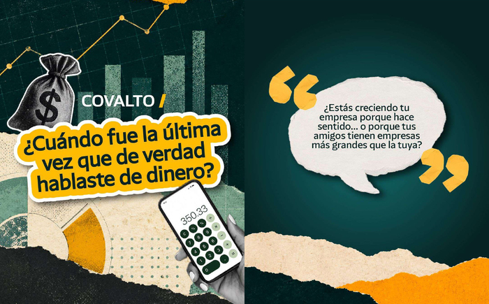
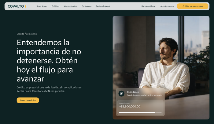
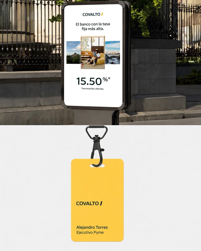
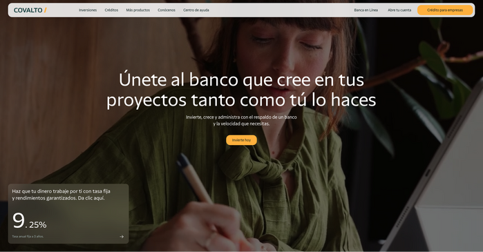
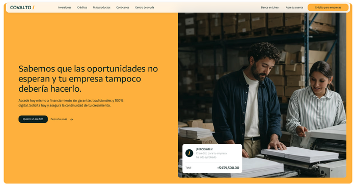
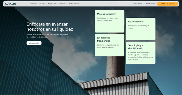
Its visual identity, relaunched in 2026, is built around the NaN Serf Sans typeface. The company also went from a logo set in a serif typeface to one set in a yet unidentified sans (Hackney, Allumi and FF Clan are similar). The whole identity, with its use of big plain colourful background, a lot of respiratory space and its typographical choice, gives hints of calm, confidence and simplicity.
The characteristic t of NaN Serf Sans, with its serif-inspired triangular top-part, flexes whenever the name of the company is written in the typeface. This gives a small hint of recognisability in an otherwise quite discreet identity.
Source: www.covalto.com ©2026 Covalto. License: All Rights Reserved.
Source: www.covalto.com ©2026 Covalto. License: All Rights Reserved.
Source: www.covalto.com ©2026 Covalto. License: All Rights Reserved.
Image extracted from their rebranding post.
Source: www.covalto.com ©2026 Covalto. License: All Rights Reserved.
Source: www.covalto.com ©2026 Covalto. License: All Rights Reserved.
Source: www.covalto.com ©2026 Covalto. License: All Rights Reserved.
This post was originally published at Fonts In Use