Corri San Mauro 2026
Piercarlo Tozzi. License: All Rights Reserved.


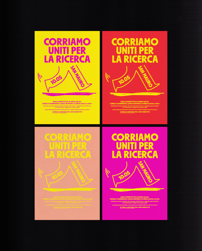
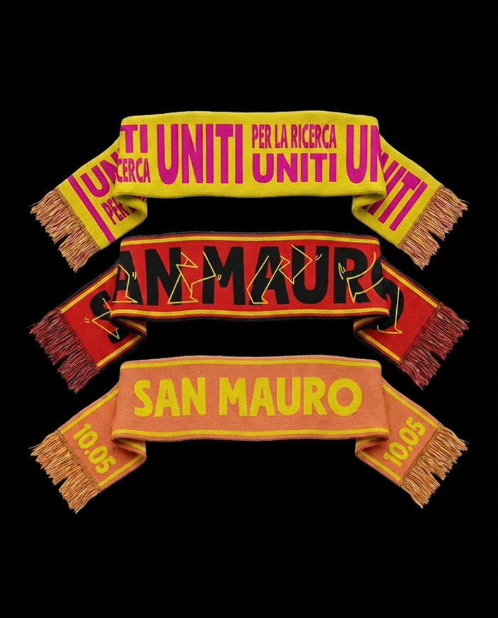
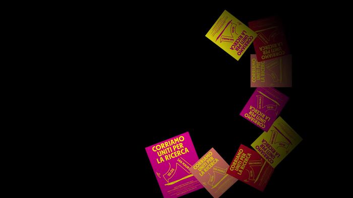
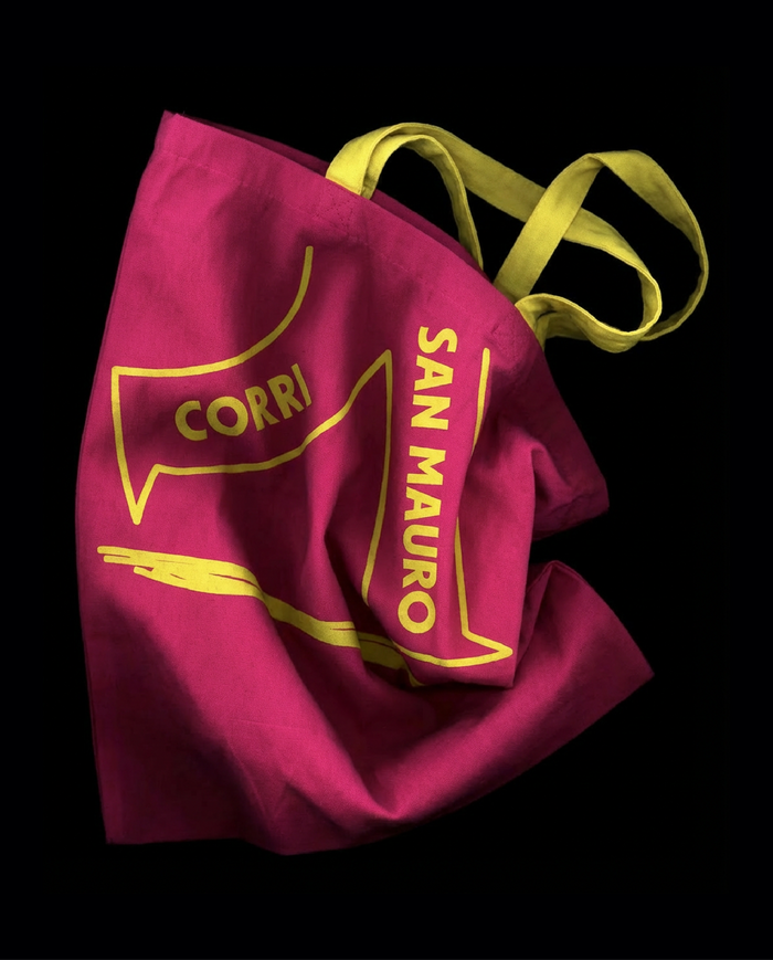
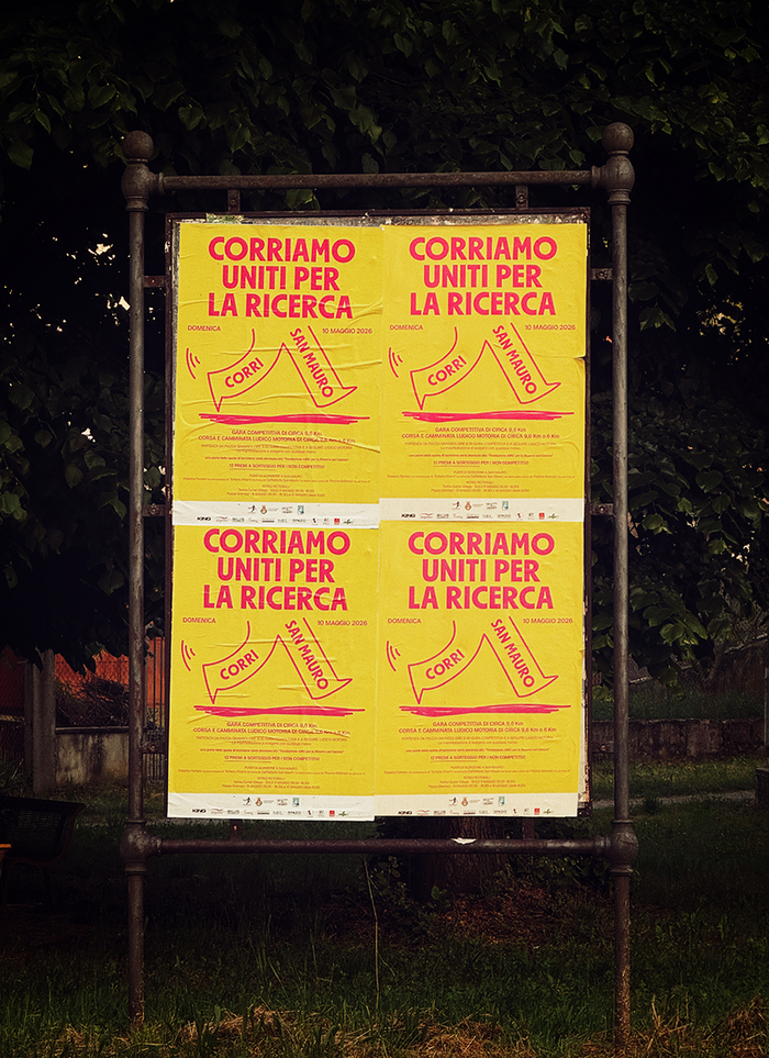
Poster and identity design for the Corri San Mauro.
Once again this year, the race is focused on raising funds for cancer research. For the 2026 edition, graphic designer Piercarlo Tozzi suggested a more pop-inspired design, featuring bold colors and contrasts along with dynamic illustrations, suitable for use in any context. The “mascot” depicted as running legs, reappears in various forms, in animations, on scarves, and on posters throughout the city.
The combination of fonts chosen strikes the right balance. Autarchist Sans, with its boldness, helps create a headline that is both impactful and legible, while Milligram is its perfect counterpart for body text. The chosen fonts also fit the intended fun, pop style, yet keep the more serious message dedicated to research unequivocal and clear.

Piercarlo Tozzi. License: All Rights Reserved.
Piercarlo Tozzi. License: All Rights Reserved.
Piercarlo Tozzi. License: All Rights Reserved.
Piercarlo Tozzi. License: All Rights Reserved.
Piercarlo Tozzi. License: All Rights Reserved.
This post was originally published at Fonts In Use