The Florian
Source: watsonnyc.com Watson & Company. License: All Rights Reserved.


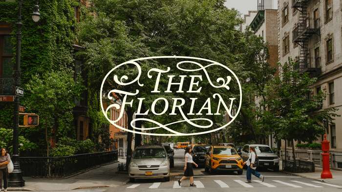
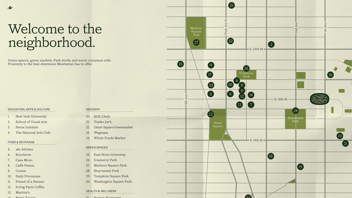
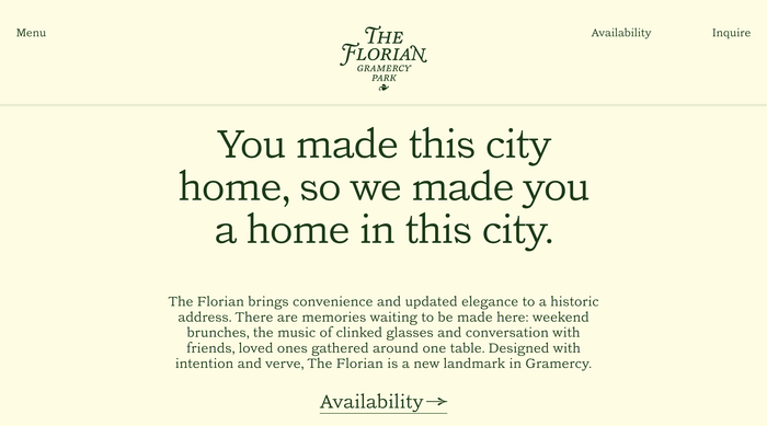
Few Manhattan neighborhoods capture classic New York quite like Gramercy Park—a desirable enclave defined by its private garden, quiet tree-lined streets, and historic architecture. Bridging timeless elegance with modern livability, The Florian carries this legacy forward.
Watson shaped the brand from the ground up with a strategic naming approach: “The Florian” evokes warmth, greenery, and enduring character—positioning the residence as both refined and welcoming. The broader brand strategy centers on appealing to a new generation of first-time homebuyers putting down roots in New York City.
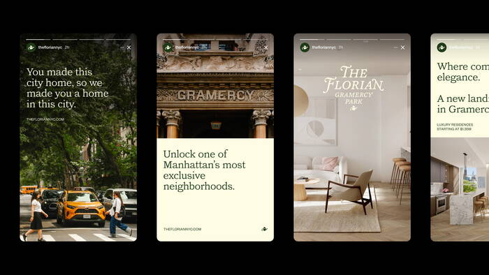
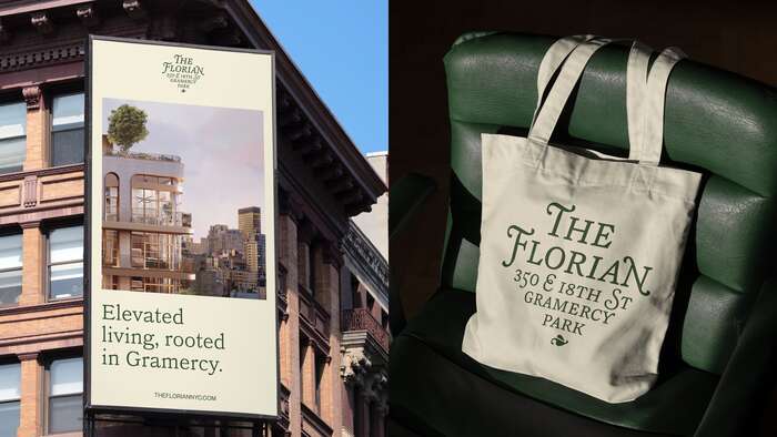
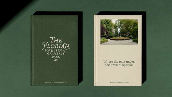
Drawing from Gramercy Park’s 19th-century ironwork, literary tradition and cultivated community, the visual identity system subtly balances history with forward momentum. A flexible logo suite spans from an expressive wordmark to a pared-back fleuron, enabling versatility across touchpoints while reinforcing a cohesive, place-based narrative. The typographic system reflects the neighborhood's effortless charm and ease while staying rooted it in its quiet sophistication. The neighborhood photography further grounds the brand in authenticity, emphasizing an emotional connection to this iconic New York location.
Both a tranquil retreat and a gateway into city living, The Florian is positioned as more than a residence—it’s a setting for new beginnings, designed for those ready to write their own New York story.
The logomark variations are set in MD Lórien with modifications to specific letterforms. Headlines are set in LL Catalogue and supporting copy is set in Founders Grotesk.

Source: watsonnyc.com Watson & Company. License: All Rights Reserved.

Source: watsonnyc.com Watson & Company. License: All Rights Reserved.
Source: watsonnyc.com Watson & Company. License: All Rights Reserved.

Source: watsonnyc.com Watson & Company. License: All Rights Reserved.
Source: watsonnyc.com Watson & Company. License: All Rights Reserved.
Source: watsonnyc.com Watson & Company. License: All Rights Reserved.

Source: watsonnyc.com Watson & Company. License: All Rights Reserved.
Source: thefloriannyc.com Watson & Company. License: All Rights Reserved.
Source: watsonnyc.com Watson & Company. License: All Rights Reserved.

Source: watsonnyc.com Watson & Company. License: All Rights Reserved.
This post was originally published at Fonts In Use