Cookoa
Source: www.cookoa.com.br License: All Rights Reserved.


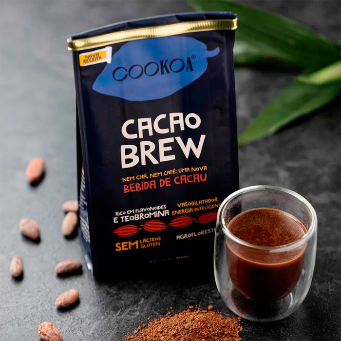
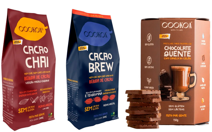
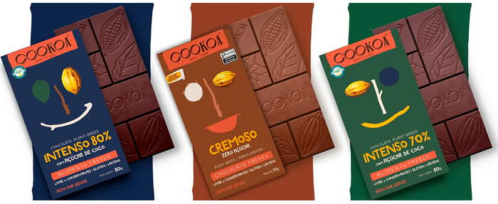
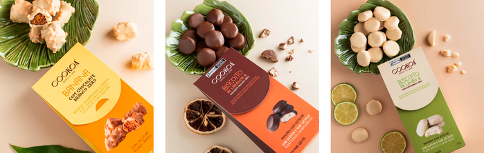
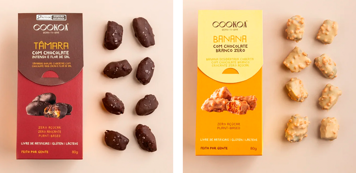
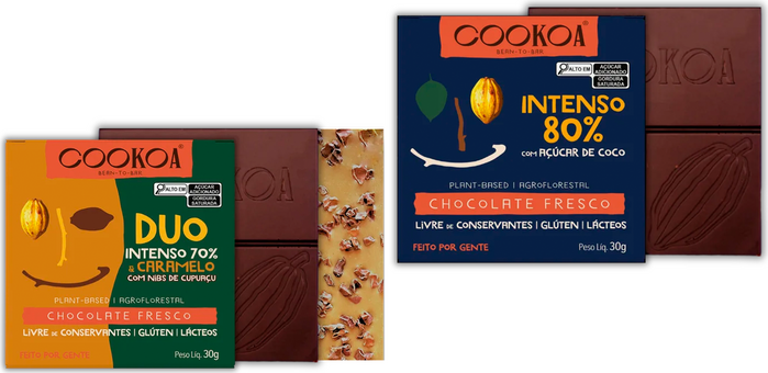
Typography is at the heart of the packaging created for Cookoa by the Brazilian design agency MOVE. Since around early 2020, the identity features Marujo from PintassilgoPrints, a lively hand-drawn script that gives the brand a warm feel. Its organic shapes bring a sense of craft to the packaging, echoing the care that goes into transforming fine cocoa beans and other ingredients sourced from agroforestry systems into chocolate and cocoa-based products with minimal processing.
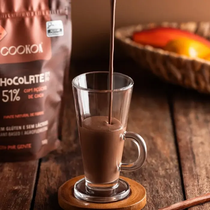
Marujo’s expressive lettering contrasts with the clean, uncluttered layouts, becoming a recognizable element throughout the product line. The typeface feels natural rather than polished, helping communicate Cookoa’s focus on simple ingredients, hands-on production, and attention to detail. Earthy colors, straightforward compositions, and Marujo’s friendly voice come together to create packaging that feels honest, inviting, and closely connected to the natural character of cocoa.
The Cookoa logo is in Canopée from VJ-Type.
Source: www.cookoa.com.br License: All Rights Reserved.
Source: www.cookoa.com.br License: All Rights Reserved.
Source: www.cookoa.com.br License: All Rights Reserved.
Source: www.cookoa.com.br License: All Rights Reserved.
Source: www.cookoa.com.br License: All Rights Reserved.
The light typeface is Marujo Fino.
Source: www.cookoa.com.br License: All Rights Reserved.
This post was originally published at Fonts In Use