Coaltown
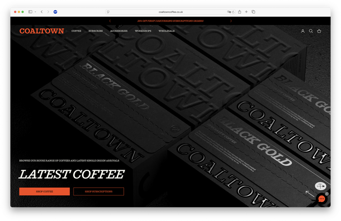
Source: www.coaltowncoffee.co.uk Smörgåsbord Studio. License: All Rights Reserved.

Branding, web, and packaging design for Coaltown, a coffee roaster based in Wales, with creative direction by Smörgåsbord Studio and featuring VFX by Dima Rodionov. The rebrand was launched in January 2026. From an Instagram post by Smörgåsbord announcing the project:
An exercise in evolution, not revolution. Coaltown’s foundations were already strong; our role was to refine and elevate. We began by rearticulating the brand strategy, clarifying Coaltown’s purpose and its reason for being. From there, we shaped a new visual language.
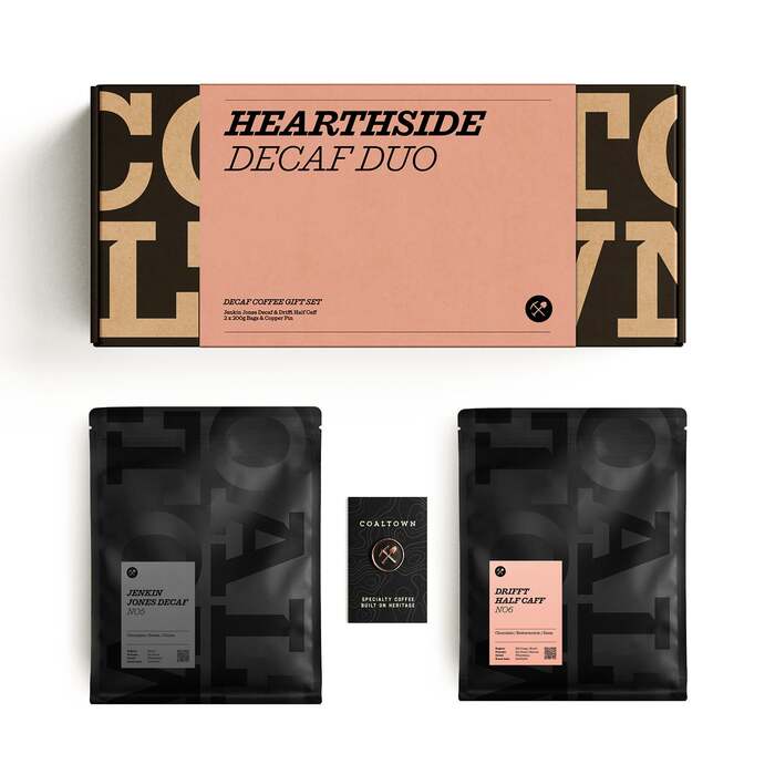
We chose to ‘celebrate the slab’. Coaltown’s logotype had long relied on a serviceable but unremarkable slab-serif typeface, so we sought a more crafted, characterful successor. That search led us to ‘Successor’, by New York–based Commercial Type.
Drawn by Tim Ripper and released in 2023, ‘Successor’ is a contemporary interpretation of the nineteenth-century English slab-serif – often referred to as Egyptian or Antique. Slab-Serifs dominated poster design from the Industrial Revolution through to the early twentieth century, when the Welsh coal industry was at its height. With 16 weights and cuts, it allowed the entire brand to be built from a single type family.
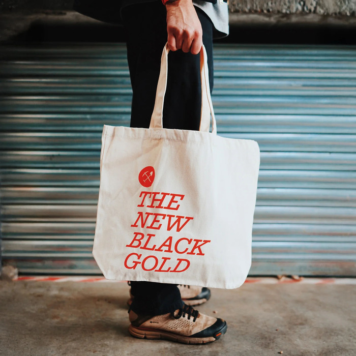
‘Coal Black’ remains Coaltown’s signature colour, complemented by five rich, muted tones inspired by the ‘House Coffee’ range. We’ve also introduced ‘Purpose Orange’ as an accent, drawn from the National Coal Board’s iconic donkey jackets – worn by miners from the 1960s to the 1980s and long a symbol of working-class identity.
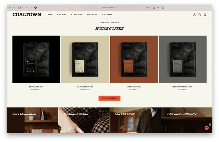
Source: www.coaltowncoffee.co.uk Smörgåsbord Studio. License: All Rights Reserved.
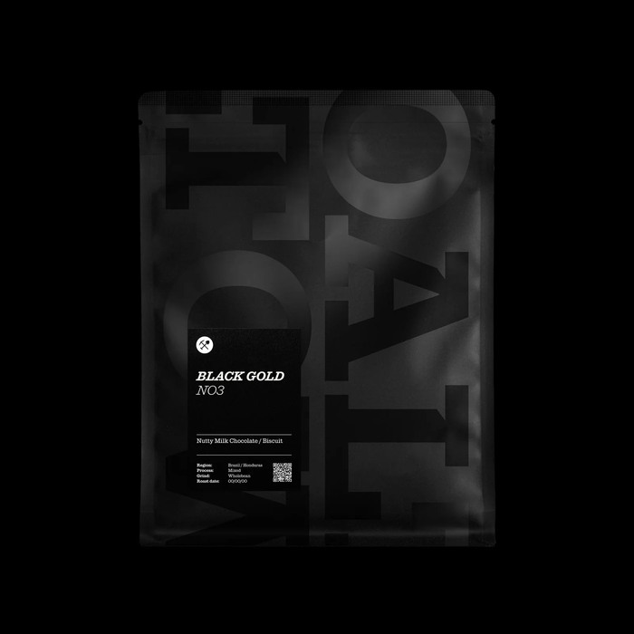
Source: www.coaltowncoffee.co.uk Smörgåsbord Studio. License: All Rights Reserved.
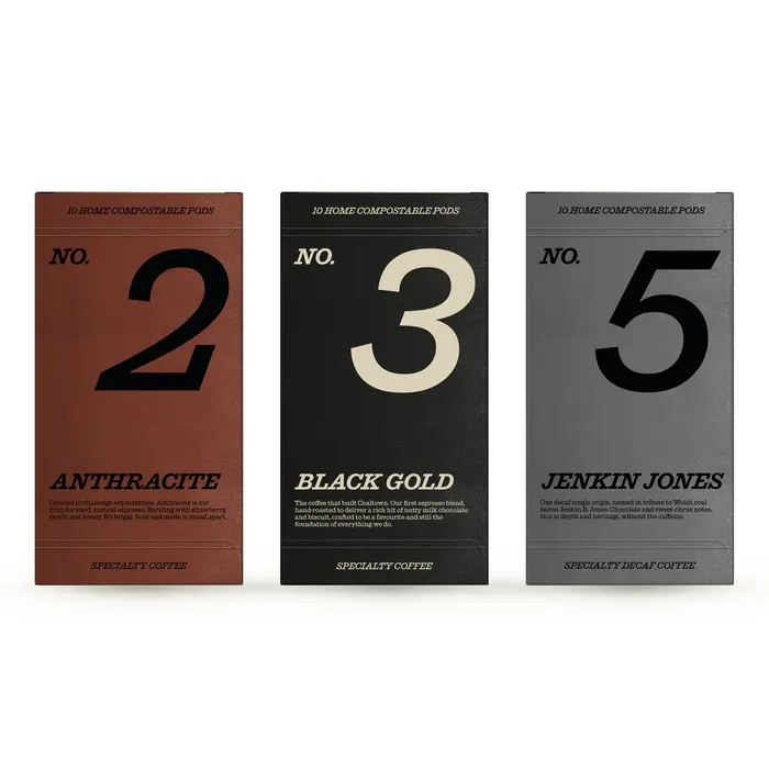
Source: www.coaltowncoffee.co.uk Smörgåsbord Studio. License: All Rights Reserved.
Source: www.coaltowncoffee.co.uk Smörgåsbord Studio. License: All Rights Reserved.
Source: www.coaltowncoffee.co.uk Smörgåsbord Studio. License: All Rights Reserved.
This post was originally published at Fonts In Use