Cierah Gallery

Source: www.instagram.com License: All Rights Reserved.


Cierah is an art gallery in New York operated by Cierah Sargent and Samson Stilwell.
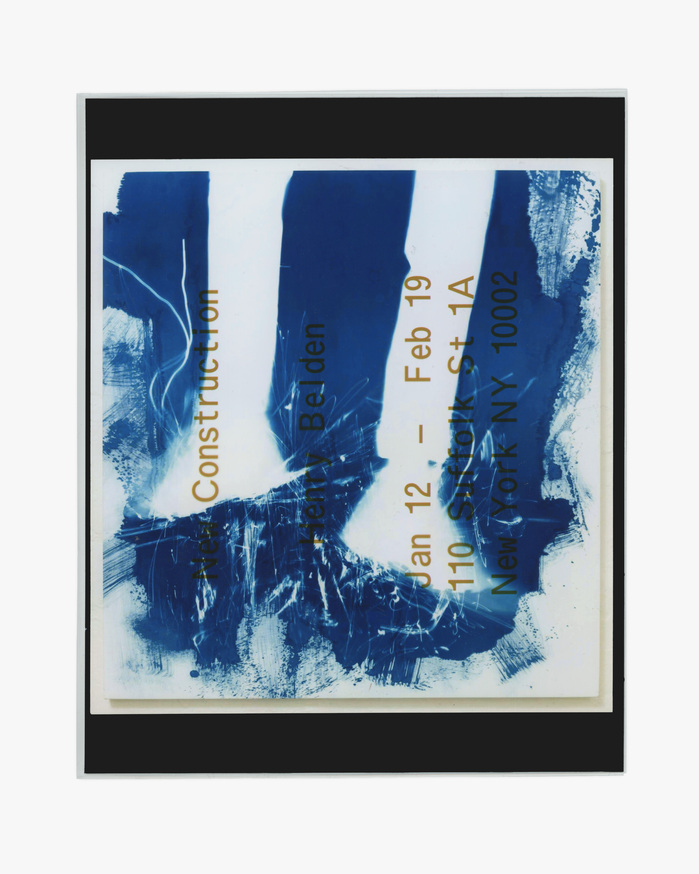
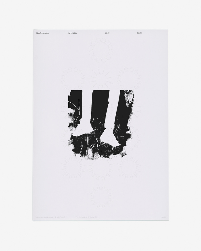
The gallery's identity and printed matter was designed by HSO, around the motifs already present in the Cierah's ground level space. The street-facing windows, visible from anywhere in the gallery, frame the door, defining the light and tone of the space. Cierah's "floret" mark is a digitization of the ornament on the wrought iron bars on the gallery's windows. And the UV printed vinyl in the brochure evokes the windows themselves.
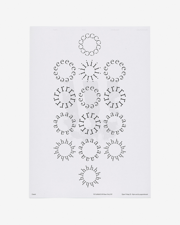
Cierah's logo and custom lettered wordmark are supported by a trio of grotesks — Gerstner-Programm FSL, Normal-Grotesk FSL and ABC Oracle Triple. Each of these typefaces strikes a distinct tone and all three are used throughout Cierah's printed matter. Gerstner-Programm FSL largely does the heavy lifting of running text, while the other two appear as needed to play the part of headline, highlight or subtitle.
Source: www.instagram.com License: All Rights Reserved.
Source: www.instagram.com License: All Rights Reserved.
Source: www.instagram.com License: All Rights Reserved.
Source: www.instagram.com License: All Rights Reserved.
Source: www.instagram.com License: All Rights Reserved.
This post was originally published at Fonts In Use