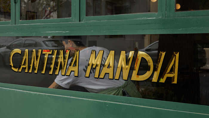
Cantina Mandia

Source: www.ufficio.studio Maria Eugenia Solla. License: All Rights Reserved.


Cantina Mandia is a restaurant in the Colegiales neighborhood of Buenos Aires. To design the identity, Ufficio Studio used the typeface Molitor by Matthieu Cortat, Banana Grotesk by Mitch Paone, and Modern Prestige by Hendry Juanda.
On their website, we can read:
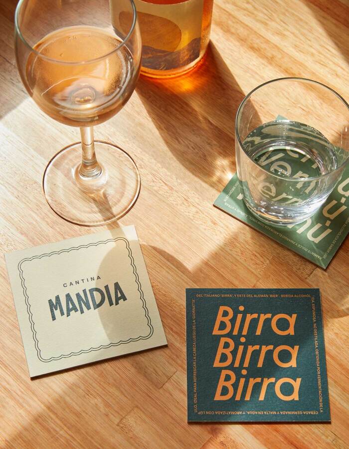
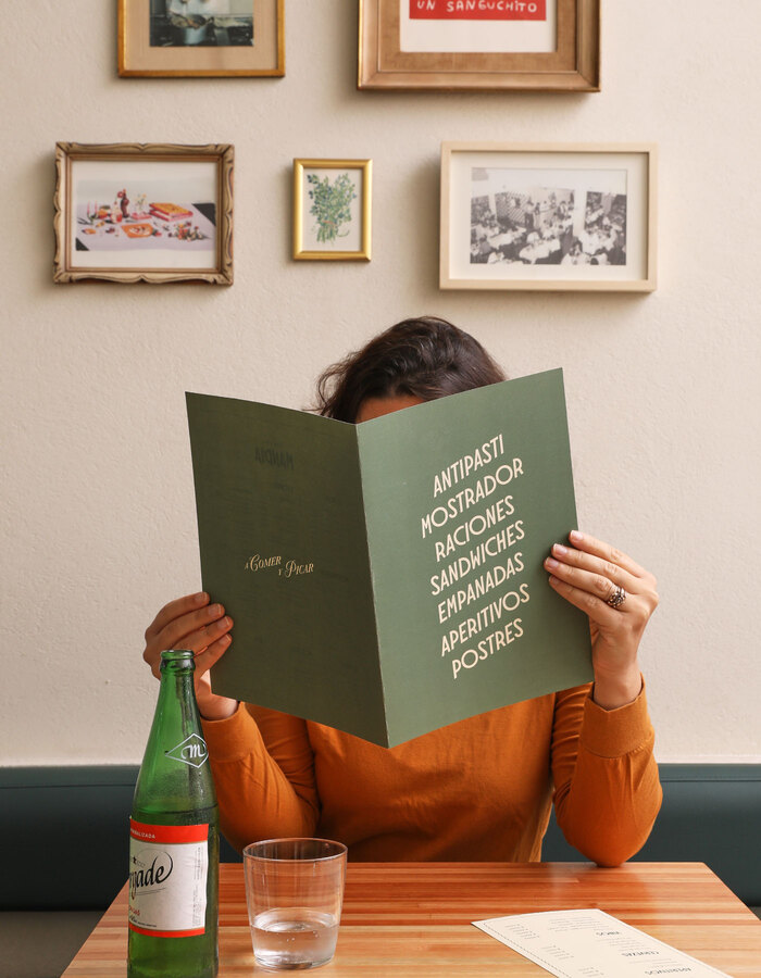
This branding was inspired by the frames of cinema in the 1960s era. The logo, based on a contemporary Art Deco typography, incorporates diagonal elements evoking the lively Italian spirit of Tarantella, with its vibrant voices, post-dinner conversations, and lively music. For the styling, we included photos of Sofia Loren related to food and leisure, and took the relaxed color palette from one of her images that combines an orange-golden hue to a great set of green tones. To introduce a feminine touch, we incorporated frames that remind us to the trimmings of folders and fabric napkins embroidered by grandmothers and added a script typography reminiscent of romantic movie titles. This blend of unique elements conveys the spirit of the era in a modern way.
Photos by Maria Eugenia Solla
Source: www.ufficio.studio Maria Eugenia Solla. License: All Rights Reserved.

Source: www.ufficio.studio Maria Eugenia Solla. License: All Rights Reserved.
Source: www.ufficio.studio Maria Eugenia Solla. License: All Rights Reserved.

Source: www.ufficio.studio Maria Eugenia Solla. License: All Rights Reserved.
Source: www.ufficio.studio Maria Eugenia Solla. License: All Rights Reserved.

Source: www.ufficio.studio Maria Eugenia Solla. License: All Rights Reserved.
This post was originally published at Fonts In Use