Wees Wijs logo and website
Published January 22, 2024
By FontsInUse
Contributed by Anita Jürgeleit
Source: weeswijs.nu License: All Rights Reserved.


Source: weeswijs.nu License: All Rights Reserved.
Source: weeswijs.nu License: All Rights Reserved.
Source: weeswijs.nu License: All Rights Reserved.
Source: weeswijs.nu License: All Rights Reserved.
This post was originally published at Fonts In Use
Source: weeswijs.nu License: All Rights Reserved.
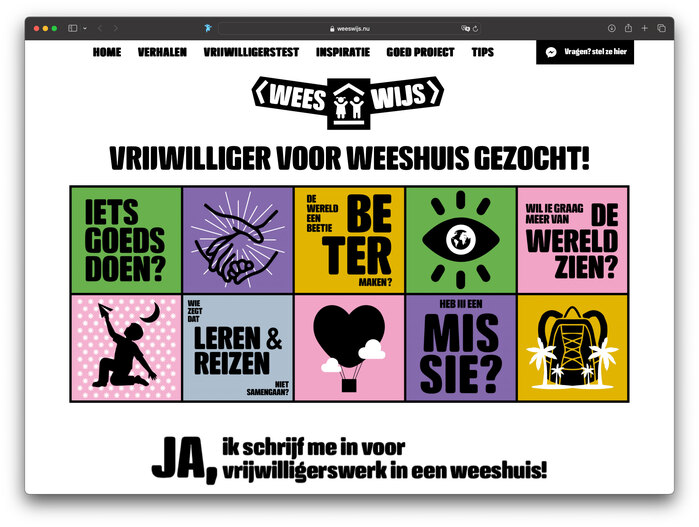
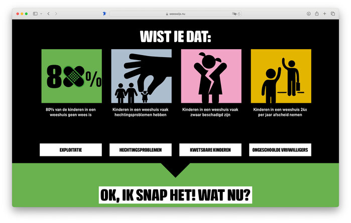
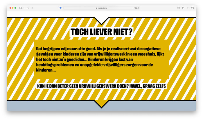
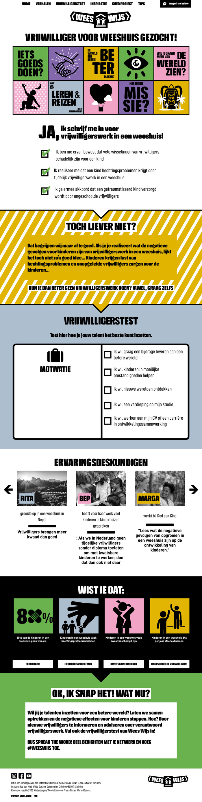
Full typographic and pictographic web design for Wees Wijs using Crossfit Black and two widths of D-DIN. Wees Wijs is a campaign of the Better Care Network Netherlands to improve the life of orphaned children and to inform about the pros and cons of volunteers working in orphanages.
Source: weeswijs.nu License: All Rights Reserved.
Source: weeswijs.nu License: All Rights Reserved.
Source: weeswijs.nu License: All Rights Reserved.
Source: weeswijs.nu License: All Rights Reserved.
This post was originally published at Fonts In Use
Read full story.
WRITTEN BY
FontsInUse
An independent archive of typography.
More from FontsInUse