Southside Justice
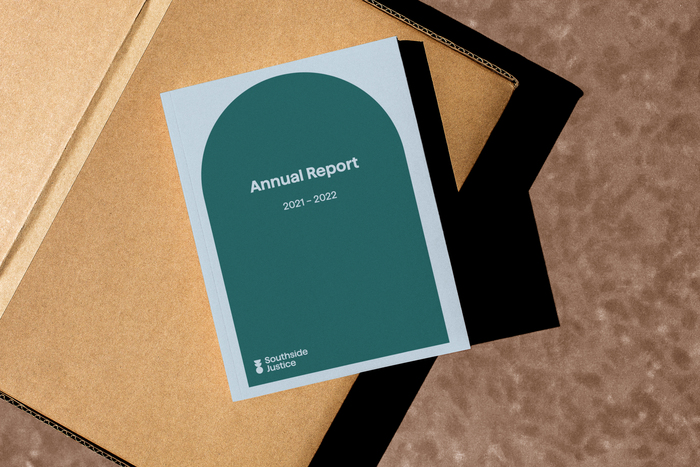
Source: designbynature.au License: All Rights Reserved.

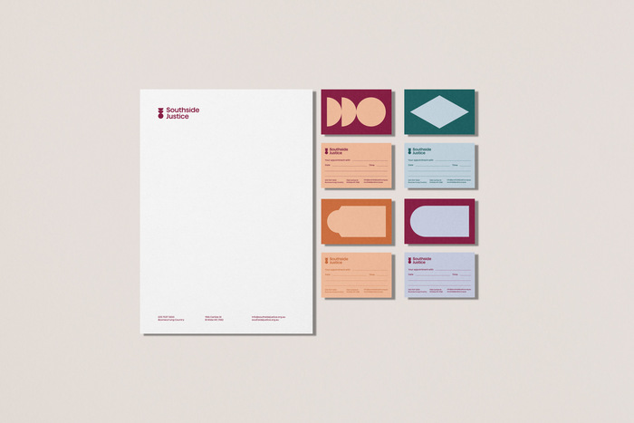
The typeface family Haffer XH was selected to support the brand's bold, friendly and inclusive feel. In the logotype, the title of the lowercase i was modified to reflect the brand's mark.
Description of the project by Design by Nature:
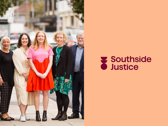
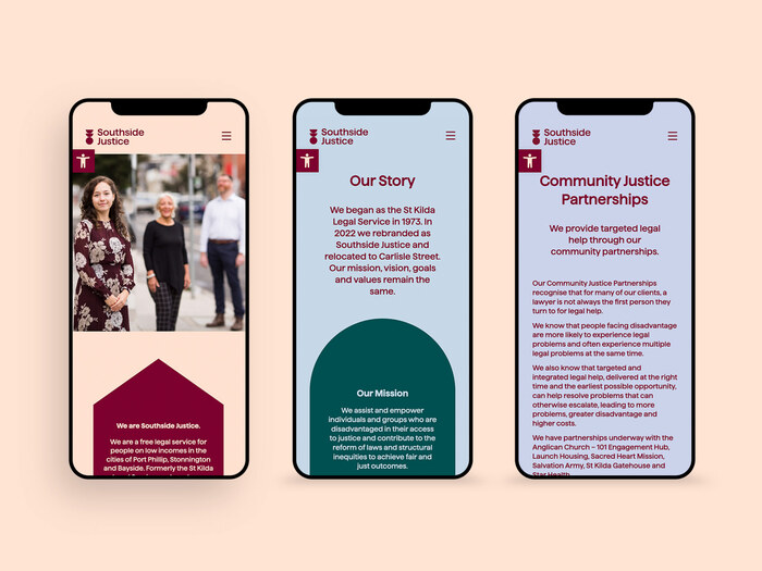
Southside Justice is a free legal service for people on low incomes in the cities of Port Phillip, Stonnington and Bayside. Formerly known as the St Kilda Legal Service, this organisation has been helping the community access justice for more than 50 years.
Design by Nature was engaged to help facilitate a new brand for the organisation. Through a co-design workshop process, we developed a new name and brand strategy before moving into identity and collateral development.
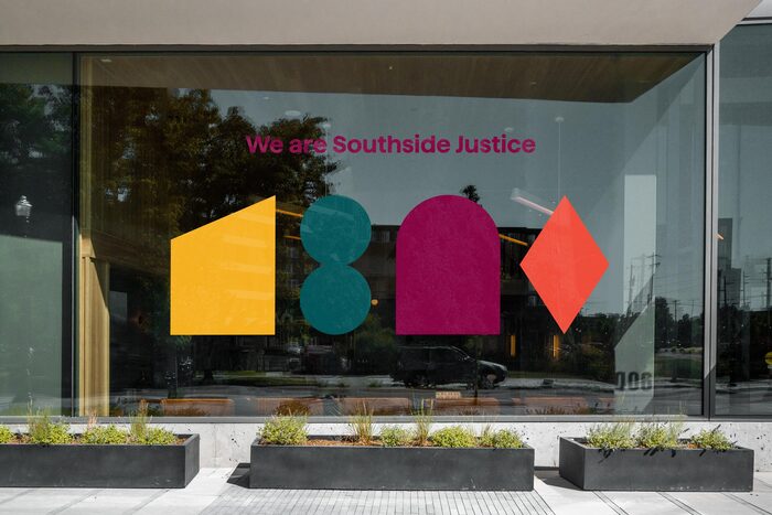
The logo concept comprises two half circles pointing south, representing the south side, and a whole circle representing justice. Brand collateral then extends this concept into a variety of graphic shapes which are pulled from the catchment area’s landscape and architecture.
Source: designbynature.au License: All Rights Reserved.
The tittle of the lowercase i was modified to reflect the brand’s mark made of circles and half circles.
Source: designbynature.au License: All Rights Reserved.
Source: designbynature.au License: All Rights Reserved.
Source: designbynature.au License: All Rights Reserved.
Source: designbynature.au License: All Rights Reserved.
This post was originally published at Fonts In Use