Bolt rebranding

Source: koto.studio Koto. License: All Rights Reserved.

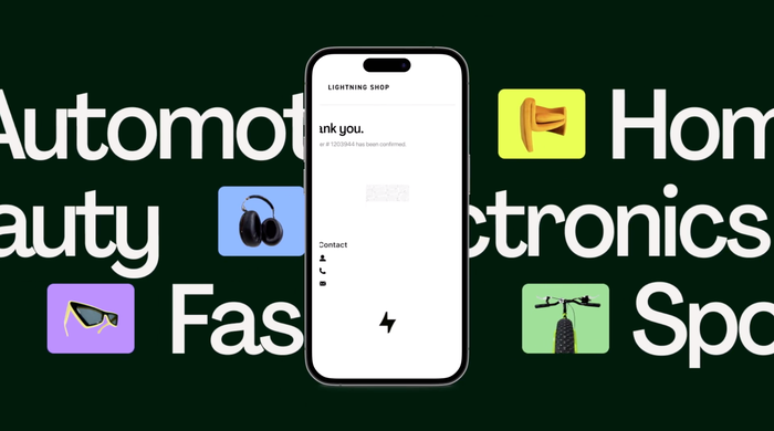
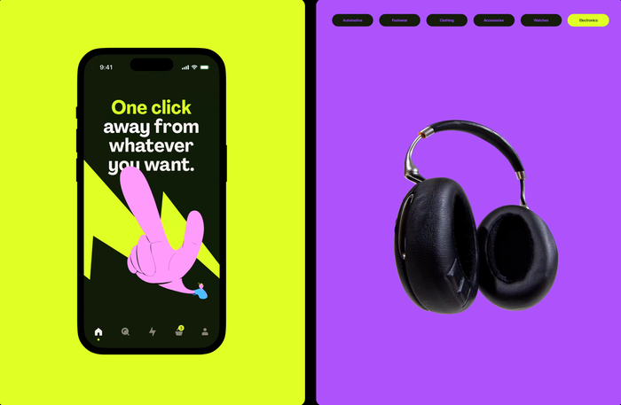
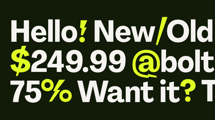
Agrandir is the brand typeface of ecommerce company Bolt. Their visual identity was redesigned by Koto:
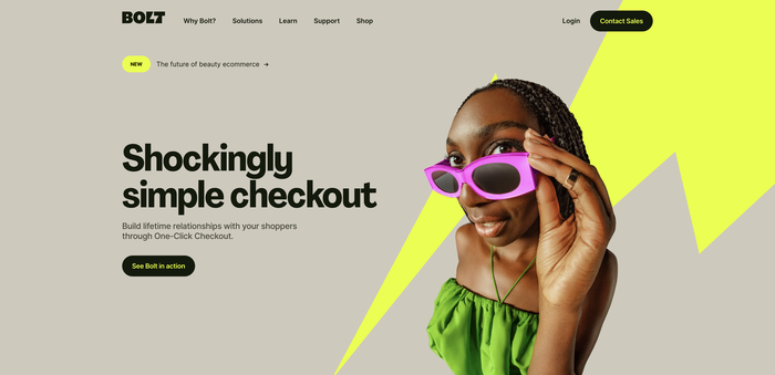
Checkout at the speed of a click. It takes about 50 milliseconds for a click to be performed, and in that brief glimpse of time an entire world comes alive. A database has been updated, a ticket has been created, an order is processed. All in a single click. Bolt’s shockingly simple checkout means fewer abandoned carts, and more lightning-fast shopping.
To bring this vision to life, we looked at every possible brand expression: from logo and custom typography all the way through motion principles, photography style, product UX/UI, marketing assets, internal comms, and a full launch campaign. Along the way we developed a new art direction and illustration style, as well as a unique sonic brand that brings Bolt into another dimension. Every element of the final system reflects the speed of the product, resulting in a brand that’s Bolt by name, and bolt by nature.

Source: koto.studio Koto. License: All Rights Reserved.

Source: koto.studio Koto. License: All Rights Reserved.

Source: koto.studio Koto. License: All Rights Reserved.

Source: koto.studio Koto. License: All Rights Reserved.
Source: koto.studio Koto. License: All Rights Reserved.
Source: koto.studio Koto. License: All Rights Reserved.
Source: koto.studio Koto. License: All Rights Reserved.

Source: koto.studio Koto. License: All Rights Reserved.
Source: koto.studio Koto. License: All Rights Reserved.
This post was originally published at Fonts In Use