Bionox

Source: bionoxusa.com Bionox. License: All Rights Reserved.

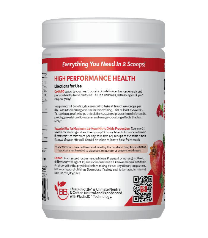
Kit Sans is the typeface chosen for the redesigned identity of Bionox. The brand for dietary supplement products introduced the font family earlier this year, starting with the packaging design of their new flagship product, CardioGO.
The workhorse sans by Darden Studio is used throughout. All information on the labels is set in various styles from the Kit Sans family. The CardioGO name is presented in caps from the boldest weight, Kit Sans Black, with a custom heart-shaped counter in the letter O. The directions of use on the back are shown in the Regular, and the slogan “Everything You Need in 2 Scoops!” in the Bold Italic. As all fonts by Darden Studio, Kit Sans offer various sets of numerals. The label text features the oldstyle variety, with numerals that ascend and descend like alphabetic glyphs.
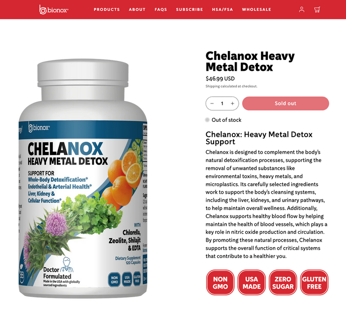
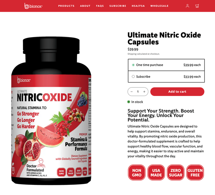
In the meantime, the use of Kit Sans has been expanded to the Bionox website as well as to other products such as the Chelanox Heavy Metal Detox and the Ultimate Nitric Oxide Capsules.

Source: bionoxusa.com Bionox. License: All Rights Reserved.
CardioGo was launched in three flavors, with packaging designs differentiated by color.
Source: bionoxusa.com Bionox. License: All Rights Reserved.
The Bionox website uses Kit Sans Regular for text, with ExtraBold for headings.
Source: bionoxusa.com Bionox. License: All Rights Reserved.

Bionox. License: All Rights Reserved.
Source: bionoxusa.com Bionox. License: All Rights Reserved.
This post was originally published at Fonts In Use