Best of the Bone
Source: universalfavourite.com.au Universal Favourite. License: All Rights Reserved.


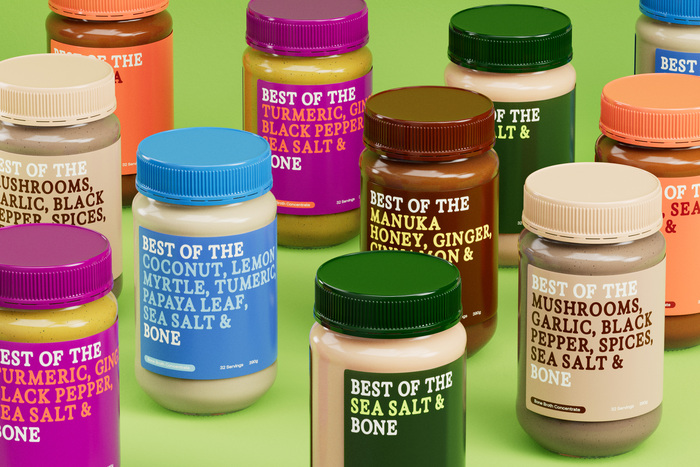
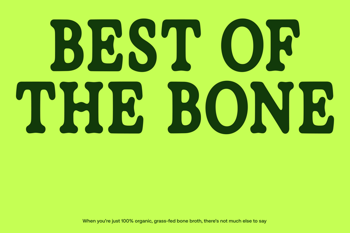
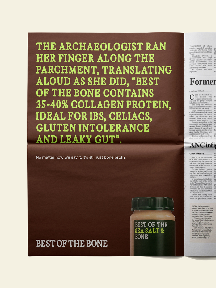
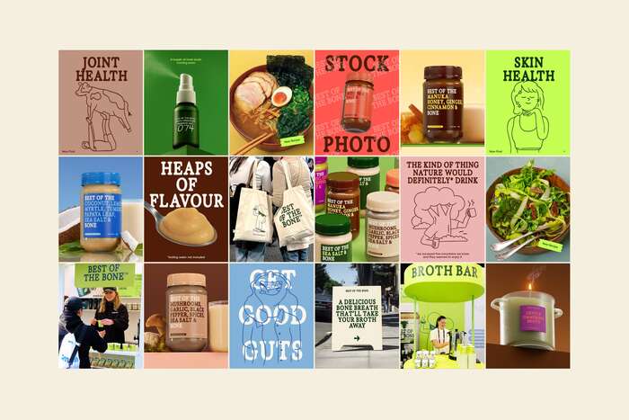
Best of the Bone makes bone broth. Not the miracle-elixir kind, or the drink-this-and-your-chakras-will-align kind, but the real-100%-organic-grass-fed-slow-simmered-and-genuinely-good-for-you kind. In evolving their brand, Universal Favourite took cues from the product itself: unfussy, honest, and quietly full of goodness. They reduced everything down to its bare bones, embracing the blunt, matter-of-fact nature of bone broth while finding playful ways to amplify what’s inside. It’s a brand that knows bone broth might seem simple, but when you boil it all down, it’s anything but boring.
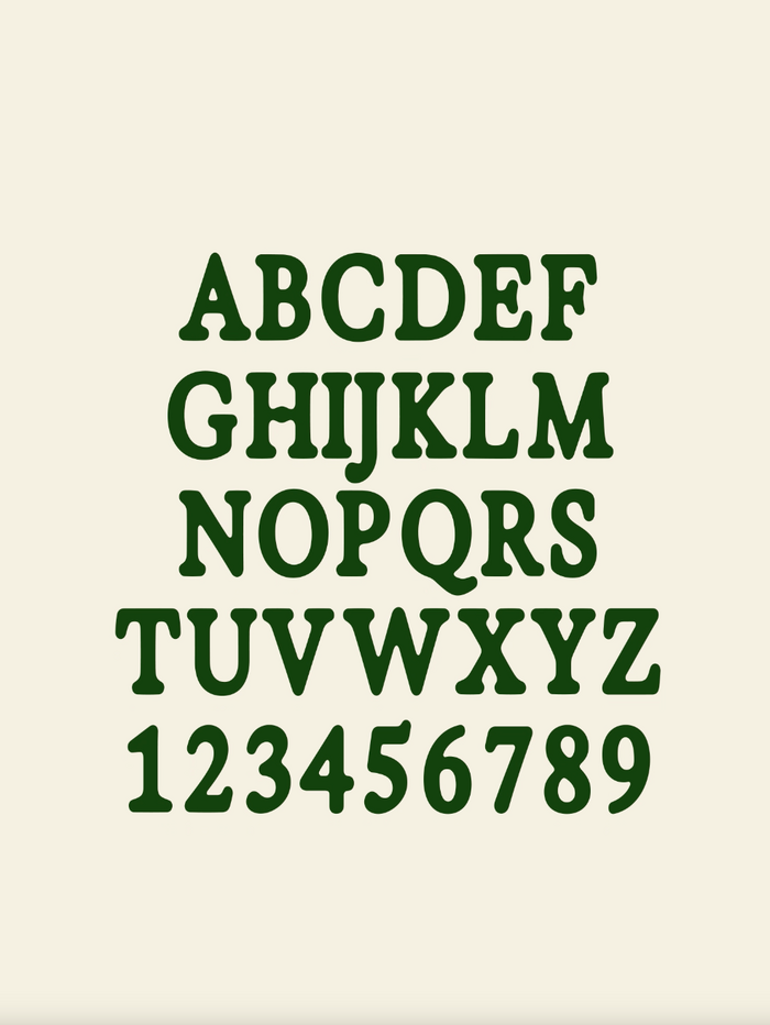
The brand is built around its own custom typeface, Exposure Bone. Created in collaboration with 205TF, it’s a refined cut of Exposure, with a narrower width and a few subtle tweaks that nod to what’s inside the jar. A gentle bend here, a modified bar there. Just enough to feel considered, without veering into costume.
It’s a continuation of the brand’s bare bones philosophy; stripped back, purposeful, and quietly full of character. The result is a typeface with enough personality to carry the brand on its own, letting the voice do the talking without the need for extra layers.
Source: universalfavourite.com.au Universal Favourite. License: All Rights Reserved.
Source: universalfavourite.com.au Universal Favourite. License: All Rights Reserved.

Source: universalfavourite.com.au Universal Favourite. License: All Rights Reserved.
Source: universalfavourite.com.au Universal Favourite. License: All Rights Reserved.
Source: universalfavourite.com.au Universal Favourite. License: All Rights Reserved.

Source: bestofthebone.com Universal Favourite. License: All Rights Reserved.
On the website, the custom typeface is supported by Aeonik.
This post was originally published at Fonts In Use