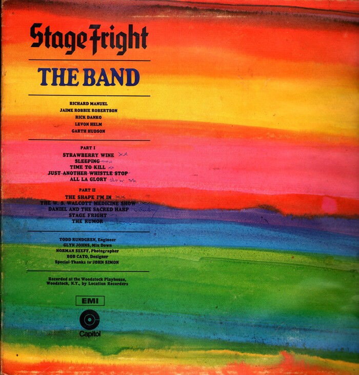
The Band – Stage Fright album art
Source: www.flickr.com Uploaded to Flickr by Klaus Hiltscher and tagged with “seidelburgheavy”. License: All Rights Reserved.

Stage Fright is the third studio album by The Band. Released in 1970, it takes its name from the title song written by guitarist Robbie Robertson (1943–2023). From Wikipedia:
The Band drummer Levon Helm has written that the song is about “the terror of performing.” Others believe that the lyrics refer to Bob Dylan, who had stopped touring live during the late 1960s.
The typeface that designer Bob Cato picked for the title is Element, a simplified textura designed by Max Bittrof and released by the Bauer foundry in 1933, the first year of the Nazi regime in Germany. Was this a conscious choice to express the idea of “fright” typographically?
The specific font in use likely is Seidelburg Heavy, which is the name Photo-Lettering chose for their adaptation of Element’s halbfett style, made sometime before 1960. I’m not aware of a place named Seidelburg. In (Southern) German, a Seidel is a beer mug. And in fact there was a restaurant in Manhattan named Old Seidelburg, serving “the best beer in town in ice cold steins”. Opened by Conrad Metterle in 1933, it was located on 626 Third Avenue, just four blocks south from Photo-Lettering’s studio.
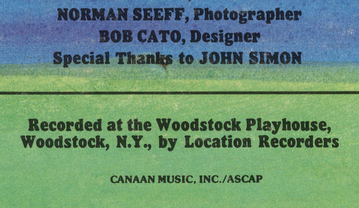
“The Band” is in caps from Cooper Americana which sits between the lighter Cooper Old Style and the bolder Cooper Black. The names of the band members and songs as well as the credits are set in Pabst Extra Bold, Linotype’s follower of Cooper Black.

Source: archive.org License: All Rights Reserved.
Detail

Source: archive.org License: All Rights Reserved.
Detail
Source: archive.org License: All Rights Reserved.
Detail
This post was originally published at Fonts In Use