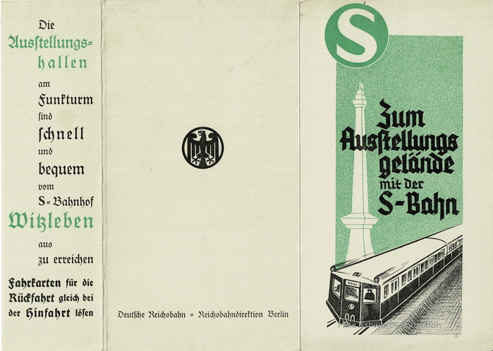
“Zum Ausstellungsgelände mit der S-Bahn” Berlin S-Bahn publicity folder
Source: www.flickr.com Uploaded to Flickr by mikeyashworth and tagged with “deutscheschrift”. License: All Rights Reserved.
While the title on the front cover is lettering, the blackletter seen on the back and the flap is Deutsche Schrift, used in two weights with both forms for the letter s (see “Ausſtellungshallen”) and the mandatory ligatures for ch, ck, tz. Note that the S in “S-Bahnhof” was added from a bold roman that approximates the logo glyph. Berthold’s Halbfette Lateinisch is a likely candidate.


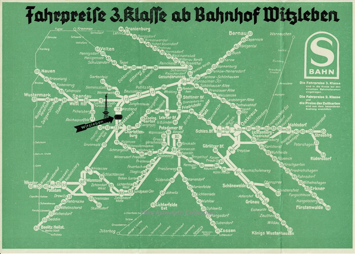
A folder advertising Third Class fares on the Berlin S-Bahn to visit the exhibition grounds and Funkturm adjacent to the city's S-Bahn station at Witzleben. The diagram is interesting in that the system’s stations include the Third Class (3. Klasse) fare to Witzleben from the station of origin.
The folder is not dated but there are some clues and others with sharper eyes and better knowledge than me may offer more information! But the station Deutschlandhalle was named as such from Eichkamp in May 1936, and the Nord-Süd links through the city centre are not shown here; the S-Bahn station at Unter den Linden, shown here, opened in 1936 as the provisional terminus (following the catastrophic collapse of the railway excavations in the locality in 1935) and it was 1939 before the S-Bahn through to Potsdamer Platz was opened.
The folder gives other information including the advice that you can travel to the exhibition grounds by S-Bahn (suburban train, that the exhibition halls at the radio tower (Funkturm) are quick and easy to reach from Witzleben S-Bahn station and that you should purchase your return ticket when you travel to the exhibition grounds.
The folder is printed on stout card and, after some discussion with more knowledgable Berliners, it is likely to be original. It shows no ‘reprint’ data and the folds are well worn suggesting some age. The folder also shows both versions of the S-Bahn symbol or logotype; that of the S in a circle and that of the S in a tombstone shape – the latter being the original design by Fritz Rosen in 1930 that was changed to the circle in c.1936. There is also the Adler or eagle symbol used by the Deutsche Reichsbahn.
Source: www.flickr.com Uploaded to Flickr by mikeyashworth and tagged with “block”. License: All Rights Reserved.
The station names aren’t typeset, but written by hand, in an inclined Blockschrift (cf. DIN 16). The fare info underneath the S-Bahn “tombstone” appears to be set in Berthold Block and Akzidenz-Grotesk.
The large black heading is written in a simplified textura. Interestingly, the letterforms don’t really follow the model drawn by Friedling in May 1935 for the Deutsche Reichsbahn-Gesellschaft, nor are they particularly close to any of the typefaces of this genre. The F with vertical, descending stem resembles the one in Element, but other details are off.
This post was originally published at Fonts In Use