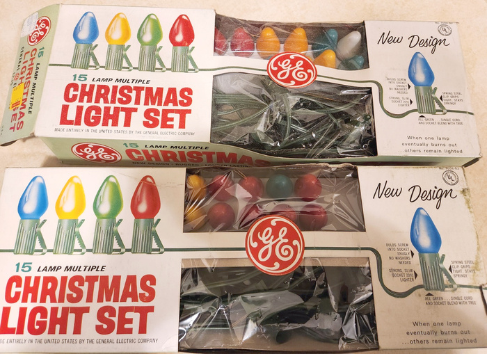
General Electric Christmas Light Set


The Headliners Inc., providers of photoprocess lettering, announced their Catalina in April 1957, see their ad in Art Direction, Vol. 9, No. 1. The casual gothic with slightly flared stems spanned six weights in four widths. Together with the (obliqued?) italics, the family offered “48 refreshing new alphabets designed to meet today’s demand for creative, modern gothics”.
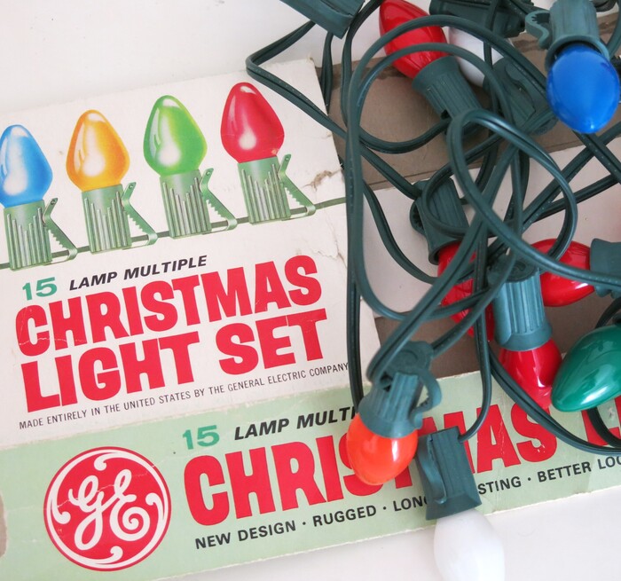
One of Catalina’s bolder weights can here be seen used in red caps for a set of Christmas lights produced by General Electric.

Source: archive.org Internet Archive. License: All Rights Reserved.
Detail of the advance showing of Catalina in Art Direction, Vol. 9, No. 1, April 1957
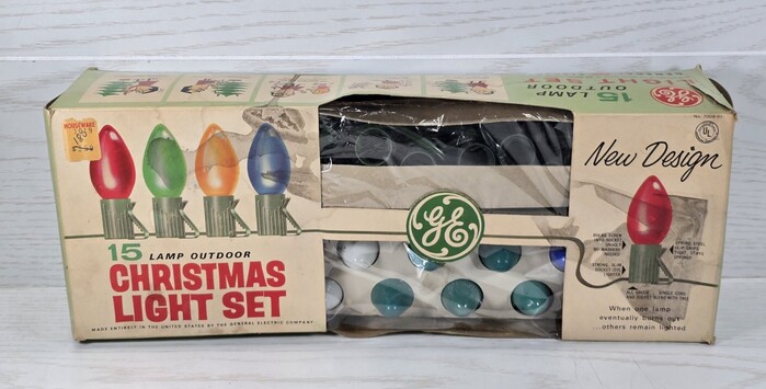
The secondary typeface on the box is Univers. Likewise announced in 1957, Adrian Frutiger’s seminal sans was praised for its comprehensive range of weights and widths. A mid-1960s specimen by ATF depicts four widths in three to four weights, with only the medium widths equipped with (obliqued) italics, for a total of 21 styles. That is less than half of Catalina’s range. A good reminder that style count isn’t everything. And also that Univers may have pioneered the concept of a large, coordinated typeface family – but only in the realm of metal type. Manufacturers of phototype were there first.
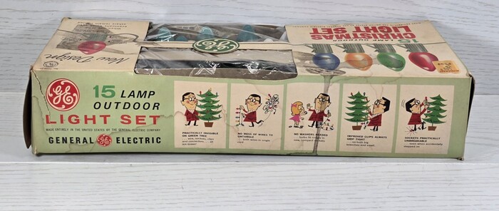
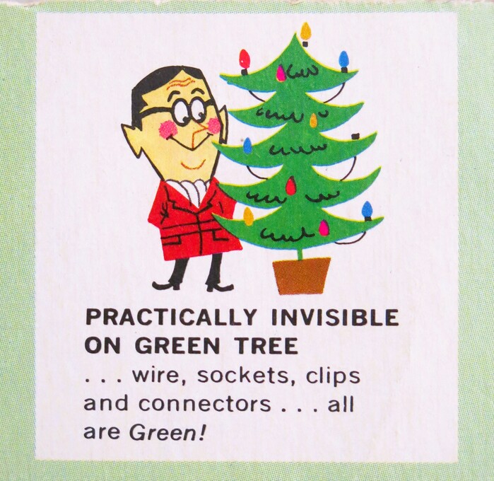
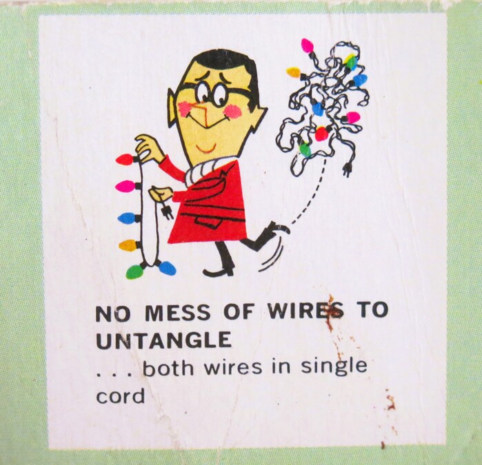
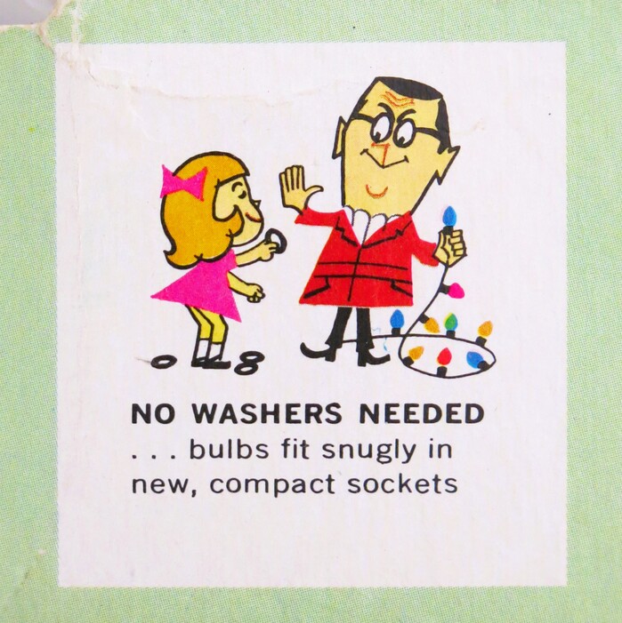
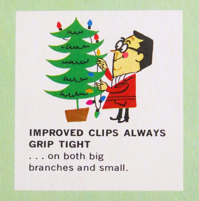
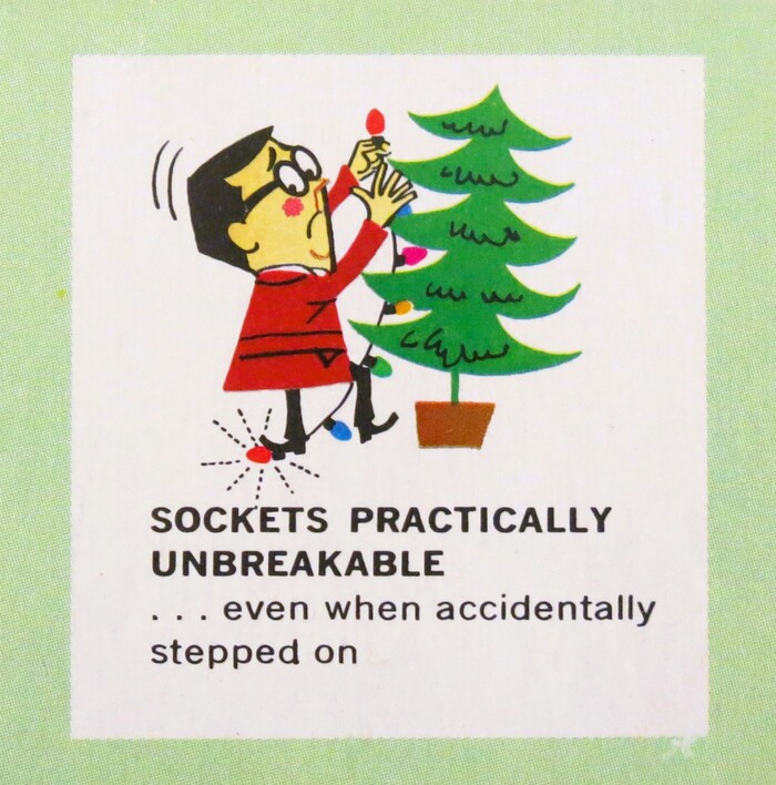
The number “15” and the words “Light Set” on the side of the box are set in Venus Extended, and the captions to the little cartoons highlighting the product’s benefits (see below) are in News Gothic.
Source: www.ebay.com Betterwithage88. License: All Rights Reserved.
This version for outdoor use has a green GE logo and shows the colored light bulbs in reversed order.
Heather David. License: All Rights Reserved.
This post was originally published at Fonts In Use