Come Back, Charleston Blue soundtrack album art and movie posters
Source: archive.org Internet Archive. License: All Rights Reserved.


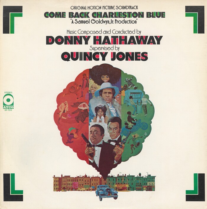
Jetport Black is the only typeface design credited to Leonard Bruck. It’s basically a bold geometric sans, with a simple yet effective twist: some of the interior and surrounding negative space is filled in. Chances are that the name is a riff on Airport Black (although the underlying letterforms are not a perfect match for Baltotype’s 1940s typeface). In 1972, Jetport Black featured in bichromatic use for Come Back, Charleston Blue, with the “fillings” separated and printed in a second color.
Produced by Samuel Goldwyn Jr., the crime comedy film is a sequel to Cotton Comes to Harlem from 1970. The soundtrack was produced by Donny Hathaway, with supervision by Quincy Jones. Jetport Black was used for both the movie posters and the cover of the soundtrack album. The secondary typeface is Jazzbeau, another recent PLINC release. As with the precursor, the art is by Robert McGinnis. No typographer is credited.
Source: archive.org Internet Archive. License: All Rights Reserved.
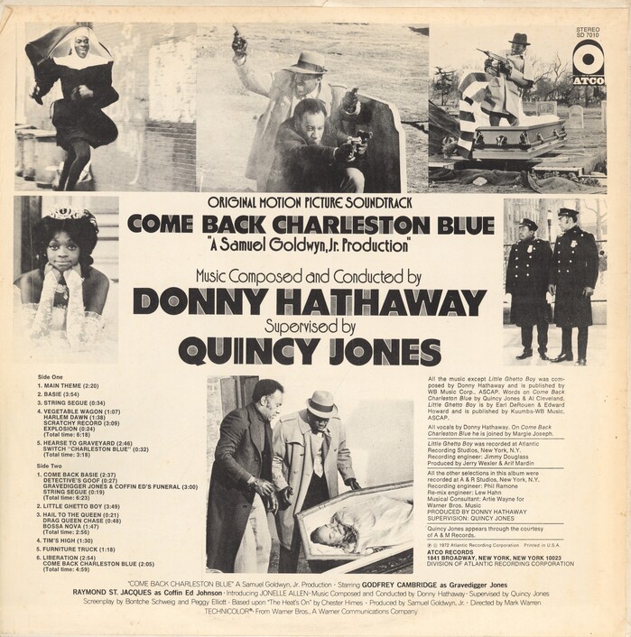
Track list and credit block on the back of the album cover are set in two weights of Helvetica. The credits at the bottom were carried over from the poster and combine Venus Light with News Gothic Bold.
Source: illustractiongallery.com Illustraction Gallery. License: All Rights Reserved.
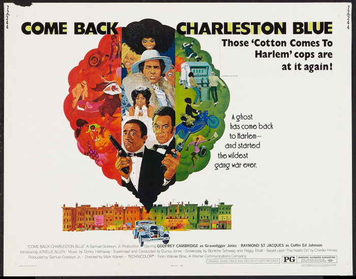
Half-sheet movie poster. “A ghost has come back to Harlem – and started the wildest gang war ever.”
Source: www.1stdibs.com 1stdibs. License: All Rights Reserved.
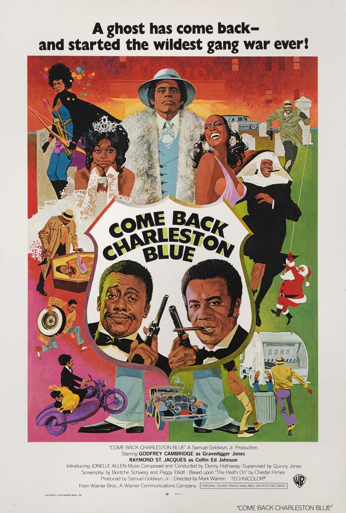
US style B movie poster, with Jetport Black set on a curve
This post was originally published at Fonts In Use