Tyler, the Creator – Chromakopia album art and campaign
Source: www.chromakopia.com License: All Rights Reserved.
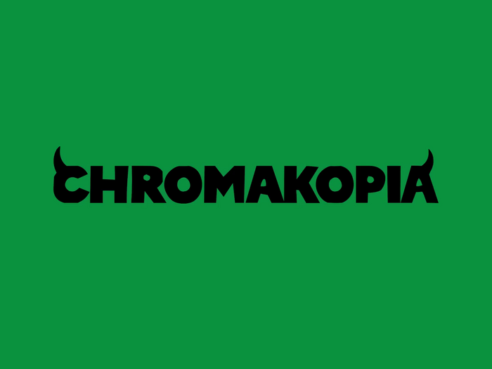
A variant of the album cover with text


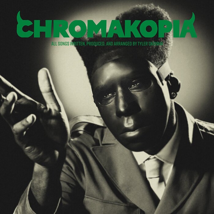
Chromakopia is the long-awaited and highly anticipated seventh (or eighth, depending on whom you ask) studio album by Tyler, the Creator. The ten days I waited for the album were agonizing but worth it.
Chromakopia’s aesthetic seems to take heavy inspiration from old monster films. Most evident is the sepia filter used in all branding, general darker tone, and the imagery of horns which evokes the devil. A slightly dim green is the album’s branding color.
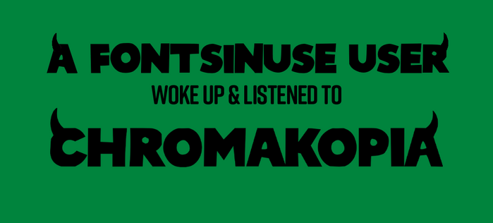
“Chromakopia” is set in Poleno SemiBold, modified to have horns on the first and last letter. It is complemented by Rift Soft which is used on smaller text, likely to balance the hard, uneven look of Poleno.
Source: www.youtube.com License: All Rights Reserved.
Title card used in the promotional videos
Source: www.chromakopia.com License: All Rights Reserved.
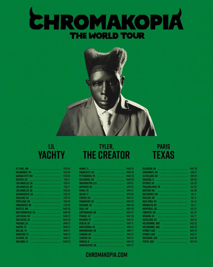
Chromakopia World Tour poster. “The World Tour” is also set in Poleno SemiBold.
Source: chromakopiatour.com License: All Rights Reserved.
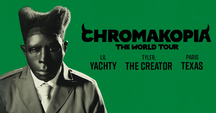
An alternate version of the poster
Source: www.chromakopia.com License: All Rights Reserved.
The website includes a text generator. I had to do it.
Source: x.com License: All Rights Reserved.
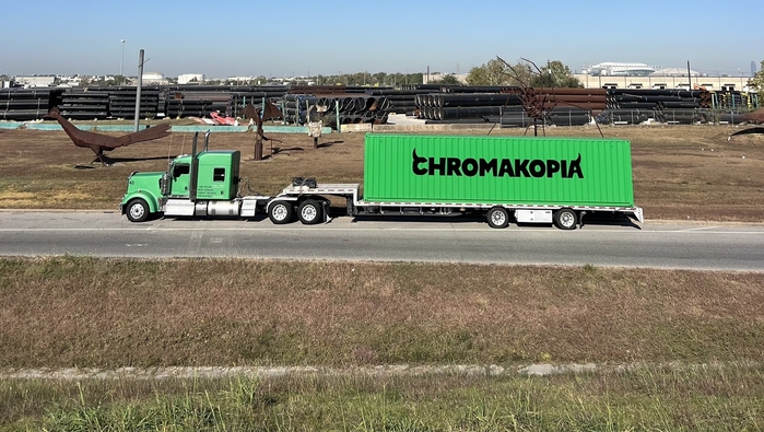
Promotion of the album via “Chromakopia’s Trucking Company”, the title displayed loud and proud
Source: www.chromakopia.com License: All Rights Reserved.
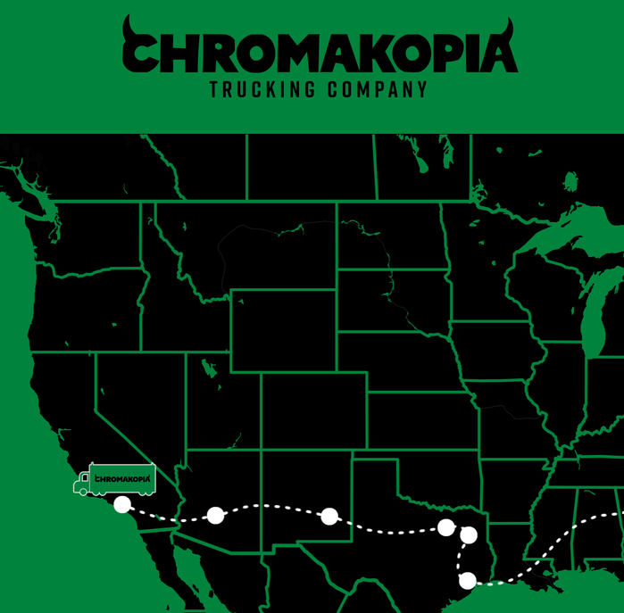
A map tracker on the website, showing where the trucks are located.
This post was originally published at Fonts In Use