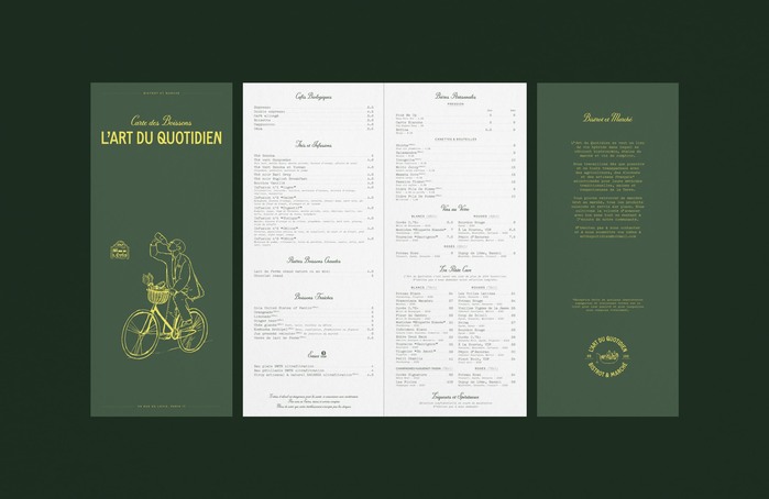
L’Art du Quotidien branding
Source: www.frenchbreadstudio.com License: All Rights Reserved.


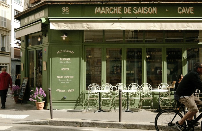
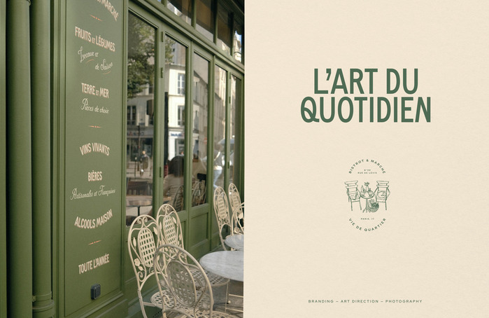
L’Art du Quotidien is a hybrid living space, fully integrated into its neighborhood in Paris, centered around a seasonal bistro and a marketplace. The offerings are exclusively products from small local producers committed to traditional and organic farming methods.
We created a tailor-made visual identity that aligns with L’Art du Quotidien: highlight the product, transparency, craftsmanship, small producers, conviviality, and quality, all while respecting an ecological and responsible approach. The goal for them was to become an institution in a vibrant Parisian neighborhood, showcasing exceptional expertise with an excellent quality-to-price ratio.
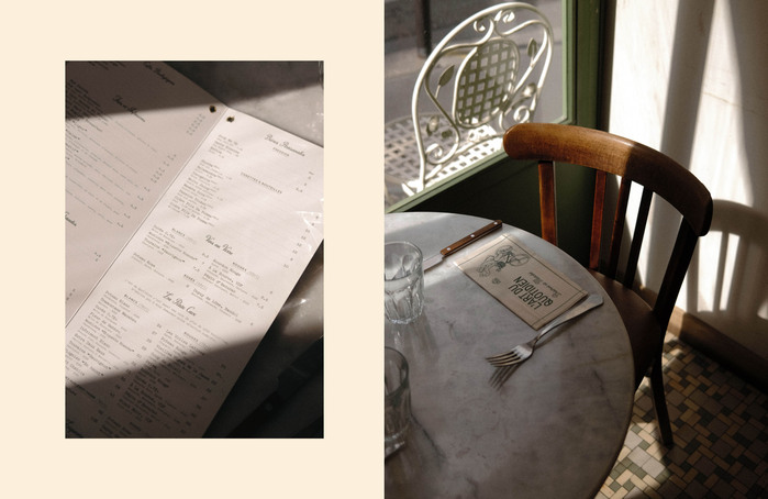
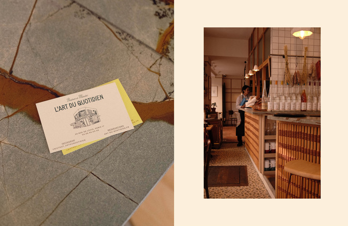
With a space thoughtfully designed in every detail, the visual identity aimed to be modern without being trendy. The concept of becoming an institution was conveyed through classic and timeless elements such as the stamp. The use of illustrations reinforced the idea of closeness, simplicity, and transparency with the customer.
Sign painting by Ateliers Victor Bert, illustration by Sébastien Gay, photography by French Bre(a)d Studio.
Source: www.frenchbreadstudio.com License: All Rights Reserved.
Source: www.frenchbreadstudio.com License: All Rights Reserved.
Source: www.frenchbreadstudio.com License: All Rights Reserved.
Source: www.frenchbreadstudio.com License: All Rights Reserved.
This post was originally published at Fonts In Use