The arcane alphabets of Black Sabbath


Black Sabbath’s first four studio albums – Black Sabbath, Paranoid, Master of Reality, and Vol 4, released in rapid succession between 1970 and 1972 – laid much of the groundwork for the heavy metal movement. While there were other bands playing heavy blues-inspired hard rock at the time, the gloomy, doom-laden stylings of Black Sabbath helped fuel their early success as one of the first – and most influential – heavy metal acts ever.
Sabbath’s dark aesthetic was established from the start with help from the visuals on their records. Their first four albums were released through the Vertigo record label in London and, as such, involved Vertigo’s in-house designer at the time, Keith Stuart Macmillan. Macmillan studied photography at Royal College of Art but has worked in various roles related to the visual side of music – from design to directing music videos. Early in his career he signed with the moniker Marcus Keef (or simply “Keef”) to avoid confusion with photographer Keith Lionel McMillan who likewise worked with rock musicians at the time.
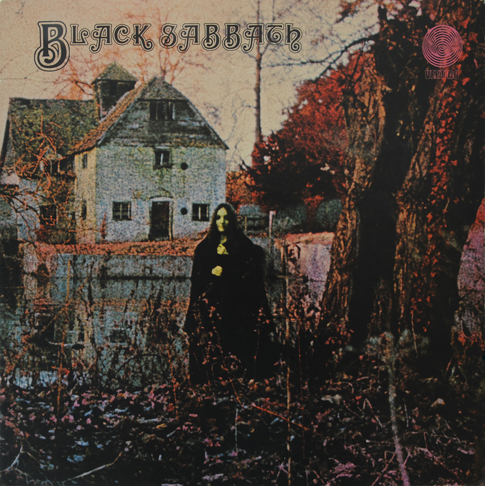
In addition to his stylized photography, Keef also contributed design work to those first four albums, which – along with designs from the Bloomsbury Group – include now-iconic titling graphics. At least for the first two releases, he entrusted a fellow student from the Royal College of Art with the typography: it was Sandy Field who designed the titling for Black Sabbath and Paranoid.
Despite the ubiquity of those albums and the many design imitations they’ve inspired, the sources of their letterforms have been largely undocumented and obscured by the passage of time. Some of the albums’ titling has often, mistakenly, been assumed to be totally hand-lettered. Even when a typeface was suspected as a starting point, exact sources have proven elusive.
This situation is not surprising when you consider those first four Sabbath covers were all designed using uncommon sources from the era of phototype and dry transfer lettering – a relatively short period after the peak of letterpress printing but before the digital revolution. Type styles from larger companies of that era, like Photo-Lettering and Letraset, have been documented fairly well in subsequent years. But there were also smaller companies and publications at the time whose designs are still much less known today, partly because the original reference materials are so scarce.
All four of the first Black Sabbath records got their titling styles from exactly those kinds of niche sources.
Black Sabbath (1970)
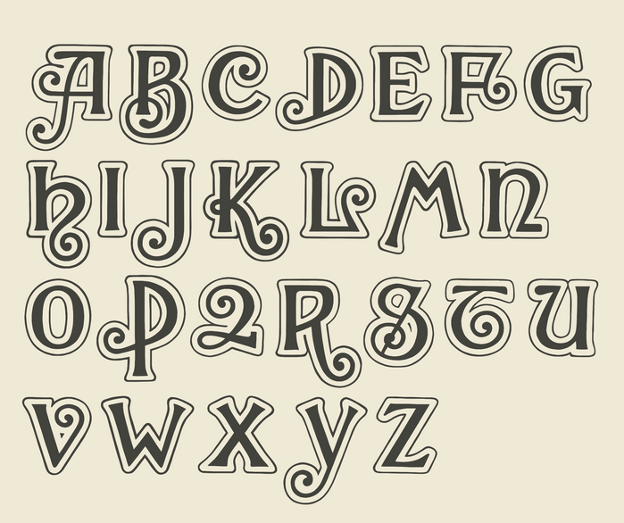
Though it is multiple generations removed, the titling style of the first, self-titled Black Sabbath album has its origins in an ornamented typeface from the Central Type Foundry called Harper, first released in 1882. The curly design was part of a wave of type styles from that era that tried to evoke a sense of exoticism through unusual forms.
Harper included a set of outlined or “rimmed” initials which seem to have outlived the core design through adaptation by various other publishers over the years, for various other formats. One such adaptation was for fonts of wood type by the British company Day & Collins, who sold it as Harper Rimmed Initials. This adaptation, in turn, inspired many subsequent interpretations, especially during the era of phototype and dry transfer lettering.
One particular take on that design wasn’t even a proper typeface in the traditional sense, but instead was published as a standalone alphabet in the Twelve Unusual Alphabets Compiled by Crosby/Fletcher/Forbes portfolio (c.1970). This adaptation of Harper Rimmed Initials appears to be the one used by Field to compose the titling for the cover of Black Sabbath.
Coincidentally, the Harper Rimmed Initials seem to have also influenced the design of the logo for Orange amplifiers around the same time. Black Sabbath weren’t regular Orange users but they were famously seen playing them for their 1970 performances on the West German Beat-Club television show.
Paranoid (1971)
Following the success of their debut, the pressure was on for Black Sabbath to quickly release a follow-up album. Keef again handled the photography and design. The photography for the cover was prepared with the idea that the album would be titled War Pigs (after the song), however the title was changed to Paranoid at the last minute and the short turnaround meant there was no time to prepare new photography, resulting in an unintended mismatch of imagery and text. Despite this mix-up, the album was a hit, furthering Sabbath’s heavy metal influence.
As with the first album, Field’s title design for Paranoid made use of a fairly recent, somewhat obscure adaptation of an earlier letter style. This time, though, instead of using an alphabet from a book based on a typeface, it was a typeface based on an alphabet from a book.
In 1961, the Lettera 2 book was released as the second entry in the Lettera series of alphabet sourcebooks, published by Arthur Niggli Ltd. The book, edited by Armin Haab and Walter Haettenschweiler, included a collection of various alphabet designs – some taken directly from typefaces, others from original lettering samples. One of the samples was an original alphabet, titled Lettre Coupé, designed by Haettenschweiler with a hand-cut appearance.
Some designers adapted the alphabet for album artwork, sometimes modifying glyphs, altering the proportions, and/or improvising characters that weren’t included in the original sample.
By 1969, the alphabet had been adapted into a proper typeface by the Lettergraphics phototype company, offered under the name Black Casual. The typeface added new counterforms to A, B, and P, as well as a few new characters (L, comma, ?, and &). Black Casual appears to be what Field used to compose the titling for Paranoid. Given the Black name, the use might be considered a partial LTypI.
Perhaps inspired by the dark vibes of Paranoid, Lettre Coupé was adapted in 1973 for the title sequence of blaxploitation horror film Scream Blacula Scream.
Master of Reality (1971)
The cover of Sabbath’s third album dropped photography entirely and went all-in on a text-only treatment, with large, bold, in-your-face, typography – twisted and warped as if being shaken by high-amplitude vibrations, or distorted by altered perception. While the photography of the first two Sabbath records gave them a dark, otherworldly feeling, the Master of Reality cover also puts an emphasis on HEAVINESS.
The darkness wasn’t abandoned though. Below the purple band name, the album’s title for the first pressings was only distinguished from the black background via embossing, resulting in raised letterforms that are equally as tactile as they are visual. If the question is “How much more black could this be?”, the answer is: “None. None more black.”
Eventually the record companies releasing new editions of the album decided that “none more black” was too black and/or embossing was too expensive, so the cover has seen many variants over the years with the title alternately colored gray, white, orange, green, pink, black with white outline, and more. Some releases have also colored the band’s name in alternating rainbow colors.
Despite the text-only cover, Keef’s stylized photography still made an appearance on a poster included as an insert with the original release. The design for the album is credited to Bloomsbury Group, a British firm active in the 1970s (apparently named after the early-1900s intellectual collective of the same name), with art direction by Mike Stanford.
The typeface on the cover is, yet again, an obscure phototype interpretation of an existing design. In this case, the ancestral type is Rudolf Koch’s Kabel which originated in the late 1920s. The reimagined adaptation used for Master of Reality is Lodwick Kabel, which pushes the weight of Kabel beyond any of its previous incarnations, and even heavier than ITC or Letraset would later take their interpretations in 1975 and 1980, respectively.
Lodwick Kabel was available by 1970 from the Photoscript phototype company, and presented as an “Exclusive Royalty face”. The name suggests a possible connection to Hardy/Lodwick (a.k.a. Hardy/Escasany/Lodwick), a studio that was active in London in the 1970s – but that connection is unconfirmed.
Since its release, the Master of Reality cover has been imitated many times, perhaps most prominently by British rock group Arctic Monkeys. Even Black Sabbath themselves have rehashed the warped sans-serif effect for a Black Lives Matter benefit T-shirt.
Vol 4 (1972)
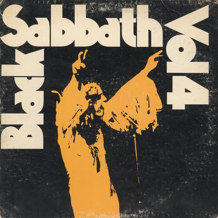
The cover for Sabbath’s fourth album, appropriately titled Vol 4, continues the theme of extra-large, extra-bold type from Master of Reality. As with the precursor, the design is attributed to Bloomsbury Group with photography by Keef – this time credited by his real name, Keith Macmillan. For this release, Keef’s photography was brought back onto the cover, showing Ozzy with arms raised, giving his signature gesture of victorious peace signs ✌️ (not to be confused with the devil horns 🤘 popularized later by Ozzy’s successor, Ronnie James Dio). The image is treated more as a graphic element than a photograph, with a high-contrast monochrome effect, framed compactly on three sides with tightly-spaced, extra-heavy, geometric, sans-serif type. As with the previous albums, the name of the band and the name of the album are set in the same size and face.
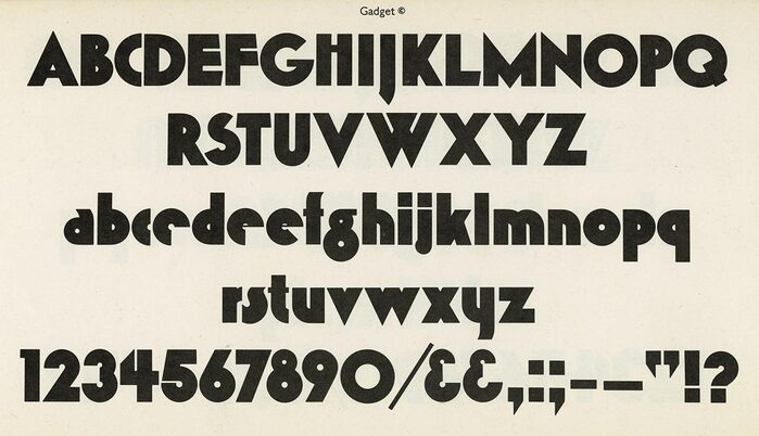
Though there were plenty of heavy geometric sans-serif typefaces being used around that time with similar structural features, the style used for Vol 4 seems to be a primarily original design, and not a direct adaptation of some other existing face. The typeface in question is Gadget, available by 1971 from Alphabet Photosetting, who listed it as a copyrighted design. Dry transfer lettering sheets of a Lined variant of the face were produced by Zipatone, and they credit the design to Peter Bennett.
Due to the obscure nature of Gadget, many people over the years have assumed the Vol 4 titling was a case of one-off lettering and not composed with a proper typeface. As such there have been multiple typefaces in more recent years using the iconic design as inspiration for creating new typefaces. It’s interesting to see how others extrapolate the letters from the cover into an entirely re-imagined set of glyphs – with some letters matching Gadget quite closely but others being taken to totally new and different places. Some examples include OZIK, Volume Dealers, and VolumeFour.
The iconic nature of Vol 4’s cover also makes it a common subject for imitation and parody, especially with assistance from those newer digital fonts.
The Vol 4 design came full circle recently when the digital VolumeFour typeface inspired by the album cover was used for promotional materials and on-stage graphics for Black Sabbath’s final show, “Back to the Beginning”, on July 5, 2025 – less than three weeks before the passing of Ozzy Osbourne.
Though Black Sabbath went on to release plenty of other noteworthy albums, the first four seem especially foundational. They are also unique in their common use of obscure typefaces, and their involvement of Keef for visuals.
Finding proper identifications for these typefaces has only been possible with the efforts of others, sometimes as a collaborative effort that unfolded over literal years in the comments of old Fonts In Use posts. Special thanks are due to Florian Hardwig, Daylight Fonts, Mark Simonson, Patrick Concannon, and Fontastique Faces. Additionally, Kory Grow’s interview with Keith Macmillan for Rolling Stone was extremely insightful, even though it didn’t discuss specifics of typography. Finally, investigative work for articles like this would be nearly impossible without Discogs and the Internet Archive.
If you have any further information about these typefaces or their use on the Black Sabbath records, please leave a message in the comments below or on the separate entries for each album. Those entries include more details about supporting typefaces, with additional detailed images:
✌️
This post was originally published at Fonts In Use


