“Good Typewriting Paper” packaging
Published July 26, 2025
By FontsInUse
Contributed by Ian Hooker
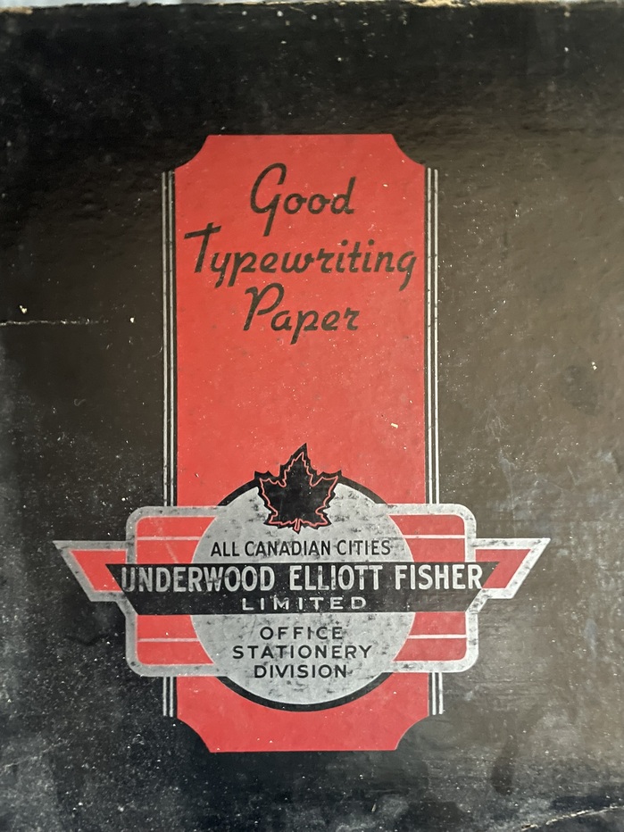
Photo: Ian Hooker. License: All Rights Reserved.

This post was originally published at Fonts In Use
Photo: Ian Hooker. License: All Rights Reserved.
Cover of a box of letterhead paper by Underwood Elliott Fisher Limited, from late 1940s or early 1950s in Canada. “Good Typewriting Paper” is lettering based on Gillies Gothic. The rendition seen here is a tad more upright than the 1930s script typeface by the Bauer foundry, and also features a rounder form for w. Compare to the glyph set for Flott halbfett, which was the German name for Gillies Gothic Bold.
The text at the bottom is presented in gothic caps of various widths and weights. This part likewise is lettering but not necessarily based on particular typefaces.
This post was originally published at Fonts In Use
Read full story.
WRITTEN BY
FontsInUse
An independent archive of typography.
More from FontsInUse