KYNE – Adaptation exhibition, poster, catalog
Koji Maeda. License: All Rights Reserved.


Fukuoka is the biggest city on the Japanese island of Kyushu, and the capital of the eponymous prefecture. It is home to the communal Fukuoka Art Museum, opened in 1979 and famous for its broad selection from traditional Japanese to European Art. Fukuoka is also the hometown of the artist KYNE [pronounced key-ne, ne like in “never”] who was born there in 1988.
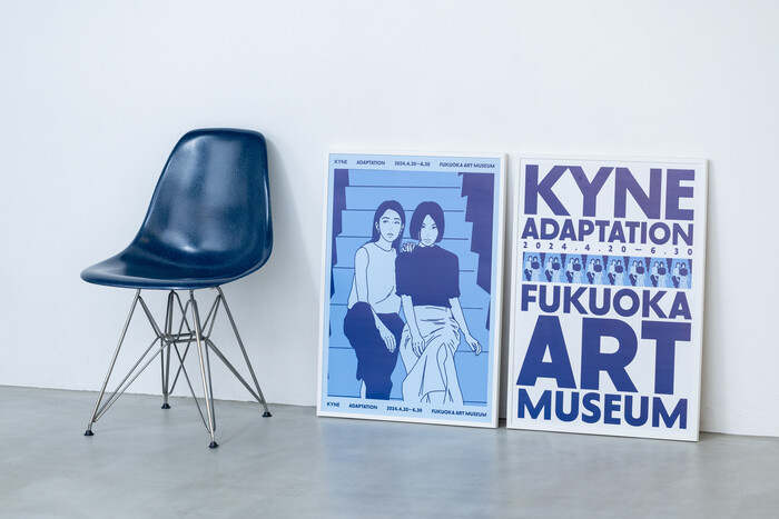
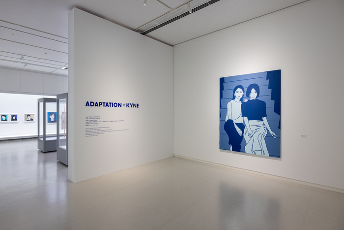
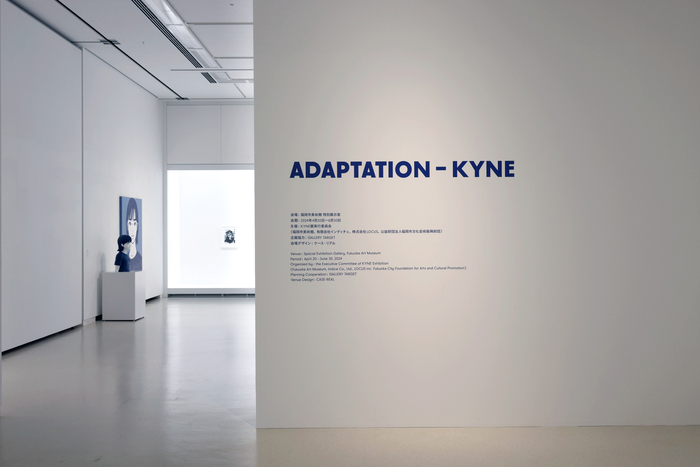
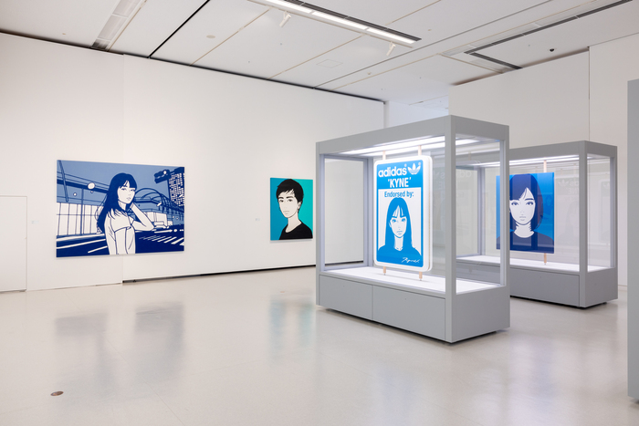
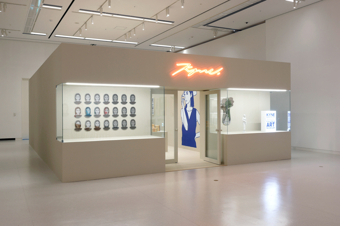
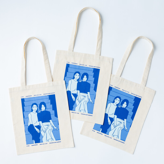
Adaptation, on display at Fukuoka Art Museum from April through June 2024, was KYNE’s first major solo show, gathering 150 artifacts that allowed to trace his path from urban street art to international galleries and 100,000 followers on Instagram. KYNE’s art is rooted in the Japanese pop culture of the 1980s and forward, inspired by record sleeves, manga, anime and at times as well by the kawaii aesthetic. His graphically stylized portraits of cool young women looking at the viewer caught the attention of magazines and fashion brands and earned him national attention. Currently KYNE works predominantly with acrylic painting and silkscreen printing, what connects him to the art of Andy Warhol.
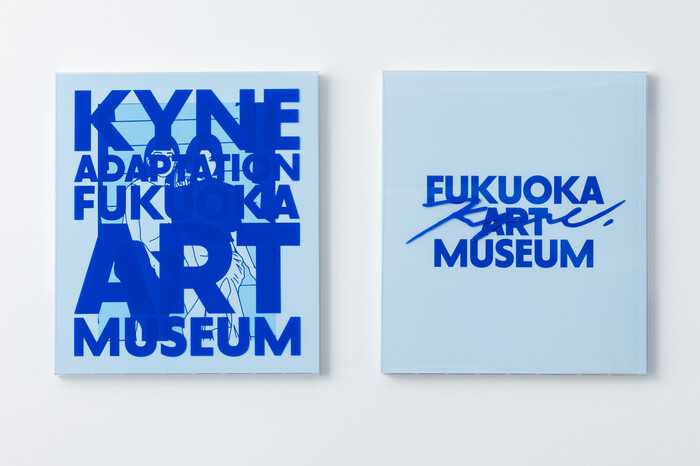
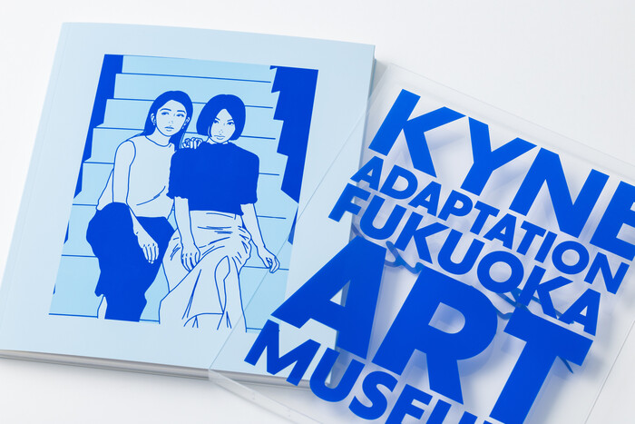
The pictures in this post show the scenography designed by Koichi Futatsumata of CASE-REAL. The key visual and exhibition catalog are the works of the Office for Typography, lead by Chi-Long Trieu and operating from Lausanne, Switzerland, and Osaka, Japan. Born in 1988 – the same year as KYNE – in Fribourg, Switzerland, Trieu studied Visual Communication, specializing in typography and typeface design, at ECAL in Lausanne, where he teaches today. His typeface project Basel earned him a Swiss Culture Award in 2017.
The typeface featured here is a more recent addition to Trieu’s œuvre: the Paramount family, published by Production Type in 2023. Paramount explores the borders between humanistic and geometric concepts for the design of a sans serif, which means that pure geometric rigidity finds itself softened and humanized. The family consists of two basic styles, Paramount and its funkier sibling Paramount Neo that floats out into a futuristic realm. Additionally, both styles offer a variant with rounded stroke endings instead of straight ones. Ranging from Light to Black and including an oblique Italic, the typeface family offers a wide range of stylistic alternates that make them a great starting point for logotypes.
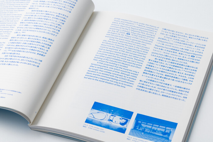
The typography around the Adaptation exhibition works with Paramount Medium and Paramount Black, rendered in dark blue instead of black, a visual reference to the blue tones used by KYNE in a series of paintings. The Latin Paramount is paired with the Japanese TB Gothic for the typesetting of the catalog. In sum we see a firework of minimalism at its best: the graphically reduced style of KYNE’s artworks, the sober scenography by CASE-REAL, and on top of that the compellingly plain visual language of Office for Typography.
Koji Maeda. License: All Rights Reserved.
Koji Maeda. License: All Rights Reserved.
Koji Maeda. License: All Rights Reserved.
Koji Maeda. License: All Rights Reserved.
Koji Maeda. License: All Rights Reserved.
Koji Maeda. License: All Rights Reserved.
Koji Maeda. License: All Rights Reserved.
Koji Maeda. License: All Rights Reserved.
This post was originally published at Fonts In Use