Mir’a
Source: zaina.international License: All Rights Reserved.


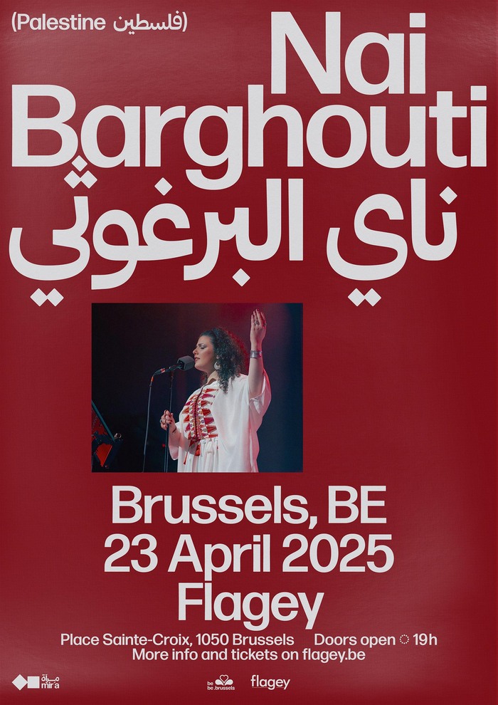
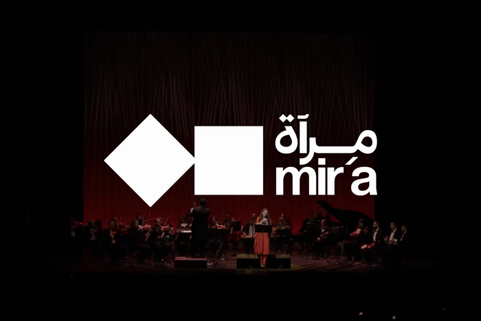
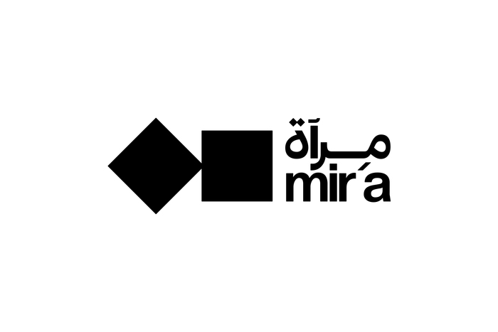
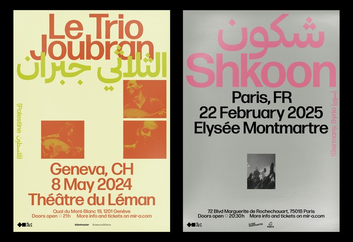
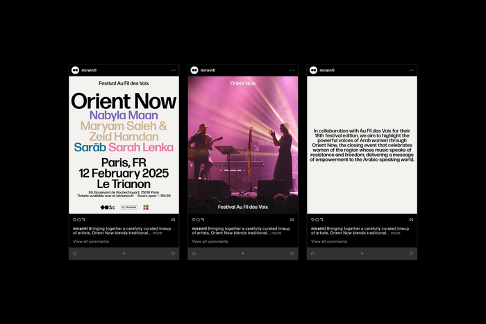
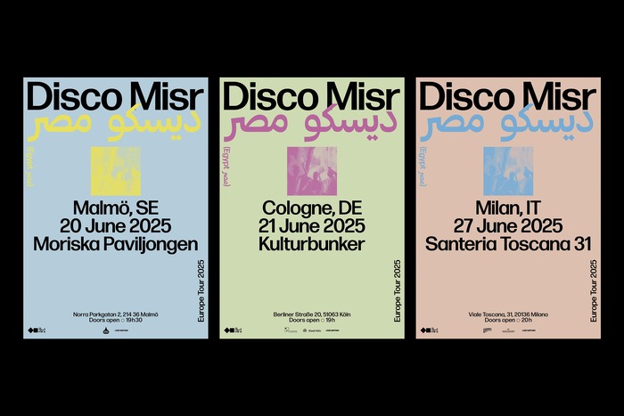
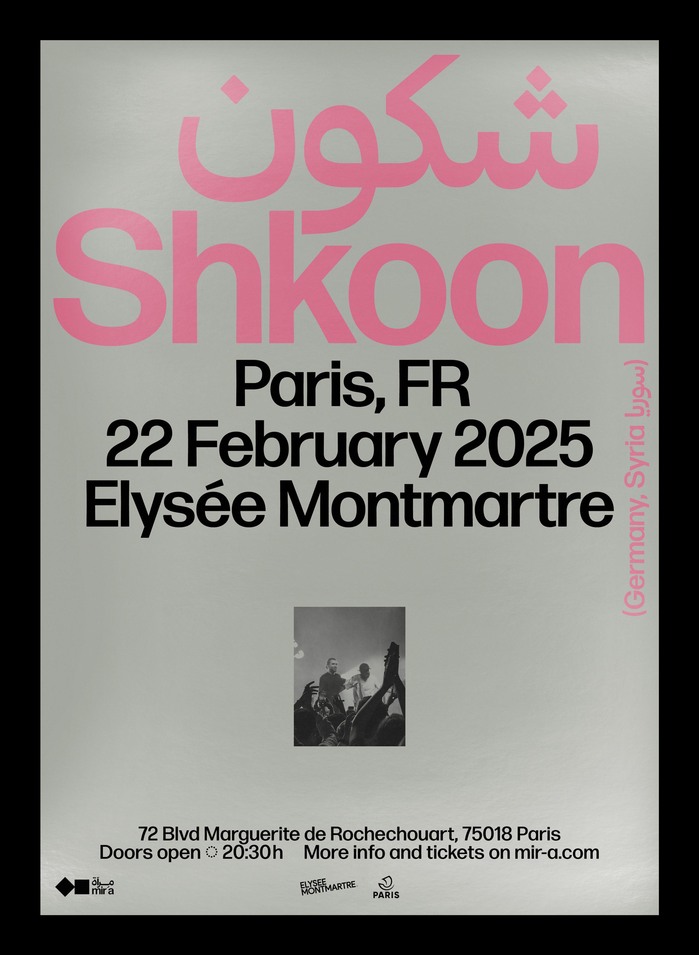
Mir’a creates cultural events such as concerts, screenings, and exhibitions to promote Middle Eastern and North African artists in some of Europe’s most prestigious venues. Their new visual identity was created by Zaina, and is typeset exclusively in Forma DJR Arabic, designed by Wael Morcos and Khajag Apelian, and its companion Latin that was revived by me (David Jonathan Ross) based on the original Latin from Nebiolo.
Zaina describes their thinking behind the identity:
The visual identity reflects Mir’a’s unifying mission. The bilingual logo design plays on the relationship between the two wordmarks, with shared punctuation and harmonious stacking. The symbol evokes cultural synergy, emphasising the connection between Arabic and Latin writing to create a simple yet striking icon. The typography-led communication uses both scripts assertively to present the artists and their native countries in a spirit of representation and integrity.
I worked with Zaina to customize Forma DJR Arabic with a series of fine-tuned weights between Medium and Bold, and the alternate R and j deployed as the default forms.
This is the first time I have seen Forma’s Latin and Arabic bouncing off of one another in this way, and I am so happy to see Zaina harnessed this interplay so successfully in their work.
Source: zaina.international License: All Rights Reserved.
Source: zaina.international License: All Rights Reserved.

Source: zaina.international License: All Rights Reserved.
Source: zaina.international License: All Rights Reserved.
Source: zaina.international License: All Rights Reserved.
Source: zaina.international License: All Rights Reserved.
Source: zaina.international License: All Rights Reserved.
This post was originally published at Fonts In Use