Anna Krzanicka-Bombczynska
Published July 3, 2025
By FontsInUse
Contributed by Smuss Studio
Source: lenivastudio.com Leniva Studio. License: All Rights Reserved.


Leniva Studio. License: All Rights Reserved.

Leniva Studio. License: All Rights Reserved.

Source: www.behance.net Leniva Studio. License: All Rights Reserved.
This post was originally published at Fonts In Use
Source: lenivastudio.com Leniva Studio. License: All Rights Reserved.
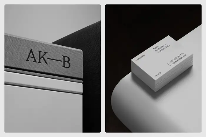
Identity for the law firm of Anna Krzanicka-Bombczynska. From the designers of Leniva Studio:
The design system balance serif and sans-serif type to reflect both precision and approachability – two traits essential in legal practice. The logotype is built around the clients surnmae and adapts to context: compact and personal on a business card, more formal and spaced out in documents. Instead of a hyphen, we use a pause — a subtle graphic gesture that gives the name space to breathe.
The identity utilizes a soft gray palette, and is set in its entirety in STK Bureau Sans and STK Bureau Serif by Smuss Type Kiosk.
Leniva Studio. License: All Rights Reserved.
Leniva Studio. License: All Rights Reserved.
Source: www.behance.net Leniva Studio. License: All Rights Reserved.
This post was originally published at Fonts In Use
Read full story.
WRITTEN BY
FontsInUse
An independent archive of typography.
More from FontsInUse