Anders Normal
License: All Rights Reserved.

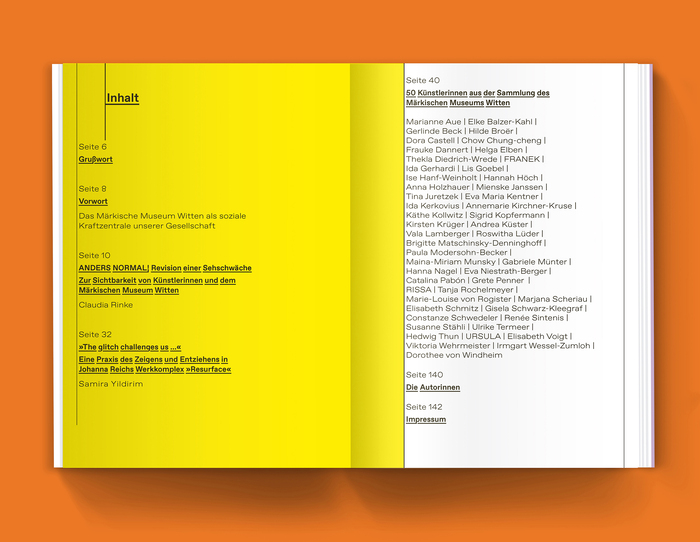
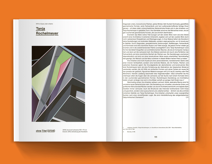
In the exhibition Anders Normal (“differently normal”), the Märkisches Museum Witten deals with the historical and existing underrepresentation of female artists. With an initial critical look at its own collection, 50 female artists from the holdings are presented. A sustainable museum practice must face the task of illuminating and questioning its own blind spots, the gaps in the art canon and its own museum and collection history.
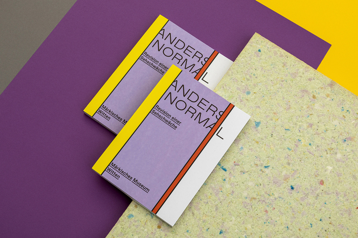
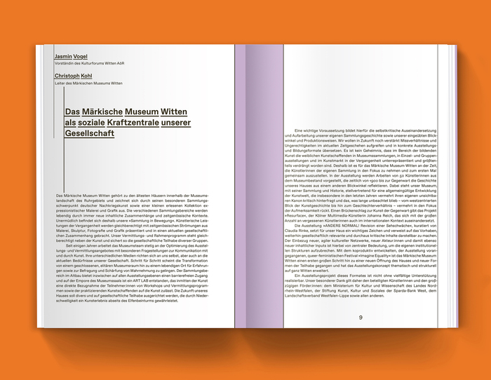
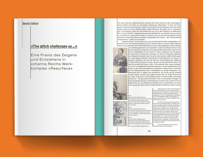
The design of the catalog as well as the exhibition, traces the gaps in visibility that institutions exhibit. Without pointing fingers, the texts provide themselves with the space they deserve and push the color fields and engravings into their place. Colorful and bright, it reflects the wide spectrum of lifestyles and ways of working, recognizable as a rainbow directly on the open spine of the catalog.
The typography uses Favorit by ABC Dinamo, in two widths: Regular and Extended. Favorit’s Underline style is used for headlines and subheaders.
License: All Rights Reserved.
License: All Rights Reserved.

License: All Rights Reserved.
License: All Rights Reserved.
License: All Rights Reserved.
This post was originally published at Fonts In Use