Skrift i Oslo exhibition

Source: www.grafill.no Daniel Spiro. License: All Rights Reserved.

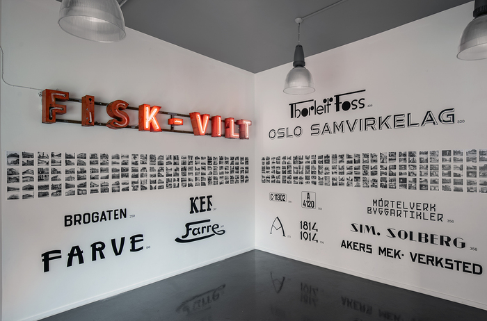
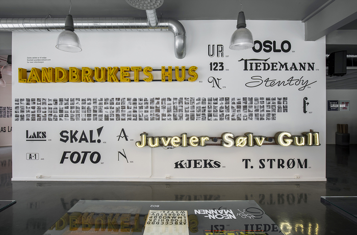
Skrift i Oslo (“Letters in Oslo”) was an exhibition documenting signage in Oslo between 1864 and 1964. The exhibition featured 704 photographs of handmade sings and lettering, and aimed to reveal Oslo’s visual dialect; from the time when letters were produced locally. Many of those old signs were further developed and extrapolated into full font families, forming the foundation of the type foundry Store Norske Skriftkompani. The exhibition was designed by Arve Båtevik.
The Plakat cut of Store Norske Nord is used throughout the exhibition identity.
Several other of Store Norske Skriftkompani’s typefaces were showcased in the exhibition: Store Norske Samvirke, Store Norske Neon, Store Norske Jernskrift, Store Norske Mekaniske and Store Norske Bygg. They are all elaborations on letterings found in the photographs.
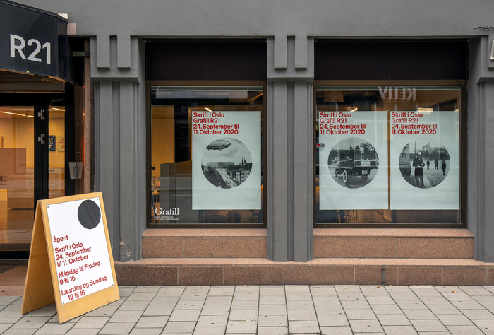
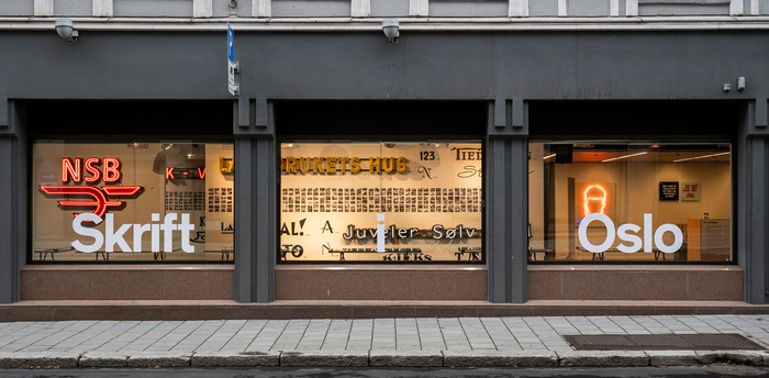
The exhibition was shown at Grafill R21 in Oslo.

Source: www.grafill.no Daniel Spiro. License: All Rights Reserved.
Source: www.grafill.no Daniel Spiro. License: All Rights Reserved.
Top right: “Oslo Samvirkelag” is set in Store Norske Samvirke. Bottom right “Akers Mek- Verksted” is set in Store Norske Mekaniske. “Mørtelverk Byggartikler” is set in Store Norske Bygg.
Source: www.grafill.no Daniel Spiro. License: All Rights Reserved.

Source: www.grafill.no Daniel Spiro. License: All Rights Reserved.
The materials that were referenced for Store Norske Skandia
Source: www.grafill.no Daniel Spiro. License: All Rights Reserved.
Source: www.grafill.no Daniel Spiro. License: All Rights Reserved.
This post was originally published at Fonts In Use