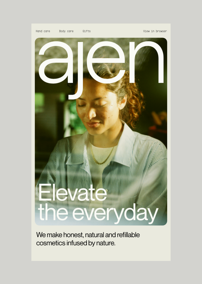
Ajen
Source: the-brandidentity.com The Phoney Club. License: All Rights Reserved.


Rotterdam-based creative studio The Phoney Club developed the branding and art direction for personal care brand Ajen. From Ritupriya Basu’s article for The Brand Identity:
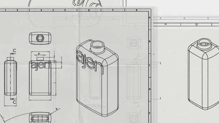
“Building on the brand story, we delved into the history of Dutch typography. The Netherlands boasts a rich tradition in type design – something we can be quite proud of for such a small country! This exploration led us to Wim Crouwel, the renowned graphic designer born in 1928, whose iconic typefaces, like Gridnik, remain influential to this day,” de Wild explains. Driven by this legacy, the team chose PP Supply Mono as the secondary typeface, reflecting the clean, structured heritage of Dutch design. “The primary typeface, Neue Montreal, guided this selection, ensuring a cohesive and harmonious relationship between the two typefaces within the brand’s identity,” says de Wild.
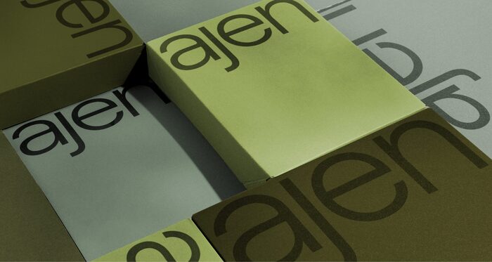
The logo appears to be based on Roobert.
Source: the-brandidentity.com The Phoney Club. License: All Rights Reserved.
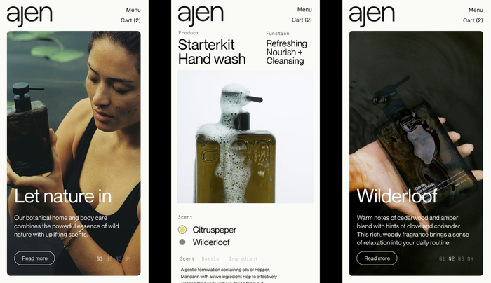
Source: the-brandidentity.com The Phoney Club. License: All Rights Reserved.
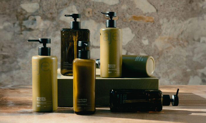
Source: the-brandidentity.com The Phoney Club. License: All Rights Reserved.
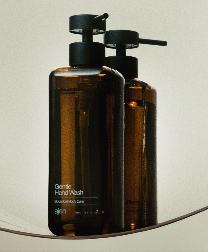
Source: the-brandidentity.com The Phoney Club. License: All Rights Reserved.
Source: the-brandidentity.com The Phoney Club. License: All Rights Reserved.
This post was originally published at Fonts In Use