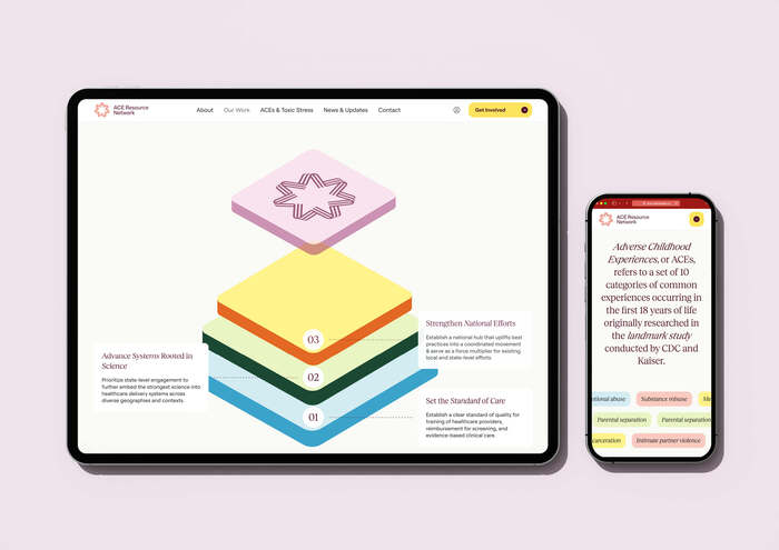
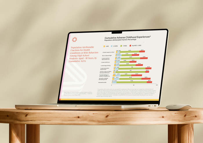
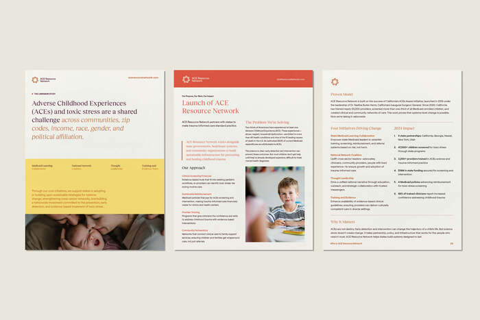
ACE Resource Network
Source: numinousco.com License: All Rights Reserved.

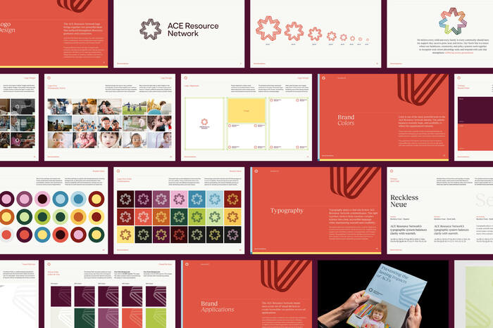
A brand that has to feel scientific and human can't lean on the logo to do it. The type carries the tone everywhere the logo isn't. So for ACE Resource Network (ARN) we paired two faces that pull in opposite directions on purpose. One brings the warmth. One brings the clarity. Together they sound like one voice.
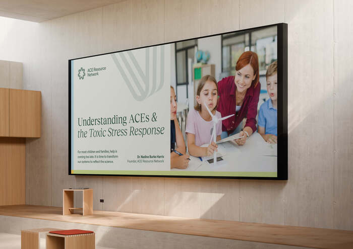
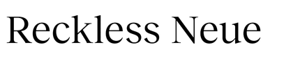
Reckless Neue does the feeling. It's the serif in the headlines and titles, the moments that need to land with some weight and warmth. It's refined without being stiff, with softer edges that keep it human instead of academic. This is the face that makes a brand about childhood trauma feel grounded and trustworthy rather than clinical and cold. When ARN needs to sound like a person who cares, this is the voice.
Roobert does the work. It’s the sans serif running through all the body copy, the captions, the labels, every place readability has to win. Clean and modern, but never sterile. It holds up across a dense policy brief and a quick social caption without changing character. This is where the science lives, the long reads a clinician actually sits with, set in a face that's easy to trust and easy to stay with.
Two faces, one job. The serif carries the warmth, the sans carries the rigor, and the brand needs both at full strength. That’s the whole tension of ARN, set in type.
Source: numinousco.com License: All Rights Reserved.
Source: numinousco.com License: All Rights Reserved.
Source: numinousco.com License: All Rights Reserved.
Source: numinousco.com License: All Rights Reserved.
Source: numinousco.com License: All Rights Reserved.
This post was originally published at Fonts In Use