The Typography of whitehouse.gov, 2000–2026


Since the early 2000s, the official website of the United States federal government has not only been a crucial information and media outlet, but has also come to carry politically charged stylistic connotations. With each revision and evolution, the site’s design and typography has testified to changes in infrastructure, technology, ideology, and mainstream taste, and has eventually come to allegorize different eras’ political realities. With a little help from the Internet Archive’s Wayback Machine and a browser window screenshotted at 1280px width, I will now retrace the typographical history of whitehouse.gov, demarcated by presidential terms.
Bush 2000–2004
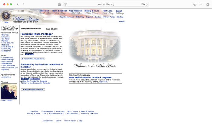
Although the Wayback Machine has been snapshotting whitehouse.gov from as early as 1996, before the year 2000 it was just a makeshift search portal to White House articles and images. During the first administration of George W. Bush, whitehouse.gov became a properly designed website, rudimentarily laying out a rich body of government information with an HTML table layout at 755px width.
Author screenshot. License: CC BY-NC-ND.
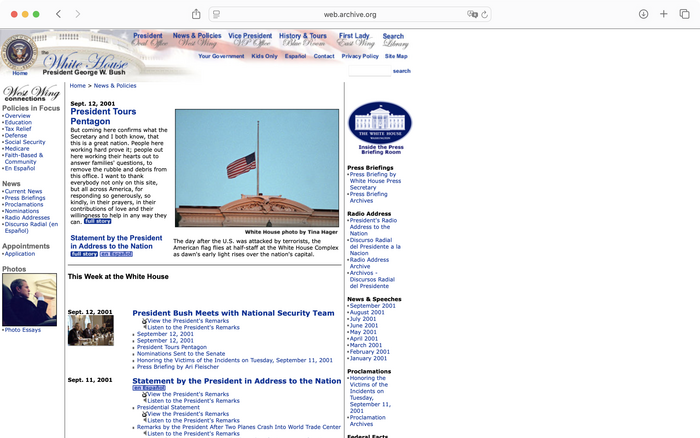
The whitehouse.gov homepage on September 12, 2001, the day after the infamous strike.
Author screenshot. License: CC BY-NC-ND.
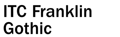
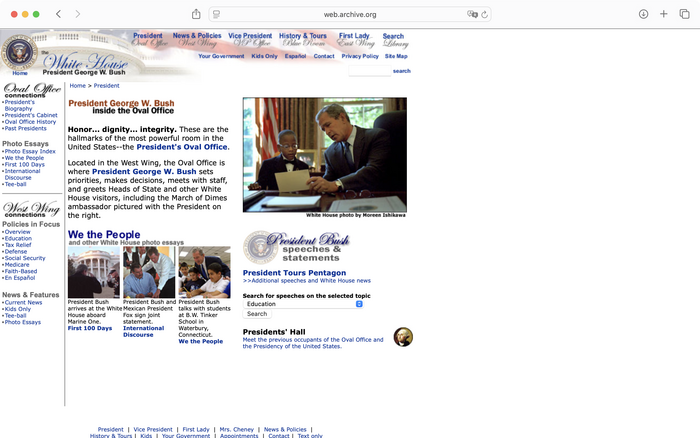
The bigger headings on this page (e.g., “President George W. Bush Inside the Oval Office”) use a paradigmatic American typeface, Franklin Gothic (here ITC Franklin Gothic), embedded in static images. The smaller ones, such as “President Tours Pentagon” and “Presidents’ Hall,” simply use a bigger, bolder style of the body typeface: Verdana.
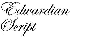
Aside from the ITC Edwardian Script embedded in many images, also notable is the presence of ITC Franklin Gothic in some of the headlines. Despite Franklin Gothic’s status as the quintessential American gothic, it never reappeared in later administrations’ sites.
Bush 2004–2008
Still hampered by bandwidth limitations and crude browser technology, whitehouse.gov during Bush Junior’s second term followed a basic three-column layout that was popular at the time. By this point, though, the designers had enlarged the table-body width to 900px and centered it horizontally in the HTML document.
Author screenshot. License: CC BY-NC-ND.
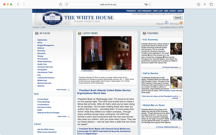
October 1, 2008. This was shortly after the financial market crash. The top right corner features links not only to the president’s and first lady’s profiles, but also to those of the vice president and second lady.
Author screenshot. License: CC BY-NC-ND.
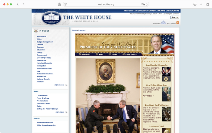
The president’s profile page. The ample use of gold ornamentation and script type eerily presages Trump.
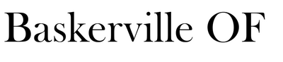
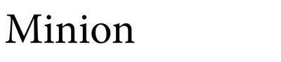
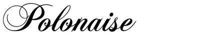
Although the site’s designers set live text in Arial and Georgia, they embedded the balance of the typography in images, and used a variety of typefaces, like Baskerville Old Face in all caps for “The White House,” and Minion Bold with small caps for “President of the United States.” “George W. Bush” is in Polonaise. Some of the card titles are set in all-caps Trebuchet.
Obama 2008–2012
Under Obama, whitehouse.gov expanded the Bush era’s gradient reflections and drop shadows (then still built into images), evolving the overall look into a juvenile version of what would later become known as skeuomorphism, which emerged in phpBB forums and peaked in iOS 6. This early consciousness of typographic and design style on a web page steadily matured, crystallizing in the latter half of Obama’s second term.
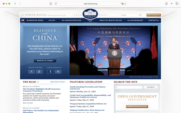
Author screenshot. License: CC BY-NC-ND.
July 31, 2009. The hero section contents document a deepening of US–China relations: The former’s recovery from the 2008 financial crisis depended on the latter’s contribution.
Author screenshot. License: CC BY-NC-ND.
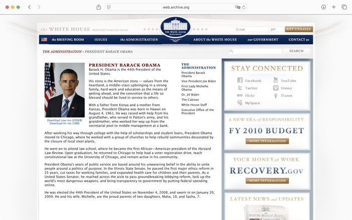
Barack Obama’s about page has significantly fewer gold accents than his predecessor’s.
The first Obama administration’s website slowly started to modernize, with the main body width expanding to approximately 1024 pixels. A burgeoning sense of web interactivity (as opposed to a web page thought of as a static onscreen document to be graphically laid out) also began to take shape, in the form of auto-rotating carousels in the “above the fold” section to highlight key policy focus.
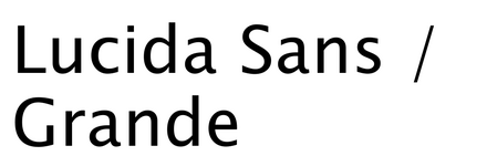
Typographically, the Obama site inherited a lot from its predecessors, but started to embed type into images more extensively, mostly with various styles of Hoefler Text set in all caps. Given the availability of similar Garalde typefaces at the time, the rationale for choosing Hoefler Text is not completely clear – except that Hoefler Text had long been bundled with Mac OS, and would’ve conveniently appeared in the graphics editor’s type panel. Running text was set in the calligraphically informed Lucida Sans / Grande, whose open structure and legibility led it to dominate the body text of many other websites at the time, including those of Apple and Facebook.
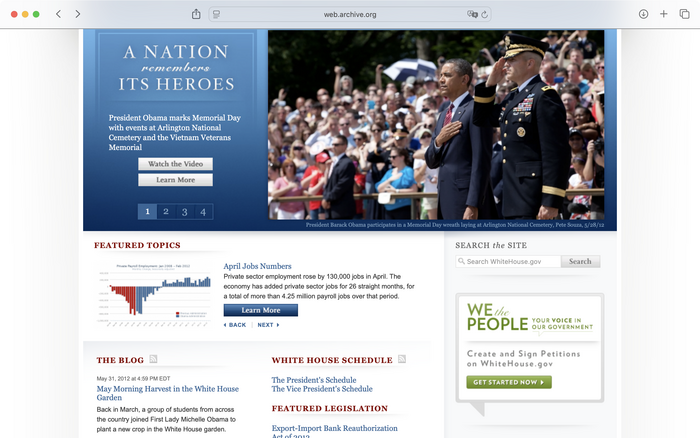
Author screenshot. License: CC BY-NC-ND.
May 31, 2012. Here, Brandon Grotesque advertises White House petitions, a prototype for what would later become change.org. (This also marks the only use of green on the page.)
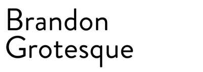
In addition to Arial, all-caps Hoefler Text, and Georgia, in 2012 the website designers introduced a technologically mediated “democratic” voice: HvD Fonts’ Brandon Grotesque. First released in 2010, Brandon Grotesque quickly became a trend because of its innovative reappropriation of the low x-height typical of early geometric sans serifs (Erbar-Grotesk, Futura, and many other art deco sans serifs whose elegant, all-caps proportions Brandon Grotesque shares). Combined with explicit calligraphic influences in the form of abruptly angled stroke endings, an unusually small upper loop of the lowercase g, and cutely rounded glyph outlines, Brandon Grotesque balanced an appearance of technological progress with just the right amount of quirk and whimsy to signal harmless nonconformity, winning the hearts and minds of many boutique digital design studios and early design teams at tech startups. The site’s running text also shifted from Lucida Grande to Arial with the classic CSS font stack of “Arial, Helvetica, sans-serif.” This reflects a general trend at the time: shifting away from the humanist sans serifs and toward the sleeker, more subdued and rationalized Helvetica-ish forms.
Author screenshot. License: CC BY-NC-ND.
November 1, 2012. With Arial as the headline typeface in “An America Built to Last” (intentionally specified in the CSS, not appearing as a fallback font), this version of whitehouse.gov further reduced the amount of serif typography in an attempt to convey a message of technological progressivism.
A later revision of whitehouse.gov under Obama got bolder and more mature in its layout and graphics skeuomorphism. A clear sense of “above the fold” now appeared, featuring splashy images afforded by higher internet speeds and bigger typography layered on semitransparent color blocks – a significant CSS update at the time.
Obama 2012–2016
The second Obama administration’s website kept its outer structure largely intact, but introduced even bolder layouts and lightly interactive features, such as a countdown clock to enroll in ObamaCare.
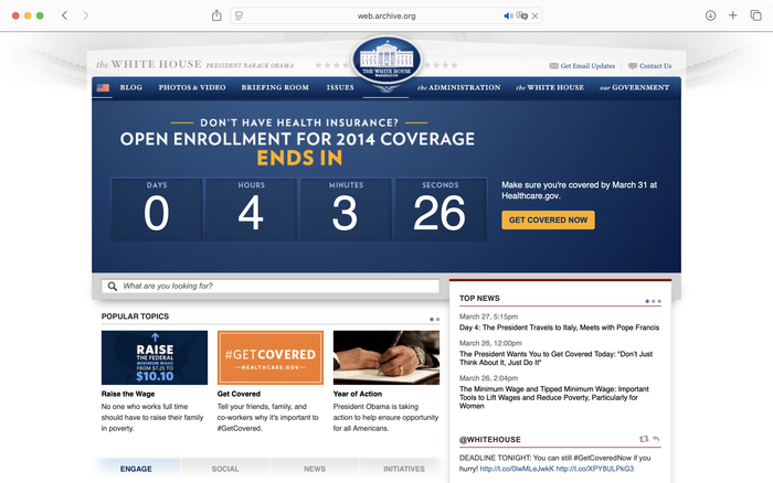
Author screenshot. License: CC BY-NC-ND.
March 31, 2014. The headlines (“OPEN ENROLLMENT…”) are set in Brandon Grotesque and embedded in the image asset, while the countdown numerals are set in Helvetica, probably because they have to be live text.
2014 was probably when whitehouse.gov started to use Helvetica instead of Arial in its body text, which stirred an uproar among some type and web designers: Arial was allegedly better suited to small running text because of its looser spacing and manual hinting for Windows machines.
This was the last time we’d see Brandon Grotesque on the whitehouse.gov site – its overindexing on cuteness quickly exhausted its ideological potency.
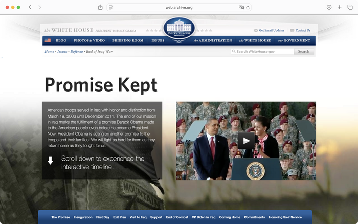
Author screenshot. License: CC BY-NC-ND.
April 1, 2014. The page headline “Promise Kept” is set in Whitney, which represented a new wave of humanist sans serifs that did not model calligraphy as strictly as Lucida Grande, but interpreted it in a freer, more structural fashion. The output of KABK’s Type and Media program during this time reflected a similar shift.
Expanding on the Hoefler Text connection, the Obama whitehouse.gov site became a longtime customer of Hoefler & Co., which changed its name from Hoefler & Frere-Jones after Frere-Jones’s departure in 2014. Hoefler products seemed to hit all the ideological sweet spots for a Democratic technocratic White House, blending progressive digitality, humanist approachability, and a carefully curated, nonconservative brand of Americana, all made domestically in New York, NY. On this parallax-scroll page about Obama’s exit from the Iraq War, in addition to Whitney (named after its original commissioner, the quintessentially American Whitney Museum of American Art), there also appeared a gratuitous amount of Neue Helvetica Thin – an obvious influence from the freshly released iOS 7.
Author screenshot. License: CC BY-NC-ND.
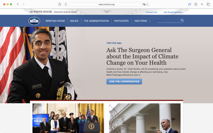
April 9, 2015. The top navigation bar’s typography has changed from all-caps Hoefler Text to all-caps Neue Helvetica. Its background has also “flattened” and lost the bright gradient.
The front page underwent a minor facelift that inched closer toward mainstream web design at the time, incorporating a full-bleed, image-based hero section. The headline “Ask the Surgeon General” was in fact meant to be set in “Hoefler Text A,” which indicates that it was a dedicated webfont loaded in the browser instead of the stock Hoefler Text that came bundled with Mac OS – clearly an attempt to deliver consistent typography across operating systems. It failed to load in this snapshot on the Wayback Machine, but in later iterations Hoefler Text webfonts would occur even more often. The webfont was named “Hoefler Text A” because it only contained partial font data as an anti-piracy measure, to be completed by a “Hoefler Text B”.
Also notable is the progressive simplification of the front page. Earlier versions were quite dense, filled to the brim with blocks of hyperlinks. Not only did the overall navigation become simpler (the all-caps Neue Helvetica Thin still a clear inspiration from Apple), but the entire page now had only one hero section, two individual news items below, a few more service entry points, and then the footer.
Author screenshot. License: CC BY-NC-ND.
June 1, 2015. Note the correctly loaded Hoefler Text A in the hero headline.
From 2014 to 2015, the Obama whitehouse.gov website didn’t substantially change its graphic design or structure. The only difference was that Whitney now replaced Neue Helvetica in the header, forecasting its increased favorability in later iterations. (The webfont was called Whitney SSm A. “SSm” was Hoefler’s internal product name for “ScreenSmart,” meaning the font files are engineered primarily for screen display instead of printing.)
Author screenshot. License: CC BY-NC-ND.
January 1, 2016. Whitney is now used in the Light weight, perhaps inspired by the all-caps Neue Helvetica Thin earlier. Note that one of the footer’s social-media icon buttons points to Google+, a now-defunct platform.
Whitney had now replaced many more instances of Neue Helvetica, probably with the design intention of eventually rendering a body-text typeface everywhere. The design itself was also peak Obama era: a stylistically eclectic combination of typefaces, just a touch of skeuomorphism with light outlines and subtle drop (or white inner) shadows on a visibly off-white background, and all-caps text set in a small size to imitate actual small caps. This coincided with the gradual identity formation of web designers who, as an incipient social faction buttressed by growing tech wealth, no longer saw themselves as just “graphic designers who happened to draw for the screen.” Carefully layering drop shadows, intricately setting text headings, and drawing “lickable” buttons freehand without 3D rendering software formulated a distinct aesthetic grammar that not only demonstrated the designers’ handicraft prowess to employers and clients, but also became a series of group rituals that reaffirmed their professional identity on websites like Designer News and Dribbble.com.
Trump 2016–2020
While the Obama administration incrementally changed whitehouse.gov, it was in fact the first Trump administration that most dramatically improved the site’s richness and modernized some of its infrastructure, since it was approximately around this time that web technologies most advanced, design methodologies stabilized, and Silicon Valley started to gain cultural heft. If Trump could be considered America’s first “Twitter president,” web typography now also became a full-fledged battleground of stylistic connotations, almost on par with TV ads, with each site change across all successive presidencies encoding significant ideological messages.
Author screenshot. License: CC BY-NC-ND.
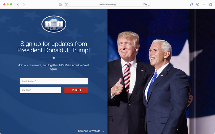
February 1, 2017. Both the page headline (“Sign up for updates…”) and subtitle (“Join our movement…”) are still set in Whitney at a generous type size, against the same flat, semitransparent blue background. It failed to load in this case, falling back to Neue Helvetica Light.
A holding page to collect email addresses and zip codes still used Hoefler fonts – the uprightness from the previous administration had apparently not abated. While Obama’s whitehouse.gov used exclusively commercial fonts (in addition to the system fonts Arial and (Neue) Helvetica), the placeholder text on this page from 2017 used the free Source Sans, a forecast of what was yet to come.
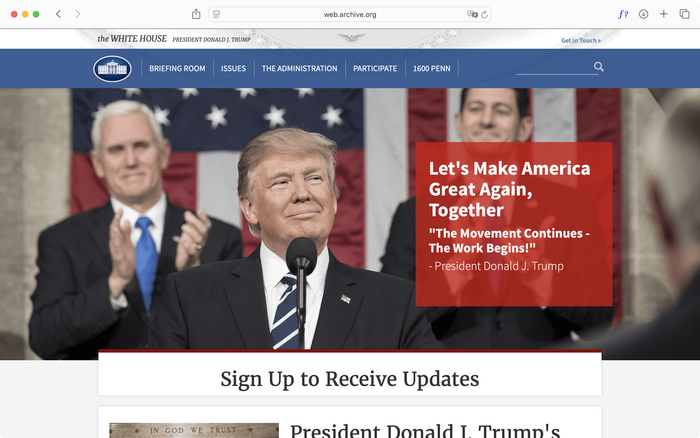
Author screenshot. License: CC BY-NC-ND.
April 30, 2017. Though the site’s layout remained unchanged, the cacophonous typographic hierarchy in the red block (“Let’s Make America Great Again…”) and the awkward “Sign Up to Receive Updates” card imply that the Trump web team could have been working with, or even fighting against, a website CMS that they inherited from the Obama administration.
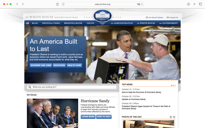
Largely repurposing the Obama site’s structure, the Trump administration’s whitehouse.gov initially still featured the same full-bleed hero layout and simple card grid below, even keeping the big blue all-caps banner navigation at the top. The most prominent change, of course, was the type: Gone were the “tasteful,” professionally curated Hoefler products. But just as the first Trump administration was unable to shake off the Democratic state apparatus’s inertia of decorum and palatability, it went for Merriweather and Source Sans – both perfectly serviceable typefaces but, crucially, free on Google Fonts.
Author screenshot. License: CC BY-NC-ND.
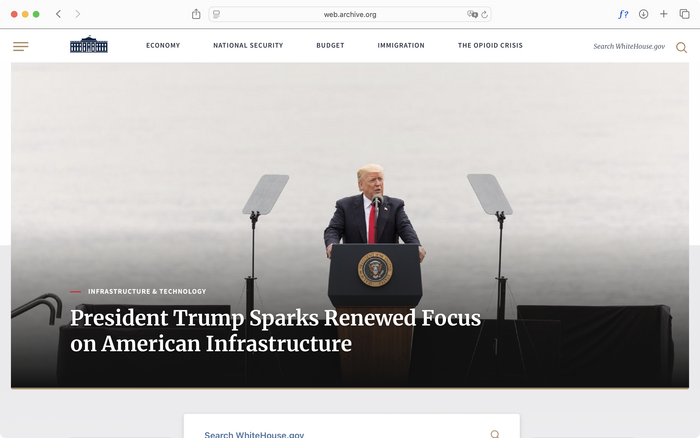
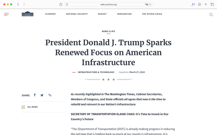
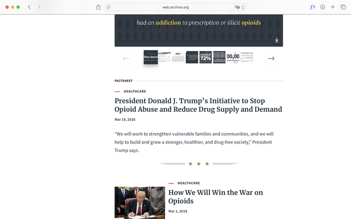
April 1, 2018. On this iteration of whitehouse.gov, the editorial atmosphere and use of Google webfonts seem to have taken inspiration from online news platforms.
Two years into the first Trump administration, whitehouse.gov received a significant update that brought it up to date with the common web-design standards at the time, the full-width responsive navigation header being the most notable example. Source Sans took over all of the site’s running text, while display typography was confidently handled by Merriweather at a large font size with appropriate leading (see also this previously published Use). The overall effect could be described as largely influenced by new-media news platforms like the now-defunct Circa (which also used Merriweather and Source Sans), sprinkled with some Americana elements. The littering of small colored bars to reinforce or imply layout hierarchy is a telltale sign of mid-2010s graphic and web-design aesthetics.
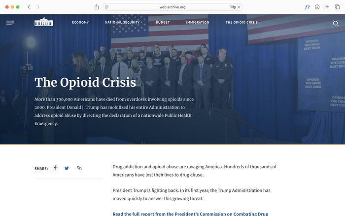
Author screenshot. License: CC BY-NC-ND.
April 1, 2020. Note the straight (“dumb”) quotation marks on the card title.
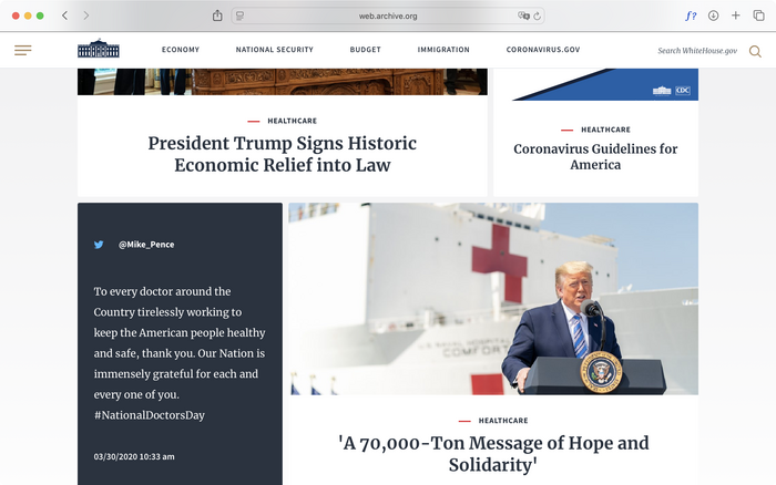
As CSS standards continued to evolve, the Trump administration’s whitehouse.gov also started to iterate the news items underneath its home-page hero section. While the Obama site featured evenly sized columns, Trump’s whitehouse.gov started using varying-width cards, whose design thinking could be traced back to Google’s original Material Design system.
Author screenshot. License: CC BY-NC-ND.
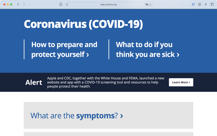
April 1, 2020. It’s possible that this minisite’s designers chose Open Sans because the “real thing” for public-service typography – Frutiger or Frutiger Condensed – is not freely available.
A telling comparison is the government’s Covid rapid-response minisite, which surprisingly used Open Sans. Once a tech darling in the early 2010s for its almost gratuitous warmth (and free availability on Google Fonts), Open Sans had long since fallen out of fashion. Since the rapid response was sponsored mostly by tech giants, the temporary return of Open Sans as aesthetic differentiator was unsurprising. In line with that of many other classic government-service bulletins, this minisite’s typography was giant and bold, conveying a sense of simple, down-to-earth immediacy.
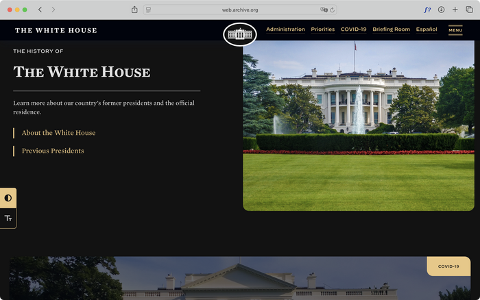
Biden 2020–2024
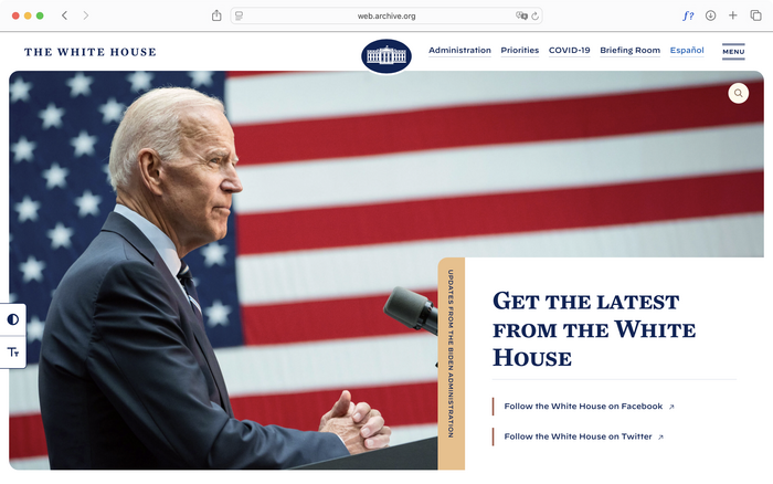
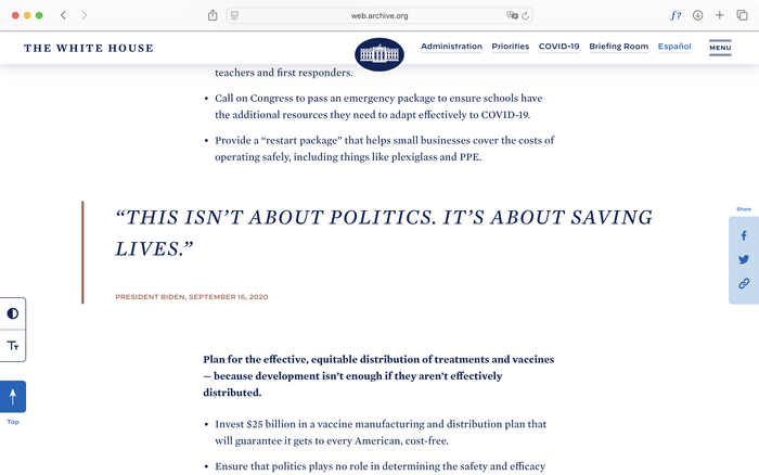
The Biden administration’s whitehouse.gov once again stepped up its design and technological sophistication, perhaps the most systematically architected and thoroughly maintained version of the site so far. Allegorizing an attempt to return to stability, professionalism, and decency, the Biden site exuded a familiar sense of refinement, from layout to color and typography, and even sprinkled on UI animations.
Author screenshot. License: CC BY-NC-ND.
January 31, 2021. The hero image has been cropped in a rounded rectangle – a friendly graphic motif that punctuates the rest of the site.
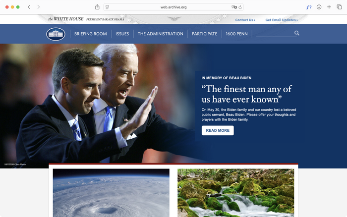
The wholesale return of Hoefler fonts on the Biden site cannot simply be explained by organizational inertia or prior business ties. Most notably, functional or running small text was set completely in the foundry’s latest offering: Decimal. Although Decimal was never a specific revival of American printed material, its appearance in 2019 scratched a similar ideological itch thanks to its cunning mix of brush-calligraphic tendencies (channeling the down-to-earth sincerity of the mythologized bodega-sign letterer), authoritative letterforms, and an obvious nod to watches and industrial dials. This allowed designers to conveniently short-circuit it with typologically honest, no-nonsense American grit – a variation of the same formula that launched the foundry’s Sentinel into popularity orbit a decade ago. The display type, a spot formerly occupied by Hoefler Text and Whitney, now featured Mercury in its CSS-activated small caps variant.
Author screenshot. License: CC BY-NC-ND.
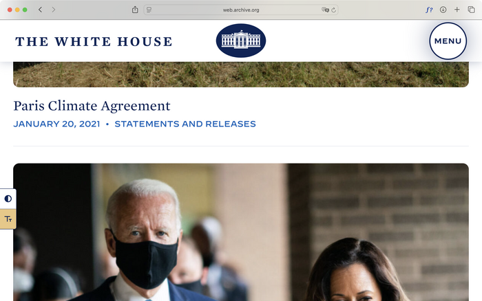
The site also, for the first time, introduce toggles for high-contrast and accessible options floating to the left. It’s possible that Democrats care more about accessibility – even if only in name – than Republicans.
Author screenshot. License: CC BY-NC-ND.
January 31, 2021. Clicking the “Accessible” button (the lower of the two floating buttons to the left) strips out the multicolumn layout, and renders the page in a single column with giant images and simplified typography – a helpful feature for mobile-device users and those with reading disabilities.
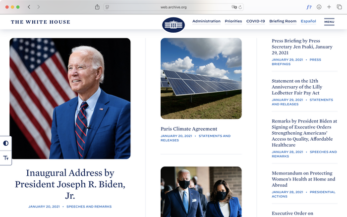
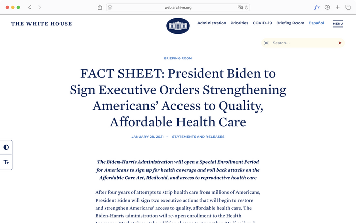
The Biden whitehouse.gov site not only got a typographic cleanse, but also evolved the modernized foundation that the Trump version established. The information density on the home page again increased, with article titles and preview summaries neatly arranged and carefully typeset in interlocking grids. The inner pages exuded an unprecedented degree of editorial refinement, especially the all-caps, loosely spaced pull quotes, which almost look like they were designed for lifestyle magazine spreads with a red-blue color scheme.
Particularly interesting was the search entry point, which used to be inside the navigation header but was now pulled into a fun, poppy, floating circle, carefully arranged so as not to collide with page content. Upon clicking, the circle animated into a pill shape with the color scheme changing from blue to yellow – the kind of “delight” details now commonly seen in web and app UI design. The sweet, almost poignant pastel color scheme itself was also uncommon, and the only appearance of such a palette on a whitehouse.gov site.
Author screenshot. License: CC BY-NC-ND.
April 30, 2022. Note the disappearance of top navigation text buttons.
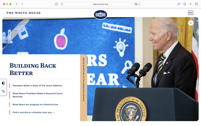
In 2022, Biden’s whitehouse.gov went through small iterations. The navigation header was simplified with only a hamburger menu button. The hero section apparently could now be configured to support overlaying typography on both sides to accommodate photography.
Author screenshot. License: CC BY-NC-ND.
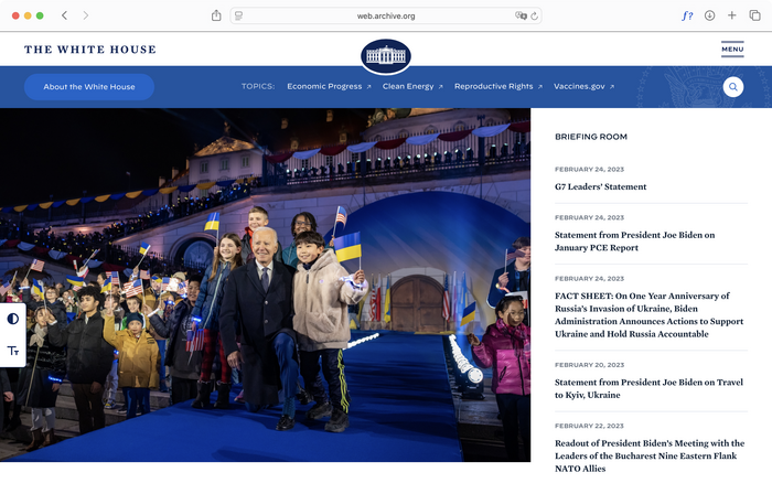
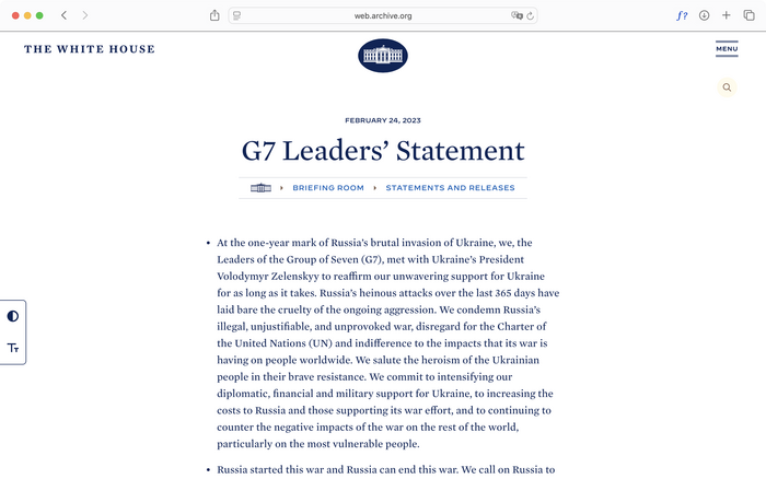
February 28, 2023. The top navigation menu buttons may have disappeared to avoid looking repetitive with topic menus inside the page (such as “Economic Progress,” “Clean Energy,” “Reproductive Rights,” and so on).
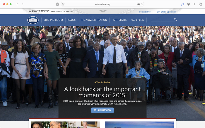
In the second half of the Biden administration, whitehouse.gov matured even more, using web-design techniques perfected in the commercial world. In tried-and-true 80/20 fashion, the sensibly typeset Mercury occupied most of the typographical terrain, and Decimal dutifully took care of the remaining functional chores. Structurally, not only did the site gain a giant, full-screen nav (a design pattern originally evolved at SaaS companies to showcase their ever-expanding product offerings and org structure), but the site breadcrumb, conventionally placed at the top of the page, now sat curiously underneath the article title, perhaps so as not to disturb the top’s graphic simplicity.
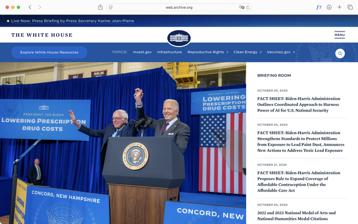
Author screenshot. License: CC BY-NC-ND.
October 24, 2024. On this particular home-page photo, Decimal flooded all of the professionally typeset signs surrounding Biden and Sanders – evidence that a dedicated design team chose and ratified the typeface for its aesthetic expression and ideological connotations.
Biden’s whitehouse.gov remained largely the same during the second half of his tenure, except for the addition of temporary banners that anachronistically used a lightly skeuomorphic blue gradient. While previous administrations’ website designs only “caught up” with the wider public world, this cautious reintroduction of slight skeuomorphic tendencies coincided with the wider commercial trend at the moment with very little time lag – a timeliness that would extend into the succeeding administration.
Author screenshot. License: CC BY-NC-ND.
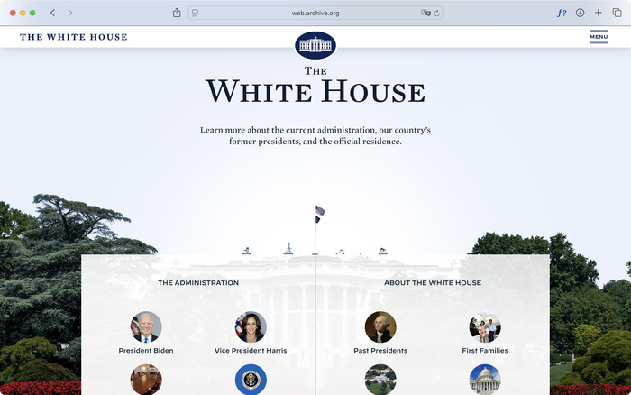
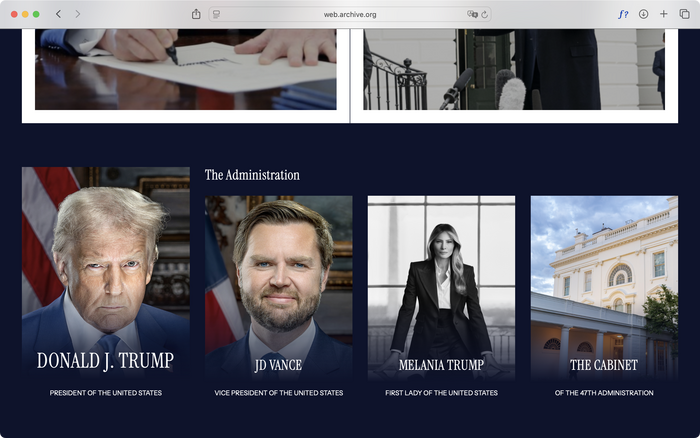
The whitehouse.gov home page now also featured a giant section introducing not only the people in the current administration, but also “Past Presidents.” This content area would be heavily exploited for a different ideological purpose in the second Trump administration.
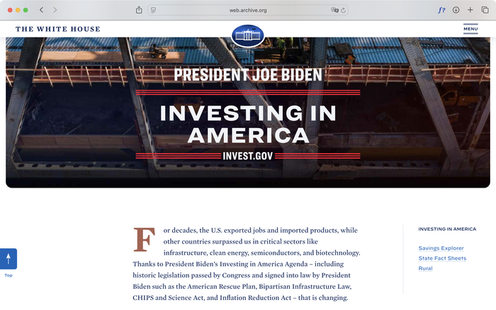
And finally, in a dedicated long-scroll storytelling page about the Biden administration’s domestic industry revitalization program, we are greeted with a long-lost typographic friend that fell out of favor for its symbolic cliché – the genre of all-caps American gothic in the form of none other than Hoefler’s Champion Gothic, harkening back to the days of Franklin Gothic in the Bush years. The American gothic as a genre of typographic image gradually faded away as the rest of the Western world deindustrialized materially (and quite graphically too), so its reintroduction as the face of American reindustrialization policies was a no-brainer.
Trump 2024–2028
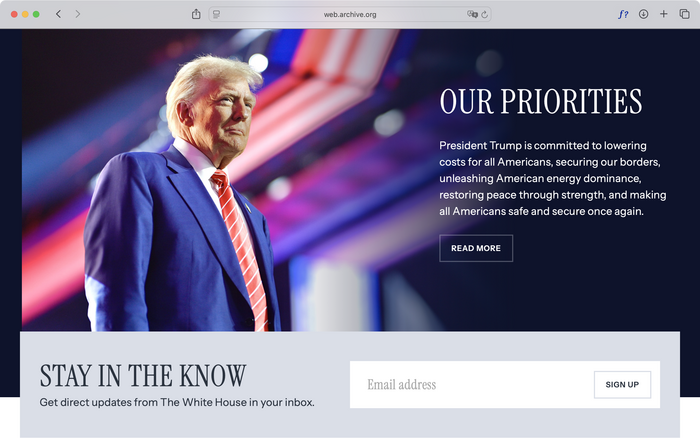
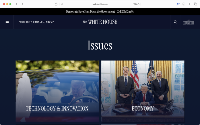
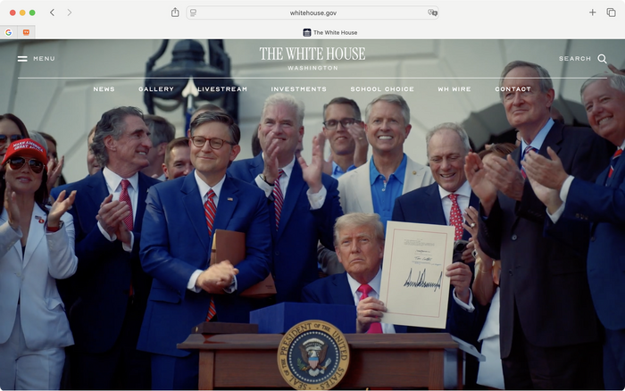
If the Biden administration’s website team had the most technical and design prowess, the second Trump administration’s counterparts, although occasionally lacking in sophistication and craftsmanship, came with an unprecedented sense of medium awareness, militantly styling and creating new content for whitehouse.gov with ideological urgency. Referencing the most up-to-date stylistic trends and employing the latest web-design techniques, the designers sought to innovate a right-wing aesthetic expression that only incompletely represented Trump’s image but inadvertently mirrored their own.
Author screenshot. License: CC BY-NC-ND.
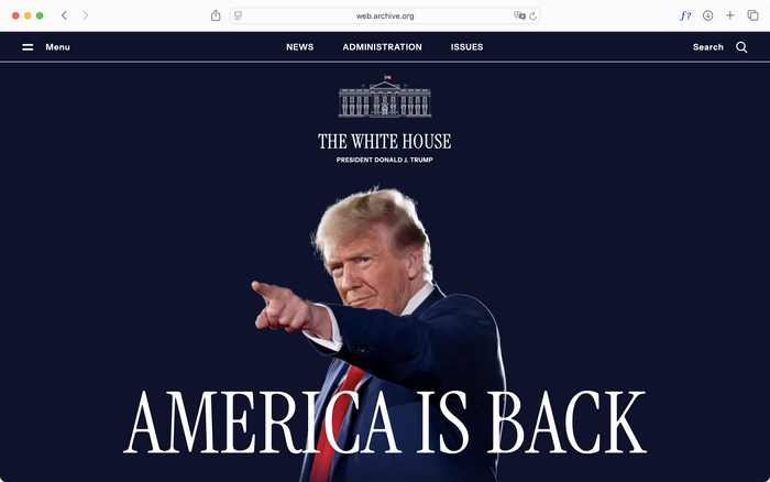
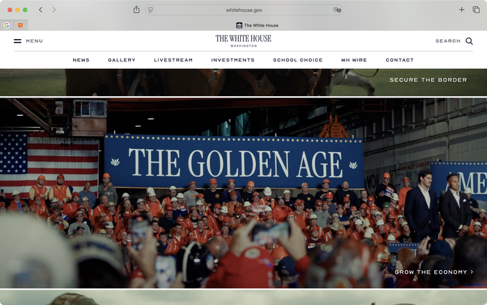
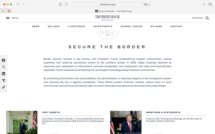
January 31, 2025. Compared to the Biden administration’s and even the first Trump administration’s site – both of which prioritized showcasing policy updates and let the graphics do their jobs subliminally – this version of whitehouse.gov’s home page undoubtedly breaks some rules: It says nothing but “AMERICA IS BACK” set against a smug photo of Trump, with the all-caps ITC-Garamond-revival completing the ’90s magazine-advertisement look.
Hoefler products, now hopelessly Democrat-coded, have disappeared from this iteration of whitehouse.gov. Finally replacing decades of neoliberal politeness are Instrument Serif and Instrument Sans, a pair of free typefaces from Instrument, a brand and design agency based in Portland, Oregon, with an office in New York.
On a basic, material level, this typeface choice by the whitehouse.gov team constitutes a striking allegory of real social events – that is, on one hand, the unholy alliance between a right-turning tech sector that, in a desperate attempt to rejuvenate its Covid-impacted profit margin, showed its true face with massive layoffs and realignment with the defense sector; and, on the other hand, a populist Republican administration that felt hampered by Democrat remnants and now gets to ruthlessly execute its long-perfected ultraconservative agenda with the former’s tools.
Instrument Sans obviously stands as a commonplace culmination of the archetypal “quirky tech grotesk,” whose two decades of multifold evolution across the Netherlands and California merits a separate essay elsewhere. But it is Instrument Serif, a tragico-farcical rehabilitation of the late 1990s tight-but-not-touching (TNT) Garamond image – once denounced by Michael Bierut for its amateurism – that is worth elaborating on: It is a uniquely American phenomenon without an original Europe import manifest. Its emptily ironic reference to an already referential image (Apple Garamond / ITC Garamond being a high-postmodern “revival” of the Garalde genre) is already registered even in foundry responses, most notably in Sharp Type’s Ghost Text, which referenced the TNT humanist sans of Clinton-era corporate identity.
But this wanton nostalgia, to undertake the briefest chronological tour, was originally given artistic license by late 2010s nightclub promo designs that later became known as acid graphics – an ominous, digitally rococo style whose unapologetic nihilism inspired many offshoots, which then operated around the affect of form as such. Nostalgia is more popular among such derivative forms for its convenient, existing sediment of ironic affect and general referentiality. In the cultural and lifestyle design spheres, nostalgia manifests as the visual regurgitation of capitalist industrial production: fruit stickers, quality-control insignias, miscellaneous industrial barcodes, other tactical and paramilitary motifs, and the eventual emergence of LOT 2046. And if these graphics feel too threatening or authoritarian (or crypto-coded) for the day-to-day tech design scenario, nostalgia for turn-of-the-century tech megacorps – like Apple and Sony – feels just spicy enough as a symbolic attempt from the further right to break through Mercury and Decimal’s neoliberal impasse, while always having a convenient pendulum-just-swung-back surface narrative to back itself when facing scrutiny.
The fact that Instrument Serif is produced by people in so-called Blue states does reveal a deeper shared interest between sects of both parties’ voters, but the more crucial point here is the very formation of this bipartisan sect, namely Silicon Valley’s technocratic intelligentsia, which, having learned all the methods and tricks of Europe’s cultural industry, decided to produce ideology using more cost-effective homegrown ingredients. Therefore, it comes as no surprise that overtightened oldstyle serifs started adorning the brand identities of the Valley’s most recent ideological avant-garde: AI startups.
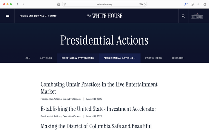
Author screenshot. License: CC BY-NC-ND.
March 31, 2025. The display typography uses Instrument Serif; the rest of the text is set in a perfectly serviceable sans serif – now already a common baseline thanks to two decades of advancements in typesetting for the web.
The conventional news area of Trump’s whitehouse.gov stripped down its graphical richness, echoing a similar theme of austerity in the wider world of tech websites. Instrument Serif, forced to live in a sentence setting with little negative letter-spacing, struggles to cohere into word-images.
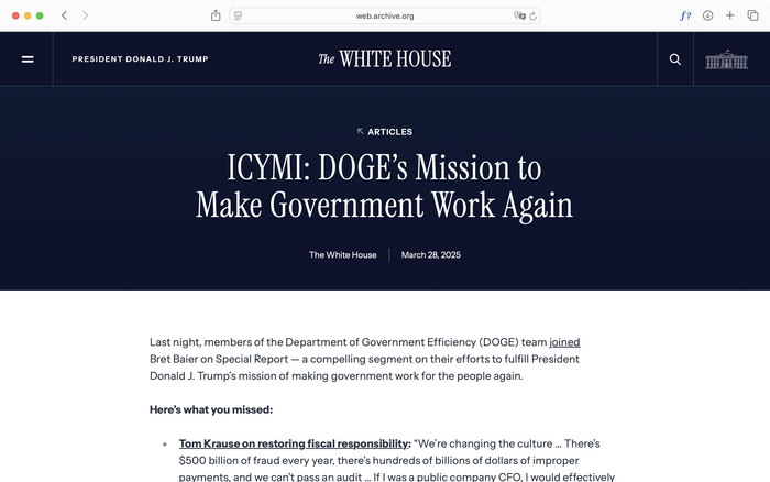
Author screenshot. License: CC BY-NC-ND.
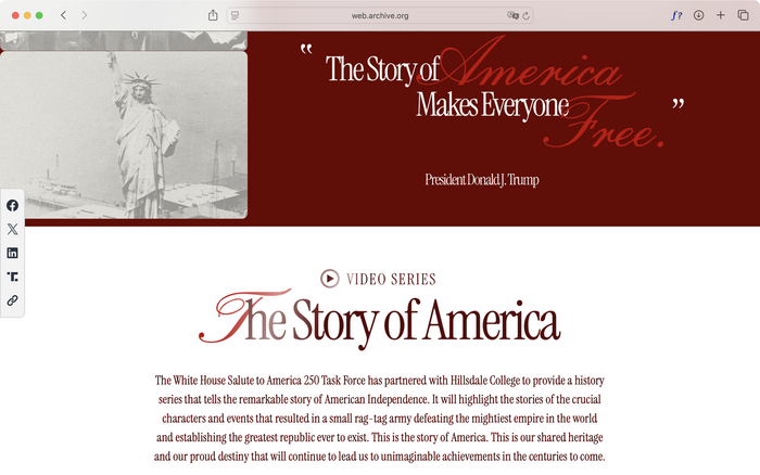
June 1, 2025. Note that Instrument Serif has been applied to small running text in “The Story of America.”
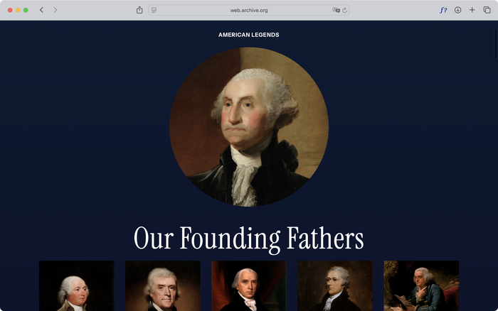
The Trump whitehouse.gov design team significantly expanded the “Past Presidents” area in an elaborate attempt to refashion historical material into a contemporary ideology. Recasting Jefferson and Franklin in the style of past emperors (with their oil-painted portraits for period evocation), this effective minisite not only symbolized Trump’s personal fascination with feudal rulers, but also served as a bridge to the so-called “technofeudal” faction within the Valley, represented by people like Mark Zuckerberg with his Caesar-style haircut.
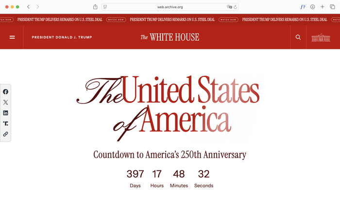
To create brand awareness for the 250th anniversary national military parade, the whitehouse.gov team also created a dedicated “America 250” page with color accents in various shades of red and gold, as well as script type embellishments set in Loren Blake Script. The page itself has a level of handcrafted richness that exudes an almost Randian ideological vigor, but its earnest application of overtightened Garamond and script flourishes inadvertently make it look like a real estate brochure from the late ’90s – fitting given Trump’s personal background. It must be further noted, crucially, the extent to which formal expression now does not imply the signified object (in this case, a military parade) as high modernism would’ve taught us on day one; instead, it speaks to us in a hermetic visual language in parallel (the sophistication of a Manhattan business magnate) that circuitously allegorizes what the signified object also tries to allegorize, as if they operate with an aesthetic echo effect. This phenomenon of circuitousness, of indirect signification based on an opaque ideological message, ultimately comes from an impossibility of representation itself, as the Trump-MAGA world is now composed of such disparate constellations of ideologies and group identities that any direct aesthetic expression would be destined to partial representation. (The same could be said of our contemporary globalized world.) Biden’s whitehouse.gov styled the administration with stable, reliable directness; the Trump administration’s design team critically grasped and exploited this new development with full disciplinary self-awareness.
Author screenshot. License: CC BY-NC-ND.
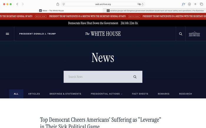
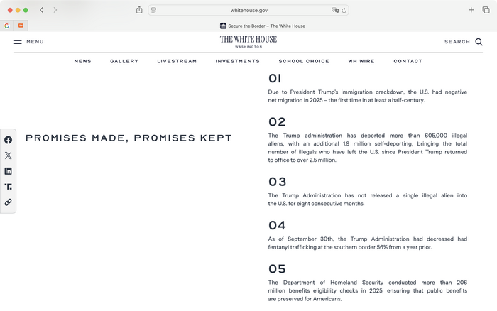
October 23, 2025. As seen in the top screenshot, this whitehouse.gov site gives much prominence, both in terms of information hierarchy and literal onscreen graphic real estate, to photo galleries, perhaps out of the cynical assumption that voters are mobilized more by carefully staged images than by cogently written, informational text.
Brazen as it is, the black full-width top strip for time-critical messages (in this case blaming the opposition party for a government shutdown) shares the same UX pattern as new-product release banners from tech companies. Stacking yet another red rolling banner on top – this time to showcase “news of nonstop wins” – highlights the almost endearing similarity between Trump’s administration and a dysfunctional tech company’s web marketing team.
Author screenshot. License: CC BY-NC-ND.
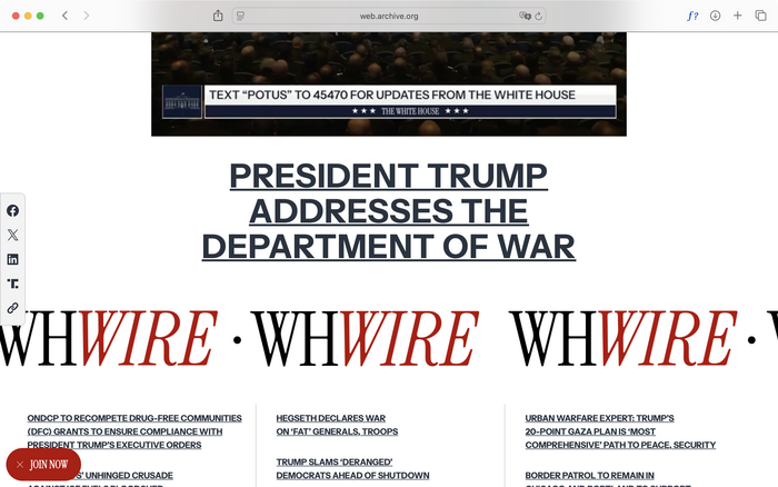
October 23, 2025. The “WHWIRE” text banner slowly and endlessly scrolls from right to left, mimicking the behavior of Wall Street banners. This style might’ve also been inspired by the Drudge Report, whose design has been remarkably stable for over twenty years.
Another conscious maneuver is the creation of White House Wire (styled as WHWire), a rolling news area on whitehouse.gov separate from the conventional press briefings, presumably to create a direct-to-consumer alternative to the “fake news” of mainstream media outlets. Also noteworthy is the floating column of buttons to the left, which hosted website accessibility options for the Biden whitehouse.gov but now prominently features the Trump administration’s social media accounts.
Author screenshot. License: CC BY-NC-ND.
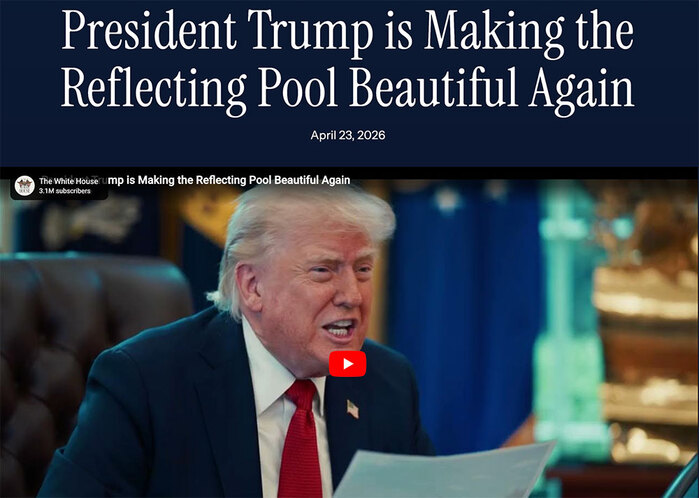
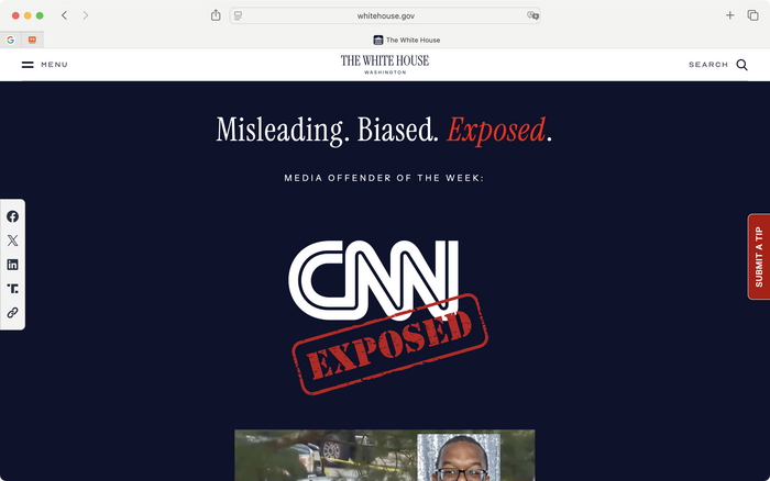
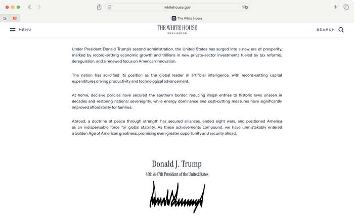
February 1, 2026. Instrument Serif has bled into the Trump administration’s physical signage (as seen in “THE GOLDEN AGE” banner), ditching its status as ironic reference and officially rechristening itself a part of Trump’s visual identity. The Trump signature in the last image is actually a looping gif that animates the pen strokes. The “Exposed” stamp graphic on the website’s Media Offenders page is set in Stencil.
As the Trump administration settles further into its second term, the design update in February 2026 to whitehouse.gov has shifted significantly toward maturity and politeness, even including the sensationalistic “expose the fake media” area of the site. Typographically notable is the introduction of Nord (now Nord Display), a wide, capitals-only sans serif in the Engravers Gothic genre (and, surprisingly for the Trump administration, a paid typeface). Derived from metal-plate engraving, this genre is now commonly associated with banking, alcohol packaging, real estate, and similar motifs of wealth and masculinity, especially with loose tracking. Having jettisoned big, cartoonish typography and bold color blocks, the graphic and interaction design of whitehouse.gov in 2026 strives for a much more solemn tone, featuring a full-screen, video-only homepage and subtle scroll animations between blocks of tiny gray type. If we could characterize the previous site as Silicon Valley’s imitation of late-1990s high class (when neoliberalism indeed started asserting its goal of world dominance with full steam), this iteration appears not only more refined but also more familiar, as if it’s advertising a premium steakhouse chain.
*
Technological kludges like baking fonts and drop shadow into image assets informed the aesthetic tendencies of the Bush Junior-era whitehouse.gov, and their gradual abatement has become apparent over the years. In a sense, advances in internet infrastructure, web technology, and design methodologies over two decades have more or less removed the medium, allowing web design to express ideology in a highly purified format, a luxury previously only afforded to print designers.
The zero marginal reproduction cost and short turnover time unique to the web can now cement a debate in the physical world: that is, the autonomy of style. In Marxian terms, it is also expressed as the classic dichotomy between the economic base and ideological superstructure. It has long been argued that changes in superstructure – art, design, music, or anything cultural – are but a derivative expression of “real” changes in the productive and economic realm, but there are also valid attacks that criticized this reading for being dogmatic and mechanical, discounting specific historical contingencies, the efforts and toils of the individual artists, and the internal grammar and history of specific creative disciplines. Now, what I hope my chronological web design survey has demonstrated is that the same set of powerful technologies – sometimes even the same people – can output vastly different forms, as demonstrated by the stark contrast between the websites of Biden and Trump’s second term. In other words, style has its own history, which can seemingly operate independently.
But I am in no way suggesting a return to New Criticism, to claim that colors, pixels, and shapes somehow truly live their own lives autonomous of social relations. Tracing the design of whitehouse.gov does seem to establish a series of symbolic equivalents between style and political reality in different presidential terms (e.g., “skeuomorphism means Obama and zero interest rates” or “pompous, brash graphics mean Trump”), but these equations are only as useful to us as mnemonic aids. Style does have its own history, but such history is not to be found in the simple succession of one style over another. Rather, it lies in people’s concrete motivations – whether it comes from designers, clients, developers, or the consuming public – that decides that one new style is a better successor than many alternatives.
And so perhaps paradoxically, style is simultaneously the output of political-economic processes and an allegory for them. The same content about domestic industry-revitalization programs appears on both Biden’s and Trump’s whitehouse.gov, but its stylistic renditions could not be more different, clearly to serve different political objectives. In other words, whitehouse.gov’s web design here is an extreme scenario in which everything else (content, technology, design methodology) has receded, leaving style in its purest, most easily observable format in service of sheer ideology.
This process of purification now also signals a new development: The postwar pretension that style somehow has transhistorical neutrality (because it operates independently of historical processes) is no longer viable. After all, proponents of such neutrality would’ve immediately ditched it the moment they saw a swastika or a hammer and sickle. From Bush Junior all the way down to the second Trump term, changes to the whitehouse.gov style strikingly demonstrate that style is, and always has been, an ideological battleground that sees its mirror images in the relations of production. To analyze style as ideology is to trace its history: It is always created by humans under circumstances already given and transmitted from the past, and any new style is always haunted by the tradition of all dead styles prior. And so it is neither content, nor its style, but the machinations of the creative act behind that style, that is whispering the actual political message into our ears.
Note: Given the current political climate, the author did not feel comfortable publishing under their real name. —Ed.
This post was originally published at Fonts In Use