4 Minnesota Ceramicists poster
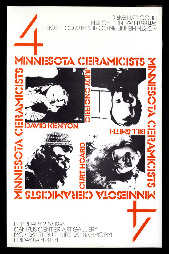
Photo: Mark Simonson. License: All Rights Reserved.


When I was studying art and graphic design at North Hennepin Community College, I designed this 11″ × 17″ poster for a ceramics exhibition held in the student union. Graphic design students were routinely called upon to design these posters and, of the ones I did, this was my favorite.
The design doesn't have much to do with ceramics per se. Instead I chose to focus on the number four—four artists, four ways to display the poster, laid out a bit like a playing card. There’s really no correct orientation, and hence no one artist gets preferential billing. They are all equally represented.
I chose Glaser Stencil (set with Letraset) because of its graphic qualities. It felt modern, almost avant garde to me at the time, and fit the geometric logic of the design, with large figure fours as the dominant typographic element. On the back I used Letter Gothic for the text. We only had access to a typewriter for setting text. Happily, it fit the aesthetic I was going after.
The photos are reproduced in high contrast to underscore the starkness of the design.
As a student, I not only did the design and typesetting, but also did the process camera work, stripping, platemaking, and printed it on a small offset press.
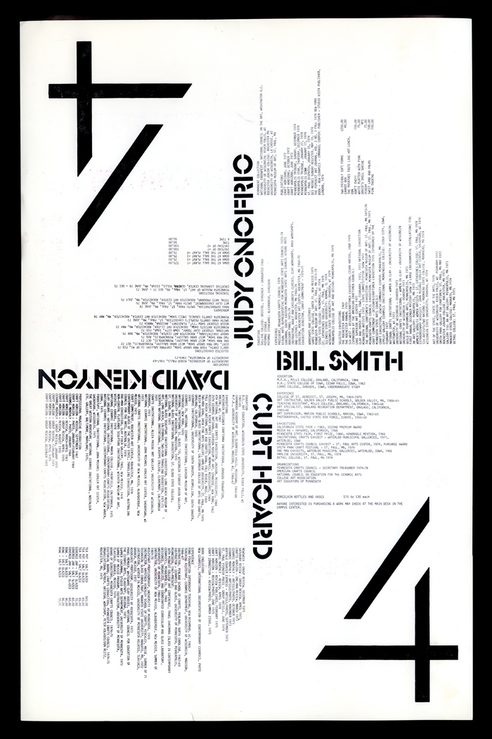
Photo: Mark Simonson. License: All Rights Reserved.
This post was originally published at Fonts In Use