Wrenbridge
Source: www.campbellhay.com Campbell Hay. License: All Rights Reserved.

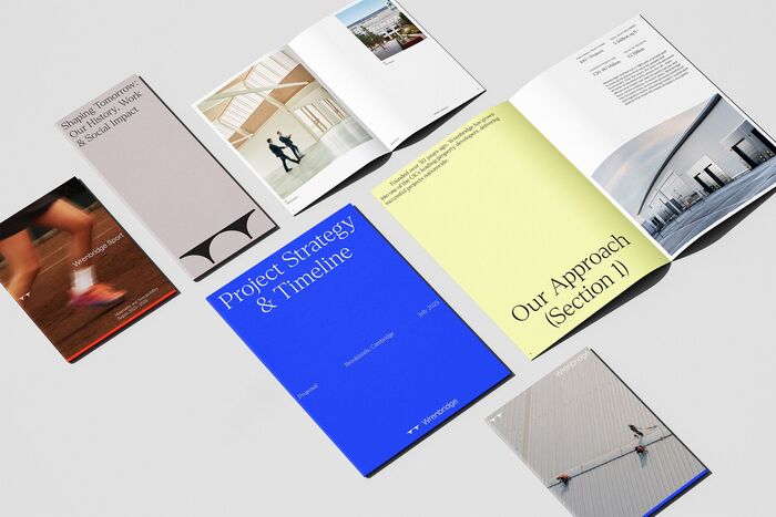
For Wrenbridge’s rebrand, Campbell Hay uses Denton as the typographic voice of a more refined and human identity. The serif gives the system a sense of editorial confidence, softening the industrial subject matter while still feeling precise enough for property development, architecture, and workplace communications.
Denton appears across brand statements, campaign lines, reports, digital layouts, and presentation materials, often paired with restrained photography, generous white space, and a sharp blue accent. In headlines such as “Partners in Progress”, its high-contrast forms add polish and pace, helping Wrenbridge move away from a purely corporate built-environment tone toward something warmer, clearer, and more distinctive.
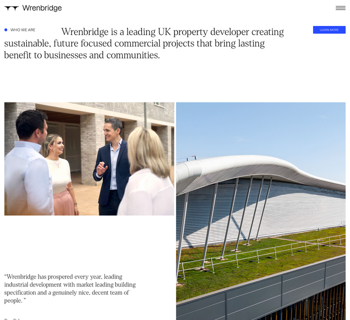
The sans-serif logotype appears to be custom drawn.

Source: www.campbellhay.com Campbell Hay. License: All Rights Reserved.

Source: www.campbellhay.com Campbell Hay. License: All Rights Reserved.

Source: www.campbellhay.com Campbell Hay. License: All Rights Reserved.

Source: www.campbellhay.com Campbell Hay. License: All Rights Reserved.

Source: www.wrenbridge.co.uk License: All Rights Reserved.
Source: www.wrenbridge.co.uk License: All Rights Reserved.
This post was originally published at Fonts In Use