Woven Whiskey
Published September 10, 2025
By FontsInUse
Contributed by Jasper Bosman
Source: www.freytaganderson.com License: All Rights Reserved.

Source: www.freytaganderson.com License: All Rights Reserved.
Source: www.freytaganderson.com License: All Rights Reserved.

Source: wovenwhisky.com License: All Rights Reserved.
This post was originally published at Fonts In Use
Source: www.freytaganderson.com License: All Rights Reserved.
Scottish studio Freytag Anderson write about the packaging and brand identity they designed for Woven Whisky:
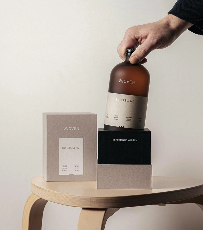
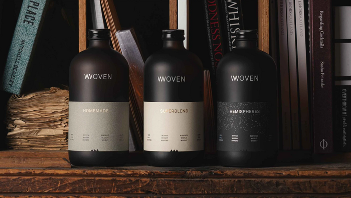
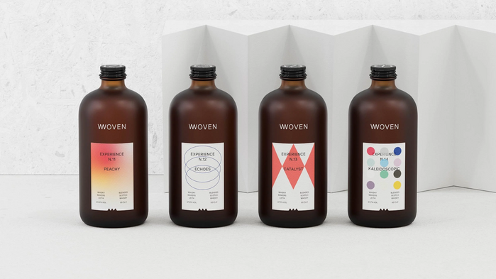
Visually, we stripped away the clichés. The custom frosted brown apothecary-style bottle is tactile and unexpected. Labels are minimal, each release numbered, named, and paired with its own distinctive graphic—an expression of the blend itself. The core range stands apart with a more pared-back identity, anchoring the brand while the limited editions build intrigue and momentum.
Luzi Type’s Spezia is used on the front of the packaging in all caps, with some details on the back in lowercase. On the website, Spezia also appears in its SemiMono form.
Source: www.freytaganderson.com License: All Rights Reserved.
Source: www.freytaganderson.com License: All Rights Reserved.
Source: wovenwhisky.com License: All Rights Reserved.
This post was originally published at Fonts In Use
Read full story.
WRITTEN BY
FontsInUse
An independent archive of typography.