Niul Cosmetics

Source: polar.ltda Polar, Ltda. License: All Rights Reserved.


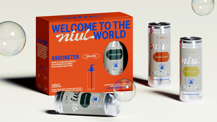
Niul is the first cosmetics brand in Brazil to adopt aluminum cans as packaging. This decision stems from a simple yet impactful fact: while almost 100% of aluminum is recycled in the country, only 1.3% of plastic meets the same fate. The proposition is straightforward – clean, vegan, and cruelty-free formulas in infinitely recyclable packaging that can be transformed back into containers, closing the loop.
The visual identity puts the planet at its core. Shapes echo world maps, doubling as flexible graphic elements and becoming a visual asset recognizable across brand applications. These shapes are also the starting point for the mascot, with a plant sprouting from its head symbolizing a healthy, thriving planet. Curious, attentive, and friendly, it embodies Niul’s spirit.
The cycle of melting and reconfiguring aluminum inspires the custom-drawn logo and the brand's animated behavior, reinforcing the idea of continuous transformation. This concept is also reflected in the typography, with the solid impact of Greed as primary typeface, always used all capitalized to ensure the urgency of the recycling conversation and the boldness of the product proposal. Also contrasting with the fluid strokes and connected serifs of DaVinci, to balance the branded impact from Greed with light and organic feeling for a variety of communication.
Deeply rooted in nature and environmental commitment, Niul offers an innovative approach to conscious consumption and planetary responsibility.

Source: polar.ltda Polar, Ltda. License: All Rights Reserved.
Source: polar.ltda Polar, Ltda. License: All Rights Reserved.

Source: polar.ltda Polar, Ltda. License: All Rights Reserved.
Source: polar.ltda Polar, Ltda. License: All Rights Reserved.

Source: polar.ltda Polar, Ltda. License: All Rights Reserved.
Source: polar.ltda Polar, Ltda. License: All Rights Reserved.

Source: polar.ltda Polar, Ltda. License: All Rights Reserved.

Source: polar.ltda Polar, Ltda. License: All Rights Reserved.

Source: polar.ltda Polar, Ltda. License: All Rights Reserved.

Source: polar.ltda Polar, Ltda. License: All Rights Reserved.
This post was originally published at Fonts In Use