Worlds of Tomorrow, vol. 5
Source: www.abebooks.com John Thompson. License: All Rights Reserved.
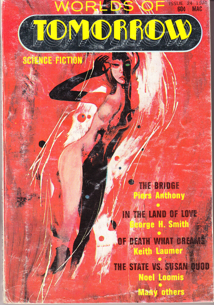
Issue 24, (vol. 5, no. 1), summer 1970, with stories by Piers Anthony, George H. Smith, Keith Laumer, Noel Loomis, and others. [More info on ISFDB] The secondary typeface is similar to Folio Condensed.


Worlds of Tomorrow was an American science fiction magazine first published by Barmaray Co. in 1963. It was later picked up by Galaxy Publishing as a companion to Galaxy, and merged into If in 1967. The magazine briefly resumed publication from Summer 1970 to Spring 1971, producing three issues edited by Ejler Jakobsson.
For this fifth volume, art director Franc L. Roggeri introduced a new logo featuring Pousse Cafe in a cartouche. Robert Montgomery’s dimensional Art Deco face is combined with wide sans-serif caps that could be a number of things, including a phototype version of Standard Extended (a.k.a. Akzidenz-Grotesk breit) with an F with bars of equal length. The cover art for all three issues was provided by assistant art director Jack Gaughan.
Source: www.instagram.com dnorsen_design. License: All Rights Reserved.
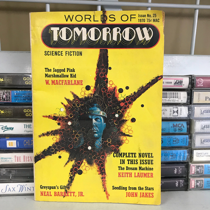
Issue 25, (vol. 5, no. 2), winter 1970, with stories by Keith Laumer, Dean R. Koontz, Gary K. Wolf, John Jakes, Neal Barrett, Jr., and others. [More info on ISFDB] The secondary typeface is Stymie Bold Condensed.
Source: www.abebooks.com John Thompson. License: All Rights Reserved.
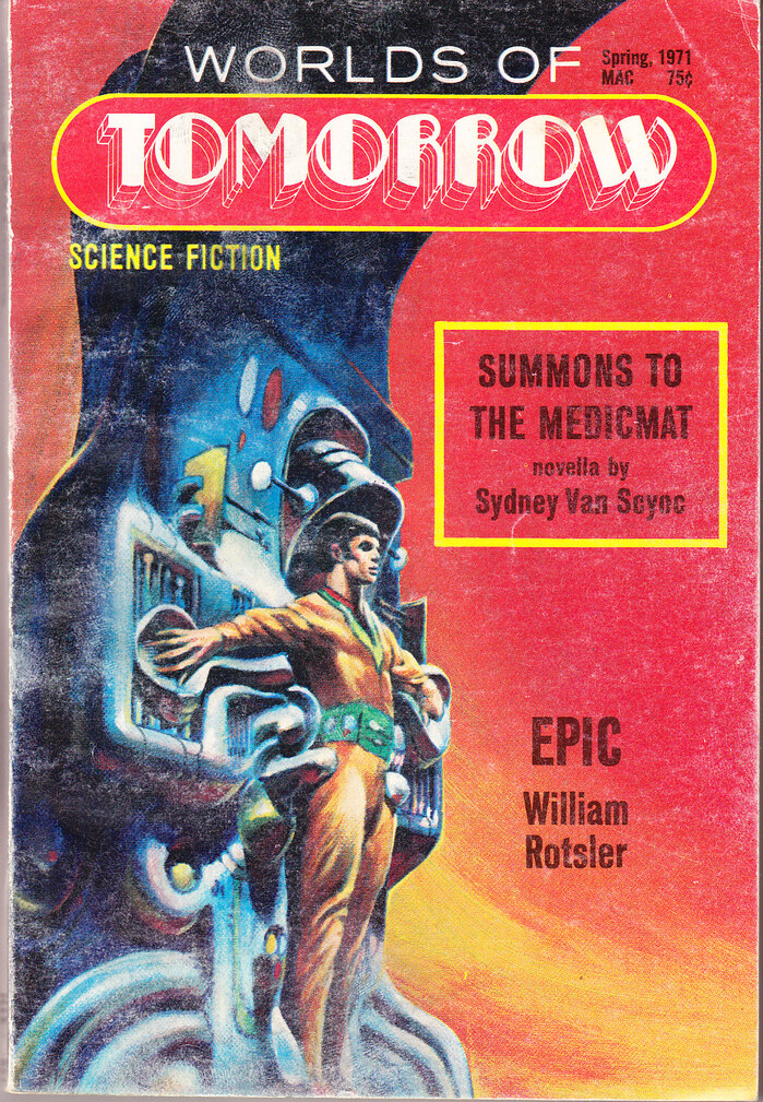
Issue 26, (vol. 5, no. 3), spring 1971, with stories by William Rotsler, Sydney Van Scyeoc, Roger Dee, and others. [More info on ISFDB] The secondary typeface is Venus Bold Condensed.
This post was originally published at Fonts In Use