Kaveesha Shah website

Source: www.kaveesha.in License: All Rights Reserved.


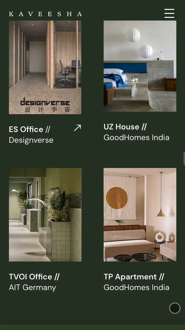
Kaveesha Shah is an award-winning interior designer at Studio Saransh, India—but her identity extends far beyond her profession. A photographer, a lover of food and poetry, and a deep appreciator of culture and history, Kaveesha approached Studio Ping Pong to design a website that would reflect the full spectrum of her personality and practice. She wanted a digital space that went beyond the ordinary—one that could evoke the materiality, serenity, and attention to detail found across her work.
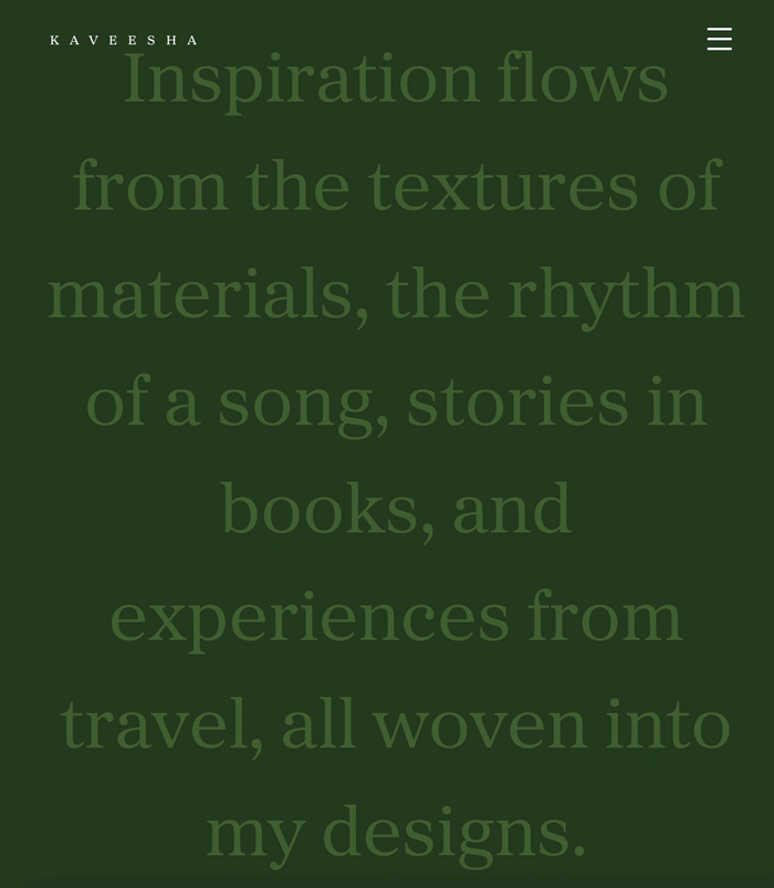
The website blends professional acumen with personal nuance. Alongside a showcase of her interior design projects, it offers glimpses into her process, inspirations, and reflections—through words she lives by, music that accompanies her workflow, and photographs taken during her travels.
We chose the typefaces Proxima Sera and DM Sans to reflect the balance in Kaveesha’s practice between artistic expression and practical clarity. Proxima Sera, with its warm, contemporary serif character, blends qualities of old-style and modern serif typefaces, bringing depth and a refined touch that connects to the tactile nature of her work. By contrast, DM Sans offers a clean and modern complement. It allows for easy readability across devices and provides a grounded, neutral backdrop that supports the content without overwhelming it. Together, these typefaces create a rhythm that mirrors the duality of Kaveesha’s approach—systematic yet fluid, understated yet thoughtful.
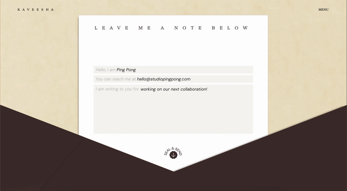
These design choices extend into the finer details of the site. A playful ‘tip of the day’ section highlights her experience, while the contact form, designed like a traditional envelope, gives users a small moment of interaction before they leave. Every element was crafted to ensure that Kaveesha’s personality and professionalism were represented in equal measure—a digital presence as multifaceted as the designer herself.
Source: www.kaveesha.in License: All Rights Reserved.
Source: www.kaveesha.in License: All Rights Reserved.
Source: www.kaveesha.in License: All Rights Reserved.
This post was originally published at Fonts In Use